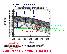
The entire gray region is the 95% confidence interval for the reference range. The darker grey region represent values above average, the lighter grey below average.
The WHO definition for osteopenia (-1) is shown as the dotted blue line and for osteoporosis (-2.5) as a dotted green line.
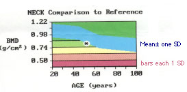
DON'T read across the graph until a patient's value crosses the mean, and frighten a young patient by saying "You have the bones of a 70-year-old woman." A 30-year-old person with a low bone density still has the bones of a 30-year-old woman, but the density is lower than average. There are other changes besides density that occur with aging, and the risk of fractures for a young person is much less than for an old person with the same bone density.