Lab 5: Excel Charts and Graphs
Objectives
- Create a column chart in Microsoft Excel
- Learn how to add extra data to your chart, and to modify your chart
- Create a line chart & format the appearance of your chart
Preparation
In this lab, we'll input some sample data into an Excel worksheet, and we'll learn how to create different kinds of visualizations of that data in Excel. We'll be creating graphs, which Excel calls charts.
Creating a Column Chart
Let's practice making vertical bar charts. Excel calls these Column Charts.
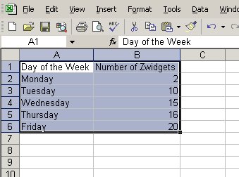
Alice just started working at a zwidget factory, where she makes zwidgets all day. This is a table of how many zwidgets she made each day during the first week.
| Day of Week | Number of Zwigets |
| Monday | 2 |
| Tuesday | 10 |
| Wednesday | 15 |
| Thursday | 16 |
| Friday | 20 |
- Open Microsoft Excel. You should have a new blank workbook
open. Save this file as
lab5.xlson the Desktop of your computer. - Enter the above data for Alice's zwidget production.
- Now, select all the data you just inputted.
- Screenshot:
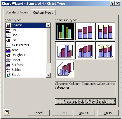
- Go to Insert->Chart.... A window, called the Chart Wizard, will show up.
- On the left side of the Chart Wizard window, under Chart Type, select Column. Then, on the right side under Chart Sub-Type, select the leftmost, top-most chart. It's called the Clustered Column chart. This should be the default chart. You can click the Press and Hold to View Sample button to preview what your chart will look like. Click Next to move on.
- Screenshot:
- Now you are in Step 2 of the Chart Wizard. The default values should be correct. Click Next.
- You should be in Step 3 of the Chart Wizard, Chart Options. There should be six tabs, Titles, Axes, Gridlines, Legend, Data Labels, Data Table. Make sure you are in the Titles tab.
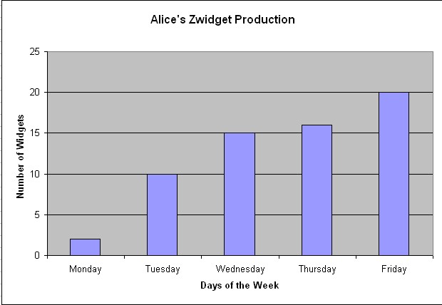
- Change the chart title to
Alice's Zwidget
Production
. Change Category (X) axis toDays of the Week. Change the Value (Y) axis title toNumber of Zwidgets. - Click on the Legend tab. Uncheck the Show Legend box. We only have one series of data in our chart, it's not particularly complicated enough for us to need a legend on our chart. Click next.
- In Step 4, Chart Location, we get to select whether we want the chart to show up on the worksheet along with your data, or on a brand new sheet by itself. We're going to keep the default value, which is to place the chart on the same sheet. If it's not already selected, select As object in and the current sheet, which should be Sheet1. Click finish.
- Congratulations, you've just created a chart in Excel! Be sure to save your work.
- Screenshot:
- Click on your chart. Notice how there are colored lines surrounding the various parts of your data in the spreadsheet, to show which cells are associated with the chart. Try to change one of values, say, Alice produced 25 instead of 20 zwidgets on Friday. The chart will change automatically. Change the value back to 20.
Adding new data to your chart & modifying your chart
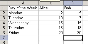
Now, let's say we want to compare Alice's level of production to Bob's. Bob also just started this week. This is what his production numbers are:
| Day of Week | Number of Zwigets |
| Monday | 5 |
| Tuesday | 7 |
| Wednesday | 15 |
| Thursday | 18 |
| Friday | 30 |
- Change the Excel spreadsheet data that you had inputted before in
the following ways. First, change
Number of Zwidgetsto beAlice. Then in the cell to the right of it, addBob. Now, in the cells in the column belowBob, add Bob's data using the table given above. - Screenshot:
- Now we need to change our chart to match our data. Click on the chart so that it is selected.
- Go to Chart->Add Data....
- We'll now have to tell the chart where the new values to be added are. Making sure the Range textbox is highlighted, click, hold, and drag over all the cells in Bob's column, from Bob's name to Bob's values for Friday. Six cells, from C1 to C6 should be selected. Now let go. The reference for range of the cells should be added to the range textbox.
- Screenshot:
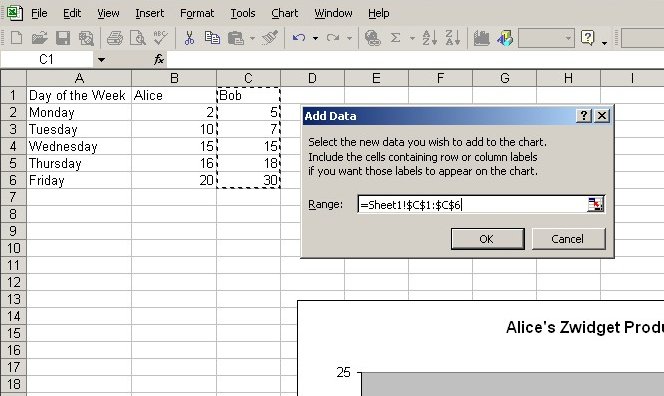
- Click Ok
- Your chart should now have Bob's data included.
- Now you need a new title for your chart because it's no longer just Alice's data, and you also need a legend. To change these, make sure the chart is selected as before, and select Chart->Chart Options... from the menu bar.
- Click on the Titles tab and change the title of your chart
to something more appropriate, such as
Zwidget Production By
Employee
. - Click on the Legends tab, and select Show Legend.
- Click Ok, there's your new chart. Save your work.
Line charts and formatting the appearance of your chart.
Let's say you've decided now that you'd rather have a line chart instead of a bar chart. Let's go change the chart type of your chart, and then make some other modifications to it.
- Click on your chart to select it.
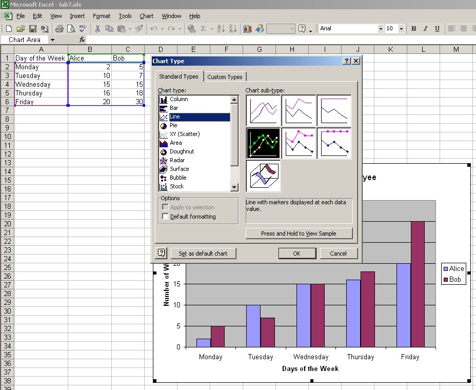
- Go to Chart->Chart Type.... Select Line for Chart Type on the left. Select the second from the top, leftmost chart for Chart Subtype. Click Ok.
- Screenshot:
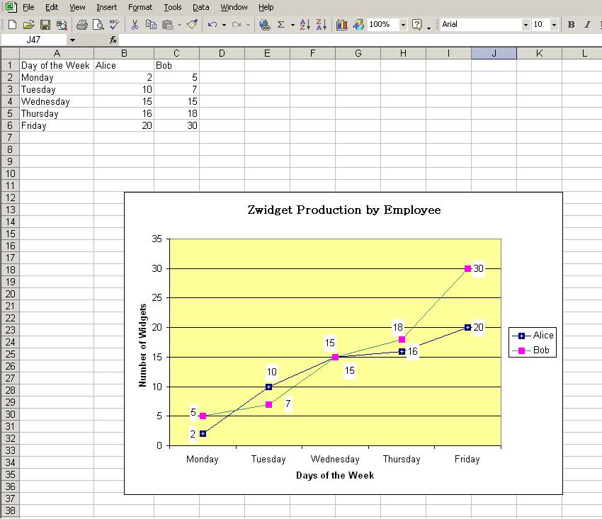
- Your chart is now a line chart, with dots for each value. But it's hard to tell what value each dot is, so let's add data labels to them. Click on the chart to select it, and then go to Chart->Chart Options. Go to the Data Labels tab, under Label Contains check only Value and click Ok. You should now have data label numbers on each of the dots.
- To change the way those data labels look, double click on one of them, on one of the numbers. The Format Data Labels window should pop up.
- Click on the Font and Alignment tabs to change font style and positioning of the labels next to the value dots. The Patterns tab lets you create a little box that will surround the value label number, and you can change the background color behind it to make it easier to see. Try changing one thing on each tab, and see what happens. If you don't like it, you can always undo. When you are satisfied with the way the labels look, move on. You need to do this to Alice as well as Bob's lines. If the labels are hiding each other, you can click, hold and drag them to move them around.
- You can change virtually anything about the formatting of your chart by just double clicking on it. A Formatting window for that part of your chart will pop up. Try doing things such as changing the background color of the chart, the color of the lines, the shape of the dots, or the font used in the axes. You can also drag elements of the chart, like the legend, labels, the whole chart itself, around to adjust their position if you like.
- When you're satisfied with the way your chart looks, you're done with this chart!
Here's an example of what your final chart might look like. Of course, feel free to play around with the formatting as you wish.
Finishing up
- To save just the chart that you created, click on the chart so that the entire chart is selected, but only the chart is selected. Go to Edit->Copy.
- Open an image editing program such as Paint (Start->Programs->Accessories->Paint). You will probably have a blank document in front of you.
- Paste the image onto the blank document. Edit->Paste.
- If there happens to be extra white space on the bottom and right side of the image, you can click on the corner of the white part, and drag it to make it smaller, to fit your chart.
- Now, let's save your chart in a web-readable format, such as a jpeg. File->Save As..
- Name the file
lab5chart.jpgas the filename, select JPEG under Save as type:, and save the file on the desktop. - Create a
lab5directory in yourCSS305directory on Dante. Copy your Excel file as well as yourlab5chart.jpgto the directory. You can view your files by going to the usualhttp://students.washington.edu/yourUWNetID/CSS305/lab5, and then click on thelab5chart.jpgto see your rchart.
Checklist
- I can create line and column charts in Excel.
- I can add modify data in my chart.
- I know how to change simple formatting in my Excel charts.