|
Info 424 | |||
| Information Visualization | ||||
INFO 424: Hall of Fame/ Hall of Shame
vote here: https://catalysttools.washington.edu/webq/survey/ostergrn/46348
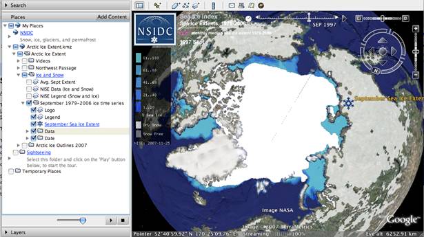
This visualization shows the amount of ice at the north pole of Earth for each year between 1979 and 2006. The visualization shows the data very clearly and concisely, as vast amounts of data are shown in the rendering. We are easily able to compare across years by sliding the slider across the frames. The data integrity is preserved because the data is mapped to a globe view of the Earth. The rendering is extremely high resolution, with thousands of data points represented at a time. This visualization is only able to display effect because cause has been very difficult to prove and quantify. One thing is for certain: a clear and coherent story of the ice caps over the years has been shown.
Shneiderman's tasks for interactive visualizations are mostly fulfilled. Overview, zoom, and filter are immediately available. Details-on-demand is not available because the data layers were rendered externally and compiled into PNG image files for each year. It is easy to relate different years using the sliding scale to show multiple years overlayed on top of each other. There is no concept of history in the visualization, but a user can mark and extract visualizations as he or she likes.
This interactive visualization follows the ideas of Schneiderman very closely. His ideas of zoom, pan, filter, overview first, and details-on-demand are easily viewed and easily accessible within this program. All of these features except for filtering (unless you want to filter by geographical location) can be done using the left grey navigation bar. Also, all utilize standard idiomatic graphical representation of the actions that can be completed. Standard view filtering can be done by time sequence using the pull-down menu offered on the far left tan menu bar. A legend of all variables (binned time in six day increments) can also be seen on the same menu bar. This tan menu bar in combination with the pan/zoom/overview features combine to create Schniderman’s “details on demand” concept.
http://www.learner.org/jnorth/maps/monarch_f07_Roost.html
Link: http://directmidi.sourceforge.net/midistation.htm
(It is necessary to download a copy of MidiStation, and there should be a link on this webpage to do so)
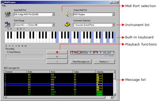
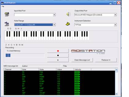
The MidiStation is an interactive visualization that allows you to select notes using either the keyboard or mouse to play on your computer. You also have an option to record a composition and replay it at a later time. There are a variety of instrumental sounds that can be used, and the user is able to select the octave range on the keyboard to control which keys will match their location with the keyboard. I feel that the display of the keyboard is appropriate, as it accurately portrays the structure of a real piano keyboard. Looking at Few and Tufte’s principles, in my opinion this visualization best shows the principles of presenting a large amount of data in a small space, and encouraging the eye to compare different pieces of data. If you cycle through the note range selection, you can select anywhere from “octave -1” to “octave 9,” which means there is a wide selection of notes that the smaller keyboard is capable of playing. This visualization encourages you to compare different pieces of data as each time you play a note it adds itself to the message list, and you can see the differences in the list as well as by clicking on different keys on the piano keyboard. It doesn’t, however, do a very good job representing any of the other principles as it seems to focus on the technology, doesn’t reveal the data at several levels of detail, and overall doesn’t show the data without the user having to create it themselves. Perceptually it would have been nice to see the black keys appear raised above the white keys as that would be how they would truly appear. Also, it seems like the black background in the message list isn’t necessary. By changing it to white and changing the text color to more neutral colors it would make that section of the display more readable and it would match up better with the color of the rest of the display. As for Shneiderman’s tasks, this display does not support zoom, details on demand, filter, or relate very well. It does support overview, history, and extract as you are able to record clips of notes exactly as they are played and get a good visualization of which notes can be played before making any selections. Overall I feel that a great deal more could have been done with this visualization and I don’t feel it was done very well. Instead of just listing the notes played, it would be interesting to see them on a manuscript moving as you continue to play more notes. That way instead of just creating midi files this visualization can help teach people how to read music correctly. In its current state the MidiStation functions much better as a recording application than an interactive visualization. It also would have been nice to have an option to assign more keys to different octaves (the current display only allows for one complete octave). Also, with the current setup it is very difficult to play more than one note at the same time if it is not contained in the octave to the far left. You are only able to click one location with the mouse, so this limits the possible note combinations that you can play.
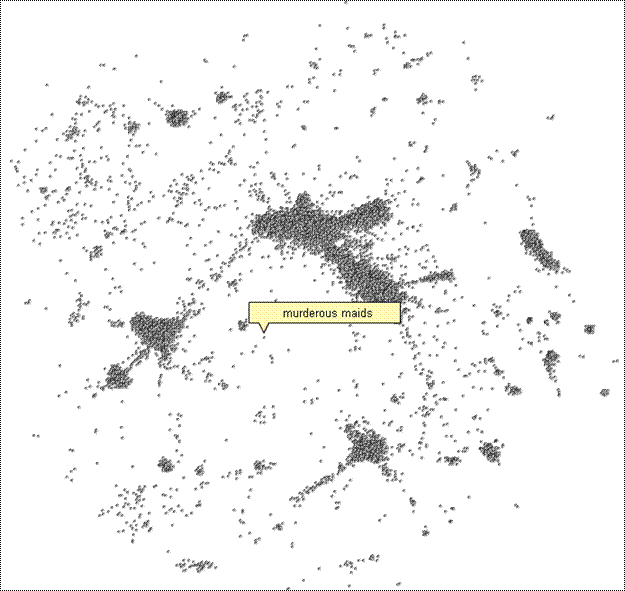
Touch Graph is a visualization tool used to examine interconnected networks. The example shown below is based on google search results for the term “Informatics”:
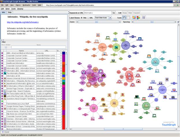
Search Results for the term “Informatics”
In the main window are the search results, size indicating how “centralized” a result is. Each color represents a cluster of results that are related in some way. Once a result is clicked on, you can click “expand” to see more related results for that cluster (as shown in the picture on the next page.
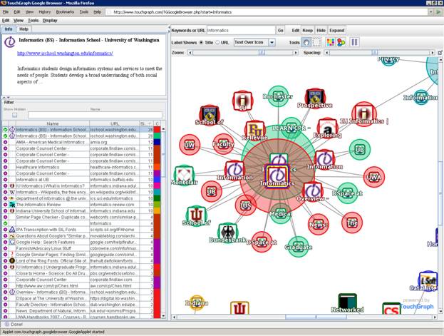
Expand shows more related results for a given cluster
One interesting feature of this tool is how results in the results window are shown that would otherwise not be shown in a normal google search. For instance, searching on google.com for "microphone wire 22 awg" returns 4 results, yet TouchGraph finds the 4 main nodes as well as more than 30 related results. The site does not explain exactly how this is done, but it does say it uses googles database, so perhaps it is running multiple queries to generate related nodes. The other main advantage of this tool over google is its ability to sort the results by name, URL, similarity, cluster and icon.
The main purpose of this tool is of course to see the connections between nodes. Interaction-wise, this goal is achieved relatively well. The applet interface is somewhat clunky and rather slow to return results, however the clustering of a given topic is clear to see. Mousing-over a node highlights its connections. Filter, Zooming and panning features are intuitive. Recoloring for visually impaired is also available.
You can move individual nodes by selecting them individually or using the box selection. Selected nodes are highlighted in the list to the left and visa versa. Right-clicking lets you refine your search, for instance selecting one or two nods and then keeping only those nodes will effectively search for relations to those nodes. It does not seem to properly “fan out” the results, which may be a bug, but despite this it is still fairly effective at refining your search.
This vizulization has a few design and functional issues. There is a clear trade-off to being unable to see blurbs about each link and being able to see clusters. In the google search results, the word you are interested in is bolded or highlighted in some way, yet in TouchGraph there is no such highlighting, and in fact you can’t see the blurb unless you click select a single node. This can create confusion and leave the user wondering how or why a given search result is connected to the query. So while the details-on-demand aspect of this program seems to be lacking, it may be argued the authors expected the users to only look at one blurb at a time and spend more time using the tool (instead of actually clicking the websites).
As mentioned before the Java interface is rather slow, it also does not allow copy and pasting, or tabbed browsing (instead it uses popups). There are also some problems with ink. The transparency is nice, but many of the circles are very large, perhaps there could have been a better way to highlight the larger nodes (maybe using differential shades of color). Not only is it hard to judge the area of a given circle, but it also creates a confusing clutter when there are many nodes on the screen. Alternatively you can switch to just text, but you will lose the icons, which surprisingly create a great deal of context (a small feature google has not yet adopted).
Overall this is an interesting project that is fairly well done. The core functionality is just about what I would expect, and while there are a few features that will probably not get used very often such as pause display and re-coloring of clusters, there is little other functionality that would be greatly desired. The biggest drawback is a lack of blurbs, and actually the lack of information that we have come to expect from a search result. But the unique view of more results and the ability to sort results makes this a potentially viable supplement to standard text searching.
http://www.touchgraph.com/TGGoogleBrowser.php?start=Informatics
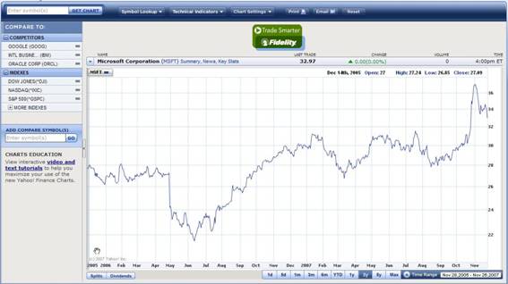
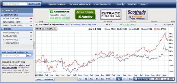
This visualization is a line graph showing Microsoft stock price in time line. This visualization tool provides with various convenient interactions for users to navigate. For example, long-term investors may convert the view to 3yr time line, and short-term investors may view hourly time line of the price variation. It shows precise time and price when the cursor is on the graph. Also, it has links to the company’s competitors which combines two graphs for comparison. This visualization is effective since it makes large data sets coherent, encourages users to compare different pieces of data, reveal the data at several levels of detail, and serves a very clear purpose. Hence it fulfills the principles of graphical excellence and integrity. It is a very powerful tool to navigate the stock markets.
Implementation: Dynamic HTML
Application Domain: Business / Stocks Visualization: Temporal https://www.etrade.wallst.com/v1/stocks/earnings/earnings.asp?view=earnings
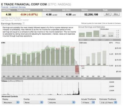
Screenshots are (Figures 1 – 7) provided for non-customers in attached pdf..
E*Trade provides its customers with many different visualizations to help them explore investment strategies. This visualization shows bars (deviation) representing quarterly earnings for a company overlaid on a line representing the company’s stock price (Figure 1). Users can extract data on demand by clicking on specific quarters (Figure 2). The stock price trend can be visualized in several different ways using the Display (Figure 3) and Overlay (Figure 4) options. Users can compare earnings and stock price to market Indicators (Figure 5). Users can filter and zoom in/out on the data shown by modifying the Actual Timeframe (Figure 6) and Estimates Timeframe (Figure 7). Via these manipulations this visualization satisfies all of Shneiderman’s tasks.
https://www.etrade.wallst.com/v1/stocks/earnings/earnings.asp?view=earnings
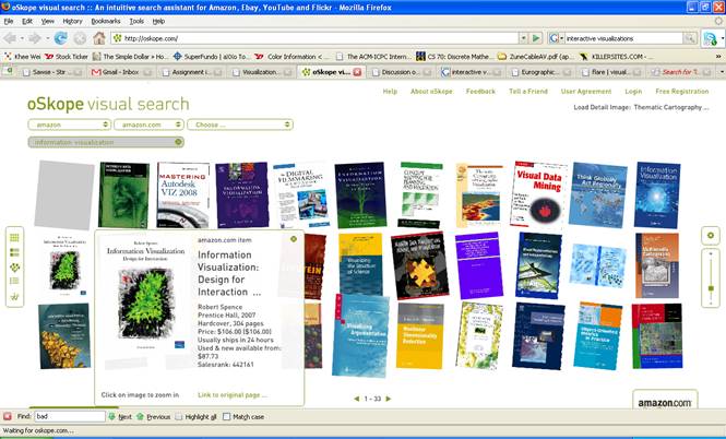
The reasons why it is effective is because users can view the items in an overview or detailed manner by using sliders and clicking on the item which are very much like a person viewing and checking items in the real world (for instance, he/she is in a library and going through a rack of books (overview) and then he/she “zooms” in on a book to check its details (detailed)). It is a faster and intuitive way of browsing the web. Plus, the option to view the data in so many different ways can reveal other dimensions encoded in the data. Saving the desired data to a folder (bookmarking) also makes oSkope effective for browsing the web.
Also, filtering the data by using the search bar reduces clutter and prevents the user from sifting through large amounts of data. Thus, it makes large data sets coherent.
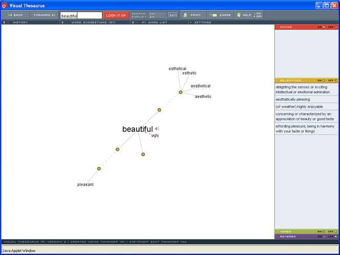
The Visual Thesaurus is an interactive dictionary and thesaurus with an innovative display that encourages exploration and learning. It is very effective because it is such a great teaching tool for people who are not native English speakers. The lively, almost “organic” interface captivates the user from the get-go. Shneiderman's mantra (overview, zoom & filter, details-on-demand...) is used effectively in this tool. The user is presented with an overview of all the synonyms and antonyms related to a word. Semantic zooming is incorporated into this interactive visualization by allowing the user to click on any of the nodes available. Definitions of the word along with its synonyms/antonyms are provided in a very simplistic and easy-to-trace manner (details-on-demand). This tool also allows you to save and print a history of all your words which is great for learning new words on the go. The little speaker symbol allows users to train their pronunciation. A simple and effective way to expand your vocabulary!
http://www.thevisualthesaurus.com
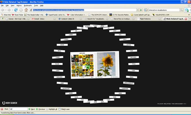
This tool allows users to explore these tag spaces in Flickr as graphs in a radial tree interface and it provides a great way to surf the images on Flickr. This visualization is so interactive because users can travel in and out of the just by hovering the mouse which makes this exploration process through Flickr images such an immersive and interesting experience. We can see Shneiderman's mantra (overview, zoom & filter, details-on-demand...) in play here. placing the mouse nearer to the center of the image gives you more detail-on-demand because the user can zoom in and see smaller subset of the data which is the set of all images related to the tag and allows you to scan through the related images and extract information. If needed, the user can obtain the name of the image from the bottom of the viewer, and more data by clicking on the “View Flickr Photo Page Link.” Related tags are easily found on the perimeter of the radial tree and hovering your mouse on the outside lets you see overall pattern and trends such as the relationship between the tags. In short, the Flickr Related Tag browser is simple and intuitive which makes it effective for surfing images on Flickr.
http://www.airtightinteractive.com/projects/related_tag_browser/app/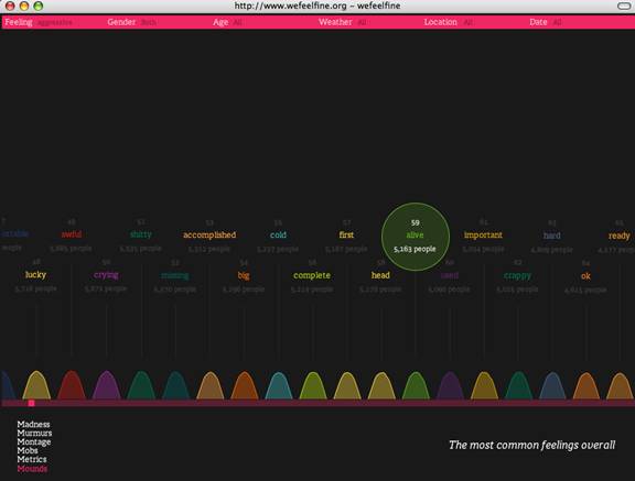
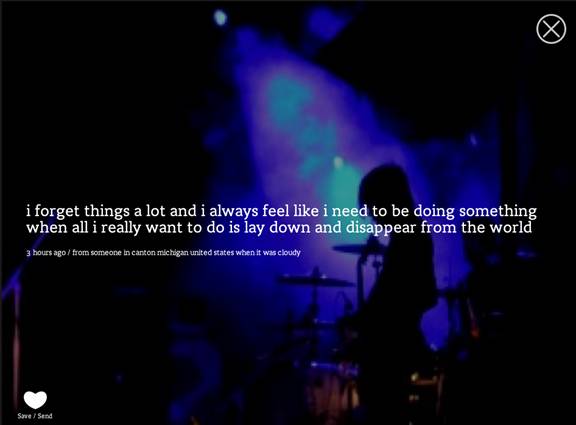
The We feel fine visualization is harvesting human feelings from a large number of weblogs using the keyword “I feel”, and then analyze how people feel over the globe. This information visualization is very powerful because it provides many facets of the data. It provides both overview and detail views in many innovative ways such as dynamic scattered plots, interactive quotes with photos. It also give users many choices to zoom in and zoom out the feelings, provide metric regarding different pre-defined feelings.
http://www.socialexplorer.com/pub/maps/map3.aspx?g=0
Explanation:
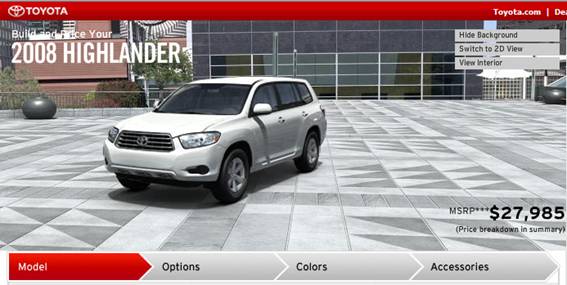
This visualization is to show users actual appearance of a car when users want to customize a car. The most effective thing in this visualization is using 3D image and real image to express reality. This visualization is effective in showing overview and detail of a car model. Users can see a car with 360 degree view and can see interior from different views. One of the other effective things in this visualization is change of image by the change in users’ selection. As users selects different color or add options, the visualization shows these changes. Also, users can hide background to see only car model, which is helpful in avoiding complex visualization.
http://www.toyota.com/byt/pub/setStartOptions.do?seriesCategory=7&zipHolder=&modelId=&zipCode=98105
Since the website uses Korean language, you need to click “cyber yard tour” on the left hand side of the main page.
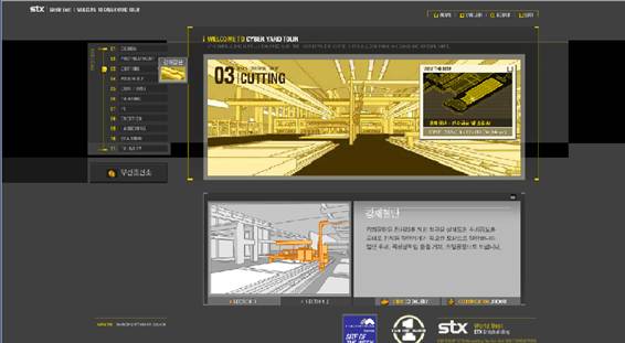
This visualization is to help users understand what the STX shipbuilding company does with their tools and techniques in building actual ship. Since the factory can be seen with 3D images, users can see where specific tools are located and how those tools are used. Due to this 3D image, this visualization is very effective in expressing overview and detail of a factory.
Explanation:
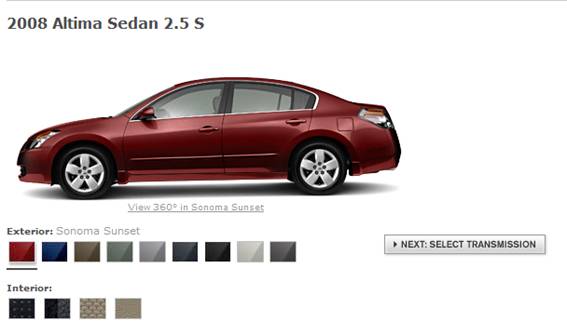
This visualization is also to show users actual appearance of a car when users want to customize a car. This visualization also shows 360 degree view of a car. However, users are not allowed to stop and see the animation of 360degree view of a car. Also, users can see 360 degree view only when selecting exterior color of a car model. Due to this limitation, users cannot see the change of image when they add optional accessories to a car model.
Description and Analysis
This interactive visualization allows the user of this website to navigate its components or works by moving your mouse left and right or up and down. The visualization is actually a 3D object and seems to be a bit circular, since the words on the visualization is skewed when moving and manipulating the visualization. The Shneiderman‘s infovis tasks that this interactive visualization really only supports is probably details on demand and this is done when the user hovers over the (non-labeled) boxes in a category/group. Other positive aspects about this visualization (other than that this 3D interactive visualization would look cool to some people) is that it focuses in on whatever part of the website the user is looking and blurs/fades out the rest into the background and use of color is rather simple. Generally, this website and the information presented is fairly simple; the use of colors (on clicking the boxes), size and white space is decent, but the main flaw of this visualization would be that it was made into a 3 dimensional object. Similar to what Few says about graphs (pies), that a graph (or visualization) shouldn’t be used if it can’t be decoded and if it doesn’t make the information more meaningful; this visualization added extra fancy stuff (3d and skewed words) that really doesn’t help present the information any more meaningfully or help the user navigate the information any better. Since there are only two categories to navigate on this website, I don’t think its necessary to add the 3D effect and if there were categories added, the nature of this visualization (without adding any other functions) would not support a user friendly interaction. The reason for this is because the 3D effect makes it confusing to at what point the user is at on the website. Using this type of interactive visualization at first would be kind of difficult to navigate since there would be no familiarity with where things are in the navigation and the boxes (that you can select in each category) aren’t labeled. Other (less insightful) annoyances of this visual interaction includes the 3D effect affecting some of the category words/names by skewing them so that you can’t always see the full category name and that this 3D object seems to stick or follow your cursor no matter what, making it seems like you can’t get out of the navigation.
http://www.screenvader.com/root.html
 This visualization shows the relationship between 17,700 movies in the Netflix movie database. Each point is a movie grouped near other movies based on whether users who like one movie like the other or those who dislike one dislike the other. You can get the title of a movie by moving your mouse over a point. This is a bad example of an interactive visualization because it has little support for Shneidermans tasks of information visualizations. It provides overview, but does not support zoom and filter or details on demand, the most basic principle of the Visual Information Seeking Mantra as given by Schneiderman. The visualization also does not support filter, relate, history, or extract. This visualization is not useful because it does not support these tasks and the poor labeling. Instead the user faces 17,700 points and can only randomly see what movie each point represents. Because points are grouped so closely together and are so small it is impossible to find and evaluate the criteria for why different movies are related.
This visualization does meet some of Tuftes principles of graphical excellent such as presenting many numbers in a small space, however it also fails many of the principles. This visualization does a poor job of making a large data set coherent because it is impossible to even make sense of what is going on, even reading a description of visualization barely helps. The visualization does not reveal data at several levels of detail and it does not serve a clear purpose. The data may encourage comparison but it is impossible to make any type of comparison except for an extremely rough one. There is a lack of labeling and no way to tell how distance corresponds to what magnitude of similarity or dissimilarity. Overall this graphic fails to meet most of Tuftes principles and Schneidermans interactive visualization tasks.
This visualization shows the relationship between 17,700 movies in the Netflix movie database. Each point is a movie grouped near other movies based on whether users who like one movie like the other or those who dislike one dislike the other. You can get the title of a movie by moving your mouse over a point. This is a bad example of an interactive visualization because it has little support for Shneidermans tasks of information visualizations. It provides overview, but does not support zoom and filter or details on demand, the most basic principle of the Visual Information Seeking Mantra as given by Schneiderman. The visualization also does not support filter, relate, history, or extract. This visualization is not useful because it does not support these tasks and the poor labeling. Instead the user faces 17,700 points and can only randomly see what movie each point represents. Because points are grouped so closely together and are so small it is impossible to find and evaluate the criteria for why different movies are related.
This visualization does meet some of Tuftes principles of graphical excellent such as presenting many numbers in a small space, however it also fails many of the principles. This visualization does a poor job of making a large data set coherent because it is impossible to even make sense of what is going on, even reading a description of visualization barely helps. The visualization does not reveal data at several levels of detail and it does not serve a clear purpose. The data may encourage comparison but it is impossible to make any type of comparison except for an extremely rough one. There is a lack of labeling and no way to tell how distance corresponds to what magnitude of similarity or dissimilarity. Overall this graphic fails to meet most of Tuftes principles and Schneidermans interactive visualization tasks.
This interactive visualization is a good example of a very bad presentation of the underlying data. This data comes from NetFlix and constitutes 17,700 movies within their database. The visualization is attempting to show the relations between the movies according to proximity to each other. However this visualization fails, in a number of ways, to utilize good design principle for these types of interactive tools. First, it completely ignores all of Schneiderman’s infovis tasks in its design. Although it might be argued that it does relate the data, upon further examination we learn that the relations between the points are not from the visualization but rather from a separate set of algorithms that was computed upon the underlying data before it was used. Second, the visualization implements none of Tufte’s nor Few’s principles for creating a useful data visualization. Though the data-to-ink ratio is low in this case, the fact that no information beyond an abstract spatial relation and title is given to the data negates any benefits associated with the use of this principle.
http://abeautifulwww.com/2007/04/03/an-interactive-visualization-of-the-netflix-prize-dataset/
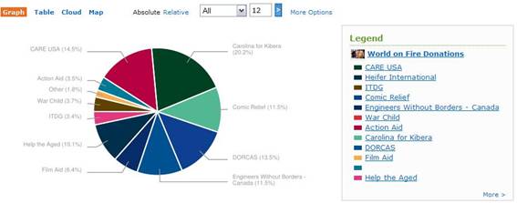
This pie chart represents the percentage of donation made by organizations around the world. It has a filter that allows users to limit the number of organizations and a color legend to refer to for corresponding organizations. Yet, this visualization is not quite effective. Pie chart makes it difficult for users to compare. Also it does not provide accurate amount of donation. The color legend is unnecessary since it already has labels of organization names by the pie chart. This visualization may be fun for the eyes to glance at, but it lacks clarity, precision and efficiency; it fails to deliver graphical excellence. Thus, this visualization is considered inefficient.
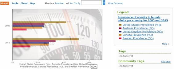
This visualization is a bar graph showing obesity rates for females by country for 2005 and 2015. It has used horizontal bars for nominal comparison. Yet, the visualization is inefficient in every possible way. The background image of the graph greatly distorts the message that this visualization is supposed to communicate. The labeling may not be necessary since the axis already shows the number correspondence of the bars. Also, the graph shows the data that may not be true which is predicted data for 2015. Hence, it fails to deliver graphical excellence and integrity.
http://www.swivel.com/graphs/show/18640025
Are you sick of wrestling with difficult tools to make mediocre visualization? Are your presentations filled will dull and unintelligible graphs? The answer is here - SuperChart 2007! Ordering SuperChart 2007 today can revolutionize the way you see and create visualizations.
Create enticing 3-D pie charts with easy that will wow and impress your bosses!
As you can see a variety of coloring options are available to further enhance your pies. Imagine the possibilities. Using state of the art 3-D technology we have also included shading features that make charts look so lifelike that your viewers may try and grab them right out of your presentation! And LOOK! bars are staggered too!
Still Not Sold??
If 3-D pie charts alone aren't enough to entice you, there's more! Imagine being able to see those old stacked-bar charts from a new perspective.
A 3-d bar chart, but now from above! It's like a your best scatter plot meets the most exciting 3-d bar chart - overlaps, meshes, and explodes into something great!
Plus, we've kept your favorite 3-d graphing features just the way you like them. You can continue to make lovely overlapping 3-d bars that quickly and simply get your point across.
To order today follow this link and get this amazing software today! Professional licenses start at just $699! Don't make boring visualizations any more, ORDER TODAY.
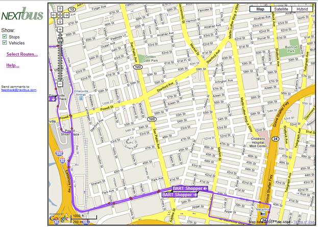
Overview: This visualization displays a bus route and where the current buses are, including the direction that they travel. While it is a good idea, it is a poor visualization.
This data set fails miserably when you attempt to show multiple bus routes that go on the same street. In that situation, the most recently selected route simply covers the others, making it impossible to find where a specific bus goes unless it is the one on top. In this situation, the tool fails to make a large data set coherent. Also, if a user is interested to see which way the bus is traveling, they cannot unless they happen to be lucky enough to see a bus nearby where they are looking at. There is no built in arrows for the traveling outside of a specific bus.
While this does provide filtering, it is very annoying to use. You have to click a link which opens a separate popup window in order to toggle checkboxes for specific buses. The color is not displayed next to this separate windows legend, which makes it even more difficult to determine which route is which (a user is likely to simply toggle a route to see which appears and disappears). The zooming of this visualization may be it’s only saving grace, however it was developed by Google Maps, not the nextbus.
http://www.nextbus.com/googleMap/googleMap.jsp?a=emery#
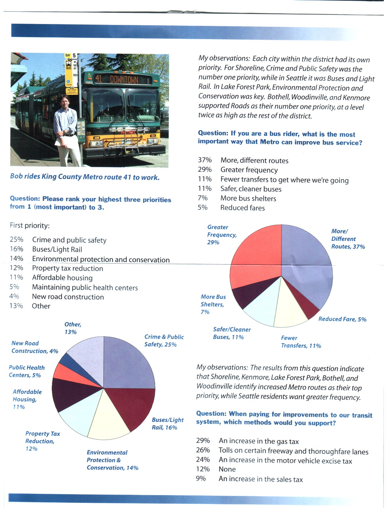
This visualization displays the results to three survey questions conducted by King County District 1 council member Bob Ferguson in 2007. The page the survey questions and underneath each question it displays the results in a table with the percentage of respondents agreeing with the particular notion and underneath the table it displays the same data again as a piechart.
The problems here are numerous. I first noticed the data/ink ratio Tufte emphasizes is not all it could be. The same data is repeated twice. Once as a very useful table that lists the values and labels in descending order by value and the second as a very unnecessary and nearly unusable pie chart. Unusable since a pie chart relies on the reader interpreting angles to judge the size of a slice in relation to another. In the first pie chart we have 8 slices we must compare and five of them are within a few percentage points of each other. This was obviously judged difficult to interpret so the designer actually labeled each slice with the label and corresponding value which not only duplicated the effort above, but actually hit upon the exact design that Few so mocked in his Save the Pies for Desert article. Consistency is another issue and this issue is important according to Few who states that “multiple instances of the same supporting components throughout a report should look precisely the same everywhere… differences work against your purpose by inviting… their brains to assign meaning to those differences.” The first two questions follow the same format of table followed by pie chart. For the last question, the designer evidently ran out of room for only the table is displayed (no, the next page doesn’t continue this question). Much better!... but confusing. Is this question less important than the others?
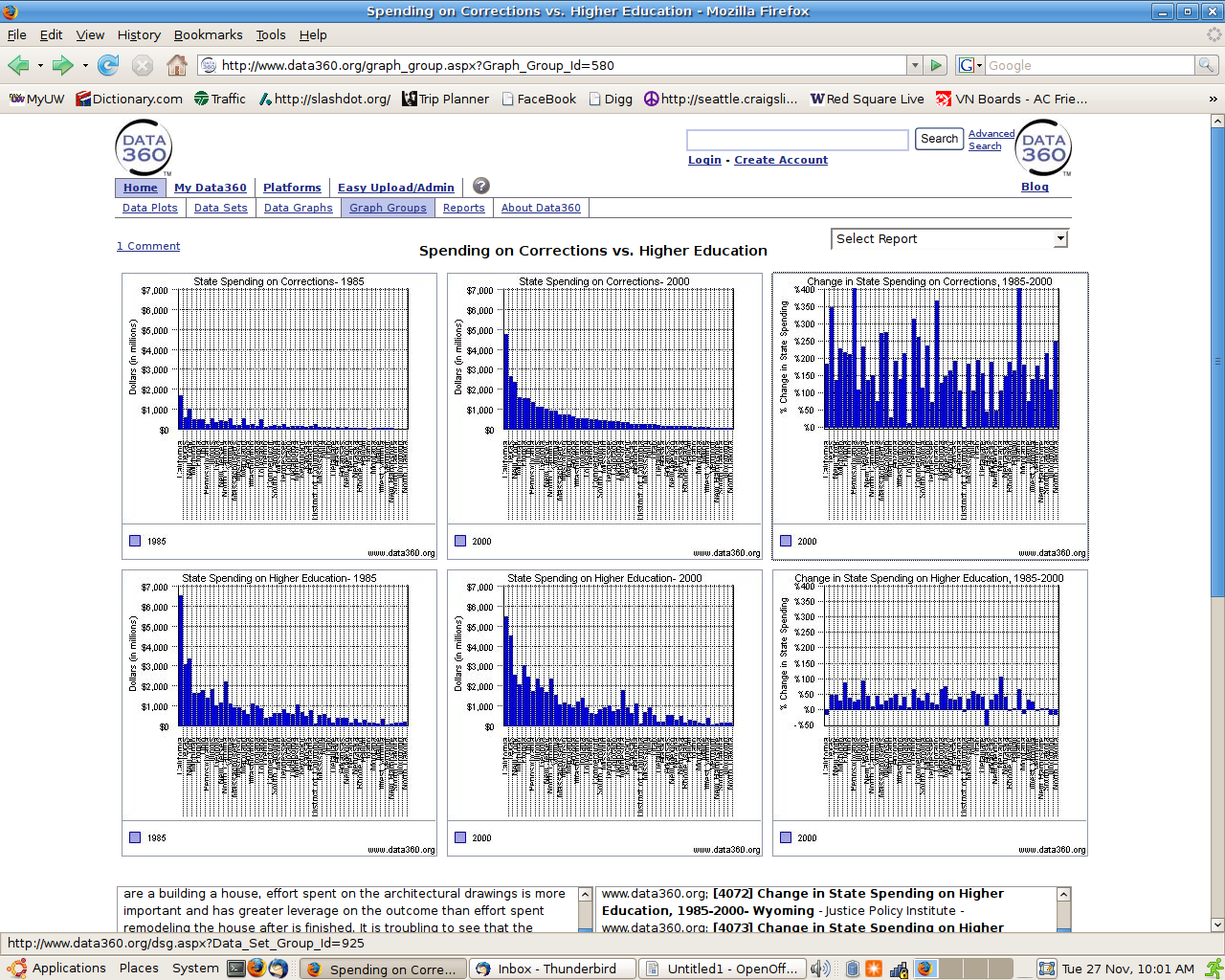 Visualization Link: http://www.data360.org/graph_group.aspx?Graph_Group_Id=580
The message of this interactive visualization system is stated on the above website to be: “These sobering charts indicate that we are increasing our spending on corrections more quickly than we are increasing spending on education.”
After browsing this system, however, I come away not sobered, but confused. This visualization system has series design problems in several areas. At the highest level, this system presents Shneiderman's Overview and Zoom tasks, but neither state clearly supports the stated purpose of the visualization (we are increasing spending on corrections faster that on education). Despite the fact that those two measures are supposed to be compared in this visualization, there is not a single graph that plots both of them in relation to one another.
Also, I find the state level of detail unnecessarily, especially in the overview. Even if you can squint hard enough to make out the state names, it's nearly impossible to compare the quantitative values for the same state across years or dimensions (education vs prison spending). After looking at this series of graphs for long enough, you may realize that the two right-most graphs plot the percentage change over years for each dimensions of spending. This shows clearly enough that prison spending has increased faster than education spending, but it does not show how much faster. The system does not even make it clear whether or not the values are adjusted for inflation.
Lastly, the data-to-ink ratio for each individual graph is atrocious. The heavy grid lines make each graph that much harder to read, and the dotted vertical lines between each state make it nearly impossible to read their names. The non-alphabetical ordering for the bars in each 'Change in State Spending' graph (on the right) makes a time-consuming and brow-furrowing job of finding the exact value for any given state. This ordering would make sense if there was an easy way to compare this graph with another in which you already knew the location of your state. Since there's not, the state level of detail becomes not only unnecessary, but confusing.