Homework 6: Due Midnight on Tuesday November 10th.
Plotting
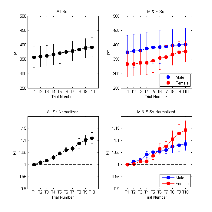
Download the mat file 'rtData.mat' here or from the homework 6 dropbox. This file contains a structure 'sub' which has data from 7 subjects. Each subject ran 10 trials of a response time task.
'sub' is a 1x7 structure with three fields: 'name', 'gender' and 'rt' which contains the 10 response times for each subject.
Plot the data to match the figure below (using four subplots)
For all plots, error bars are standard errors of the mean (SEM) – the standard deviation divided by the square root of the number of values contributing to the mean.
Subplot 1: Plot the average and SEM of the RTs for each of the 10 trials, averaged across all 7 subjects.
Subplot 2: Plot the average and SEM of the RTs for each of the 10 trials, averaged separately for male and female subjects.
Note that in both of these plots the ‘fatigue’ effect (longer RTs as a function of trial number) is hidden by inter-subject variability. This also makes it difficult to see whether the ‘fatigue’ effect is different for male and female subjects. The next plots show one way to deal with inter-subject variability.
Subplots 3&4 are just like subplots 1 and 2 respectively, except that you should plot the mean and SEM of the RTs after normalizing each subjects’ data by dividing by the RT on the first trial. (This is why the first trial should have an RT of 1 for every subject.)
Things you will need to explicitly match to our example figure:
The marker for the plots, the line colors, the title, x axis labels, y axis labels, the position of the legend, x tick marks, y tick scaling, the dashed line in Plots 3&4, and the overall shape/size of the figure (obviously that will be a rough match),