Practice Questions:
AFTER YOU FINISH THE PRACTICE TEST,
Scroll Down for Answers.
Ten students participated in a study on emotions. They wore electronic beepers and were randomly beeped four times a day for one week. At each beep, students wrote down the emotion they were experiencing. Listed below are the number of times each of the ten students reported being happy. Calculate the following statistics BY HAND. NO CALCULATORS. (If an answer requires a square root, just put the square root sign around the number.)
4, 2, 3, 8, 6, 2, 2, 6, 0, 7
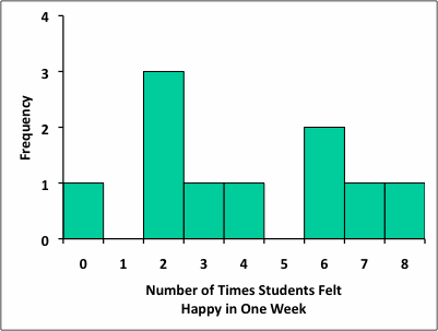
A) Draw a frequency histogram of these. data Be sure to label your axes properly (2 Points)
B) What is the Mode? (1 point) _________
C) What is the Median? (1 point)________
D) What is the Mean? (2 points)_________ (SHOW YOUR WORK)
E) What is the Range? (1 Point) _________
F) What is the Variance? (2 Points) ________ (SHOW YOUR WORK)
G) What is the Standard Deviation (1 Point)
Answers:
A) The x-axis of your histogram should be labeled something similar to "Number of Times Students Felt Happy in One Week." Alternatives could be "Number of Times Student Felt Happy," "Number of Times Student Reported Being Happy," "Number of Times Happiness Experienced," etc. If you just label it "Happiness" you would lose some credit, because "Happiness" is too vague.
The scale labels on the x-axis should read 0, 1, 2, 3, 4, 5, 6, 7, 8, which covers the range from the minimum to the maximum values of the data.
The y-axis can be labeled "Frequency" (as shown below), although an even better label might be "Number of Students."
The scale labels along the y-axis could be just 0, 1, 2, 3, because the tallest bar will reach the level of "3" on the y-axis. (In other words, there were 3 students who reported feeling happy twice during the week) However, this means that the tallest bar will reach the top of y-axis, which generally doesn't look good. Therefore, you can extend the y-axis to a maximum value of 4 just to create some "top space" in your graph.
The bars extending up from the x-axis correspond to the frequency of each number in the data set (e.g., the bar representing number "6" along the x-axis should extend up to the level of number two on the y-axis because the number "6" occurs two times in the data set. You would have no bar (indicating a frequency of 0) for number 1 or for number 5 because no students reported this frequency of feeling happy.
B) Mode = 2
C) Median = 3.5
D) Mean = 4.0
E) Range = 8
F) Variance = 6.2
G) Standard Deviation = just put 6.2 inside a square root sign (it comes out to 2.49)