Homework 2 Solutions
Page 39, #6
Class width = 5
Tree Height
Class Frequency Class Boundaries Midpoint Cumulative Frequency
16-20 100 15.5 - 20.5 18 100
21-25 122 20.5 – 25.5 23 222
26-30 900 25.5 – 30.5 28 1122
31-35 207 30.5 – 35.5 33 1329
36-40 795 35.5 – 40.5 38 2124
41-45 568 40.5 – 45.5 43 2692
46-50 322 45.5 – 50.5 48 3014
Page 41, #18
# Classes: 5
![]()
Round up to 4 to get final class size
Pungencies
Class f Midpoint Relative Frequency Cumulative Frequency
32 – 35 2 33.5 .1250 2
36 – 39 6 37.5 .3750 8
40 – 43 5 41.5 .3125 13
44 – 47 2 45.5 .1250 15
48 – 51 1 49.5 .0625 16
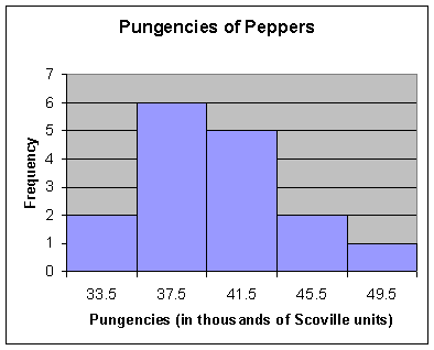
Class with greatest frequency: 36 – 39
Class with smallest frequency:
48 – 51
Page 42, #26
Saturated Fat Intake (in grams)
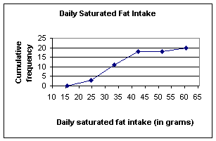
Class Class Boundaries Frequency Cum. Frequency
16 – 24 15.5 – 24.5 3 3
25 – 33 24.5 – 33.5 8 11
34 – 42 33.5 – 42.5 7 18
43 – 51 42.5 – 51.5 0 18
52 – 60 51.5 – 60.5 2 20
Page 52, #18
|
Stem-and-Leaf Display |
|
|
for Hay (lbs) |
|
|
Stem unit: |
10 |
|
|
|
|
29 |
8 |
|
30 |
5 |
|
31 |
9 |
|
32 |
7 |
|
33 |
|
|
34 |
5 |
|
35 |
1 |
|
36 |
|
|
37 |
|
|
38 |
|
|
39 |
0 3 |
|
40 |
3 9 |
|
41 |
0 5 9 |
|
42 |
|
|
43 |
|
|
44 |
6 8 9 |
|
45 |
0 5 |
|
46 |
0 5 |
|
47 |
9 9 |
|
48 |
|
|
49 |
1 |
|
50 |
3 |
Page 53, #22
Page 63, #18
(a)
|
Duration (min) power failure |
|
|
|
|
|
Mean |
61.15 |
|
Median |
55 |
|
Mode |
80, 125 |
(b)
Class Frequency Cumulative Frequency
12 – 30 4 4
31 – 49 6 10
50 – 68 2 12
69 – 87 3 15
88 – 106 3 18
107 – 125 2 20
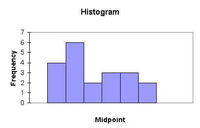
21 40 59 78 97 116
To answer this part of the question, I created a frequency table (using 6 classes) and made a histogram. While there are two modes in the upper range of the data (at 80 and 125), the frequency table shows that the class 31-59 has the most data values. From the histogram, it appears that the data are right-skewed; this is supported by the fact that the mean is greater than the median. The median represents the most “typical” value, since the mean appears to be influenced by extreme values in the right tail.
Page 63, #20
(a) The mean and median cannot be calculated because the data are ordinal.
The mode is “Watchful.”
(b) The mode is the only measure we were able to calculate.
Page 65, #32
To get the mean score for class, use the formula:
 =82
=82
Details:
|
Major |
w |
grade |
w*x |
sum(w*x) |
xbar |
|
Engineering |
8 |
83 |
664 |
1968 |
82 |
|
Business |
11 |
79 |
869 |
|
|
|
Math |
5 |
87 |
435 |
|
|
Page
65, #34
First, find the midpoint of the frequency distribution; this is the x value. Use the formula:
![]() =70.14
=70.14
Details:
|
Height |
f |
Midpoint |
f*x |
sum(f*x) |
xbar |
|
63-65 |
2 |
64 |
128 |
1473 |
70.14 |
|
66-68 |
4 |
67 |
268 |
|
|
|
69-71 |
8 |
70 |
560 |
|
|
|
72-74 |
5 |
73 |
365 |
|
|
|
75-77 |
2 |
76 |
152 |
|
|
Page
66, #38
A histogram created in Excel showed the data to be right, or positively skewed.
Page
79, #18
(a)
Dallas Houston
Range 18.1 13
Variance 37.33 12.26
Standard Deviation 6.11 3.50
(b) The data show that there is more variability in the Dallas employees’ salaries than those from Houston. There is a wider range of in the size of salary among municipal employees in Dallas than in Houston. Also, two other measures of dispersion support this claim. It can be seen from the table in part (a) above that the variance is more than three times as large for Dallas employees than for Houston, and the standard deviation for Dallas salaries is nearly twice as large as that for Houston.
Page
80, #22
(a) (i) has the greatest standard deviation (more values away from the mean), (iii) has the least (most values clustered around the mean).
(b) all data sets are centered between 3 & 7, with the same sample size—they differ in their variability about that center.
Page
81, #26
Using the empirical rule, we know that 95% of the data lie
within 2s of the mean. Therefore, we
can find the points between which 95% of the data lie using the formula ![]() .
.
![]()
95% of the data lies between $500 and $1900.
Page
81, #28
Using k = 2 and applying Chebychev’s Theorem, 75% of the data lie between 48.07 seconds and 56.67 seconds.
We find the points between which 75% of the data lie using
the same method as in the problem above. Then, apply Chebychev’s formula to find that ![]() of the data fall between the two points.
of the data fall between the two points.
Page
91, #16
(a)
and (b)
Q1 = P25 = 28
Q2 = P50 = 29
Q3 = P75 = 32
(d) One-half of the secondary school teachers who obtained tenure were between the ages of 28 and 32.