Chapter 8: Basic Plotting
Most of this information (and more) can be found in the Matlab help documentation in the section Basic Plotting Commands.
There are 6 stages of plotting data.
1. Prepare your data. If you don’ t think about how you are going to analyze your data when you are writing your experimental program then your analysis program will be a lot more complicated. One good idea is to create a fake data set and analyse it before collecting real data. This is often a good way of realizing that there may be issues in your experimental design that you hadn't thought of. It's also a great way of checking for bugs in your analysis code.
2. Decide which figures you want, and how you want them to be organized.
3. Plot the data
4. Set axis limits, tick marks etc.
5. Annotate the graph with x and y labels, titles and legends explaining each curve. Labels should be informative ("water-deprived" rather than "condition 1").
6. Print the figure, hold it out at arms’ length and see whether someone with presbyopia (your supervisor) will be able to read it.
99.8% of students omit stages 5-6. The easiest way to make your supervisor love you is to not forget those two stages.
Why use Matlab rather than Excel?
There are two reasons to plot data in Matlab rather than Excel.
- Matlab is more powerful. Matlab makes it easy to explore data by plotting it in a wide variety of ways. This can help you get a greater insight into your data than you could by simply carrying out a standard set of tests. While you could easily use Excel to create all the plots that we create in this chapter, you will see examples of plotting data later in this book that would be very difficult or impossible in Excel.
- It is easier to replot data using Matlab. You will find that you replot data repeatedly either as you collect more data, or as you (or your supervisor) think of new ways to look at it. A well written Matlab function will easily allow you to make modifications (e.g. throwing out outliers, only looking at male subjects) without having to entirely recreate the figure.
The figure window
Here we are simply closing any windows that might already be present, then putting up a figure window with no data in it so we can look at its properties.
figure(1);
get(gcf);
Alphamap
= [ (1 by 64) double array]
CloseRequestFcn = closereq
Color =
[0.855388 0.855388 0.855388]
Colormap = [ (64 by 3) double
array]
CurrentAxes = []
CurrentCharacter =
CurrentObject = []
CurrentPoint = [0 0]
DockControls = on
DoubleBuffer = on
FileName =
FixedColors = [ (3 by 3) double
array]
IntegerHandle = on
InvertHardcopy = off
KeyPressFcn =
KeyReleaseFcn =
MenuBar = figure
MinColormap = [64]
Name =
NextPlot = add
NumberTitle = on
PaperUnits = inches
PaperOrientation = portrait
PaperPosition = [0.25 2.5 8 6]
PaperPositionMode = manual
PaperSize = [8.5 11]
PaperType = usletter
Pointer = arrow
PointerShapeCData = [ (16 by 16)
double array]
PointerShapeHotSpot = [1 1]
Position =
[-920 278 560 420]
Renderer = None
RendererMode = auto
Resize = on
ResizeFcn =
SelectionType = normal
ToolBar = auto
Units = pixels
WindowButtonDownFcn =
WindowButtonMotionFcn =
WindowButtonUpFcn =
WindowScrollWheelFcn =
WindowStyle = normal
WVisual = 00 (RGB 16 GDI, Bitmap, Window)
WVisualMode = auto
BeingDeleted = off
ButtonDownFcn =
Children = []
Clipping = on
CreateFcn =
DeleteFcn =
BusyAction = queue
HandleVisibility = on
HitTest = on
Interruptible =
on
Parent = [0]
Selected = off
SelectionHighlight = on
Tag =
Type = figure
UIContextMenu = []
UserData = []
Visible = on

get(gcf) means "get me the properties of gcf". gcf is shorthand for "get current figure". So Matlab retrieves the current figure (the one that was most recently modified) and lists its properties. For people with experience with other programming languages, gcf is a handle (which is just another word for a pointer as far as most people are concerned) to the last figure that Matlab created. As you can see there are a lot of properties.
You can find out about, and change, the possible options for a property as follows. Suppose we want to find out how to change the the mouse pointer. We would find out what the possible alternatives are as follows.
[ crosshair | fullcrosshair | {arrow} | ibeam | watch | topl | topr | botl | botr | left | top | right | bottom | circle | cross | fleur | custom | hand ]
And to change the properties of the mouse pointer we specify what sort of pointer we want.
You can also change various other figure properties using the set command.
set(gcf, 'Position', [100
100 300 300])
set(gcf, 'PaperOrientation',
'landscape');
set(gcf, 'Name', 'My Data Figure');

Sometimes you will have more than one figure and want to be able to access and change properties on one that isn't the most recent figure. In that case you need to create a handle to each figure.
f1=figure(1);
f2=figure(2);
set(f1, 'Color', [1 1 .5]);
set(f2, 'Color',[0 1 1]);

You can also put figure handles into an array as if they were a list of numbers.
close all
clist=[1 1
.5; .5 1 1];
for i=1:2;
f(i)=figure(i);
set(f(i), 'Color', clist(i, :));
end

Axes
Any data plot is contained within an axis. A figure by default will contain a single axis, but it's possible to create a set of subplots (axes) within a single figure window. This code creates a figure window organized so as to contain two rows and two columns of subplots, and calls up the first of those subplots.
figure(1)
subplot(2,2,1)
Here's another example.
figure(1)
subplot(2, 1, 2)
Like figures, subplots have various properties which are accessed in a very similar way that as figure properties. Here gca stands for get current axis, and allows you to get the properties of the most recently modified subplot.
ActivePositionProperty
= position
ALim = [0 1]
ALimMode = auto
AmbientLightColor = [1 1 1]
Box = off
CameraPosition = [0.5 0.5 9.16025]
CameraPositionMode = auto
CameraTarget = [0.5 0.5 0.5]
CameraTargetMode = auto
CameraUpVector = [0 1 0]
CameraUpVectorMode = auto
CameraViewAngle = [6.60861]
CameraViewAngleMode = auto
CLim = [0 1]
CLimMode = auto
Color = [1 1 1]
CurrentPoint = [ (2 by 3) double
array]
ColorOrder = [ (7 by 3) double
array]
DataAspectRatio = [1 1 1]
DataAspectRatioMode = auto
DrawMode = normal
FontAngle = normal
FontName = Helvetica
FontSize = [10]
FontUnits = points
FontWeight = normal
GridLineStyle = :
Layer = bottom
LineStyleOrder = -
LineWidth = [0.5]
MinorGridLineStyle = :
NextPlot = replace
OuterPosition = [0 0.0654626 1 0.404885]
PlotBoxAspectRatio = [1 1 1]
PlotBoxAspectRatioMode = auto
Projection =
orthographic
Position =
[0.13 0.11 0.775 0.341163]
TickLength = [0.01 0.025]
TickDir = in
TickDirMode = auto
TightInset = [0.0392857 0.0404762 0.00892857 0.0190476]
Title =
[162.003]
Units =
normalized
View = [0 90]
XColor = [0 0 0]
XDir = normal
XGrid = off
XLabel = [159.003]
XAxisLocation = bottom
XLim = [0 1]
XLimMode = auto
XMinorGrid = off
XMinorTick = off
XScale = linear
XTick = [ (1 by 11) double array]
XTickLabel = [ (11 by 3) char
array]
XTickLabelMode = auto
XTickMode = auto
YColor = [0 0 0]
YDir = normal
YGrid = off
YLabel = [160.003]
YAxisLocation = left
YLim = [0 1]
YLimMode = auto
YMinorGrid = off
YMinorTick = off
YScale = linear
YTick = [ (1 by 6) double array]
YTickLabel =
0
0.2
0.4
0.6
0.8
1
YTickLabelMode = auto
YTickMode = auto
ZColor = [0 0 0]
ZDir = normal
ZGrid = off
ZLabel = [161.003]
ZLim = [0 1]
ZLimMode = auto
ZMinorGrid = off
ZMinorTick = off
ZScale = linear
ZTick = [0 0.5 1]
ZTickLabel =
ZTickLabelMode = auto
ZTickMode = auto
BeingDeleted = off
ButtonDownFcn =
Children = []
Clipping = on
CreateFcn =
DeleteFcn =
BusyAction = queue
HandleVisibility = on
HitTest = on
Interruptible =
on
Parent = [1]
Selected = off
SelectionHighlight = on
Tag =
Type = axes
UIContextMenu = []
UserData = []
Visible = on
Note that an axis has different properties from those of a figure. Once again you can look at the various options you have for axis properties using set.
[ light | {normal} | demi | bold ]
Here’s a list of the most useful properties of axes that you might want to change. As you go through these commands look at how the figure changes. But you can also find and modify lots of other properties using get(gca) and set(gca).
close all
figure(1)
set(gcf, 'Color', [.2 .7 1]);
a1=subplot(1,
2, 1);
a2=subplot(1,
2, 2);
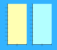
axis color properties
set(a1, 'Color', [1 1 .7]); % Sets the color inside the subplot.
set(a2, 'Color', [.7 1 1]);
axis font properties
set(a1, 'FontSize', 12);
set(a1, 'FontWeight',
'bold')
set(a2, 'FontName',
'Arial');
set(a2, 'FontSize', 16);
axis labelling
Note that you need to use a slight variant of terminology for title and axis labelling.
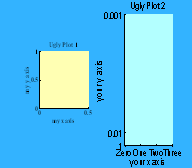
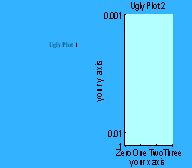
XLabel(a1, 'my x axis');
YLabel(a1,'my y axis');
title(a2, 'Ugly Plot 2');
XLabel(a2,'your x axis');
YLabel(a2,'your y axis');
Warning: Could not find an exact (case-sensitive)
match for 'XLabel'.
C:\Program Files\MATLAB\R2007b\toolbox\matlab\graph2d\xlabel.m
is a
case-insensitive
match and will be used instead.
You can improve the performance of your code by using
exact
name
matches and we therefore recommend that you update your
usage
accordingly. Alternatively, you can disable this warning using
warning('off','MATLAB:dispatcher:InexactMatch').
Warning: Could not find an exact (case-sensitive)
match for 'YLabel'.
C:\Program
Files\MATLAB\R2007b\toolbox\matlab\graph2d\ylabel.m is a
case-insensitive
match and will be used instead.
You can improve the performance of your code by using
exact
name
matches and we therefore recommend that you update your
usage
accordingly. Alternatively, you can disable this warning using
warning('off','MATLAB:dispatcher:InexactMatch').
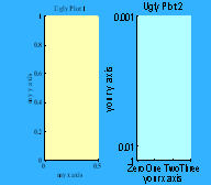
axis limits, tick
placement and tick labelling
Note how you can use either text or a vector to replace default tick labels with whatever you want. Here we are using a cell array to label our axes.
set(a2, 'XLim', [0 3]);
set(a2, 'YLim', [1 1000]);
set(a2, 'XTick', 0:1:3);
set(a2, 'YTick', [1 100
1000]);
set(gca,'XTickLabel',{'Zero';'One';'Two';'Three'})
set(gca, 'YTickLabel', [1 1/100
1/1000]);
Other useful commands
axis(a1, 'equal'); % Sets the axis so tick marks are
equally spaced on x and y axes
axis(a1, 'square') % makes the current axis square
axis(a1,'off')% turns off all axis labeling, tick marks
etc.
Plotting
Now we are going to plot data on the axes. Once again, plots have properties that you can alter. The kinds of properties you can change depend on the kind of plot you are making.
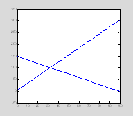
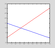
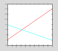
Let's start with a line plot. The command hold tells Matlab to include both plots in the figure rather than simply overwriting the first plot with the second.
close all
figure(1)
x=0:10:100;
y1=3*x+4;
y2=150-(y1/2);
p1=plot(x, y1);
hold on
p2=plot(x, y2);
Color
First we'll define the color of these plots. One way to do this is to specify the level of the red, green or blue guns, using values between 0-1.
Alternatively you can use shorthand for some specific colors. Options include: 'b', 'g', 'r', 'c', 'm', 'y', 'k' (blue, green, red, cyan, magenta, yellow black).
Line style and markers
set(p1, 'LineStyle', ':');
set(p2, 'LineWidth', 2)
set(p2, 'LineStyle', '-.');
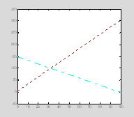
Options include: '-', '-– ', ':', '-.', 'none' (solid line, dashed line, dotted line, dash-dot line, no line)
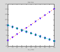
set(p1,'MarkerEdgeColor' , [0 0 1])
set(p1, 'MarkerFaceColor',
[1 0 1])
set(p1, 'Marker', 'v');
set(p2, 'MarkerSize', 15);
set(p2,'MarkerEdgeColor' , [0 0 1])
set(p2, 'MarkerFaceColor',
[0 1 0])
set(p2, 'Marker', 'h');

Options for Marker include '+', 'o ', '* ', '.', 'x', 's', 'd', '|', 'v ', '^', '> ', '<' ,'p', 'h', 'none'. The 'v', '<', '>', '^' symbols represent triangles of various orientations
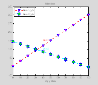
Legends and Text
Legends and text are manipulated using handles in a very similar way to plots. Because we only have a single plot in our figure window we don't need to specify which axis we are labelling.
xlabel('my x data');
xlabel('my y data');
text
text takes as input the x and y position of the string you want to position, and the text string itself. These text objects can also be assigned handles and you can change their properties. To manipulate properties you once again use get and set.
t1=text(x(5), y1(6), 'fake 1');
t2=text(x(5),
y2(4), 'fake 2');
set(t1,'Color', 'r');
set(t2,'Color', 'c');

Annotation = [ (1 by 1) hg.Annotation array]
BackgroundColor = none
Color = [1 0 0]
DisplayName =
EdgeColor = none
EraseMode = normal
Editing = off
Extent =
[39.5402 142.42 8.50575 20.9913]
FontAngle = normal
FontName = Helvetica
FontSize = [10]
FontUnits = points
FontWeight = normal
HorizontalAlignment = left
LineStyle = -
LineWidth = [0.5]
Margin = [2]
Position = [40
154 0]
Rotation = [0]
String = fake 1
Units = data
Interpreter = tex
VerticalAlignment = middle
BeingDeleted = off
ButtonDownFcn =
Children = []
Clipping = off
CreateFcn =
DeleteFcn =
BusyAction = queue
HandleVisibility = on
HitTest = on
Interruptible =
on
Parent =
[158.003]
Selected = off
SelectionHighlight = on
Tag =
Type = text
UIContextMenu = []
UserData = []
Visible = on
legend
legend takes in a list of the plot handles for which you want to create legend entries, and a list of the strings that will be the legend labels (again, don't worry about the squiggly brackets, we'll get to them soon)
ActivePositionProperty:
'position'
ALim: [0 1]
ALimMode: 'auto'
AmbientLightColor: [1 1 1]
Box: 'on'
CameraPosition:
[0.5000 0.5000 17.3205]
CameraPositionMode: 'auto'
CameraTarget: [0.5000 0.5000 0]
CameraTargetMode: 'auto'
CameraUpVector: [0 1 0]
CameraUpVectorMode: 'auto'
CameraViewAngle: 6.6086
CameraViewAngleMode: 'auto'
CLim: [0 1]
CLimMode: 'manual'
Color: [1 1 1]
CurrentPoint: [2x3 double]
ColorOrder: [7x3 double]
DataAspectRatio: [1 1 2]
DataAspectRatioMode: 'auto'
DrawMode: 'fast'
FontAngle: 'normal'
FontName: 'Arial'
FontSize: 10
FontUnits: 'points'
FontWeight: 'normal'
GridLineStyle: ':'
Layer: 'bottom'
LineStyleOrder: '-'
LineWidth: 0.5000
MinorGridLineStyle: ':'
NextPlot: 'add'
OuterPosition: [0.1351 0.8032 0.2232 0.1048]
PlotBoxAspectRatio: [1 1 1]
PlotBoxAspectRatioMode: 'auto'
Projection: 'orthographic'
Position: [0.1423 0.8079 0.2125 0.1000]
TickLength: [0.0100 0.0250]
TickDir: 'in'
TickDirMode: 'auto'
TightInset: [0.0071 0.0048 0.0036 0]
Title: 215.0032
Units: 'normalized'
View: [0 90]
XColor: [0 0 0]
XDir:
'normal'
XGrid: 'off'
XLabel: 216.0032
XAxisLocation: 'bottom'
XLim: [0 1]
XLimMode: 'manual'
XMinorGrid: 'off'
XMinorTick: 'off'
XScale: 'linear'
XTick: -1
XTickLabel: ''
XTickLabelMode: 'manual'
XTickMode: 'manual'
YColor: [0 0 0]
YDir: 'normal'
YGrid:
'off'
YLabel: 217.0032
YAxisLocation: 'left'
YLim: [0 1]
YLimMode: 'manual'
YMinorGrid: 'off'
YMinorTick: 'off'
YScale:
'linear'
YTick: -1
YTickLabel: ''
YTickLabelMode: 'manual'
YTickMode: 'manual'
ZColor: [0 0 0]
ZDir: 'normal'
ZGrid: 'off'
ZLabel: 218.0032
ZLim: [-1 1]
ZLimMode: 'auto'
ZMinorGrid: 'off'
ZMinorTick: 'off'
ZScale: 'linear'
ZTick: [-1 0 1]
ZTickLabel: ''
ZTickLabelMode: 'auto'
ZTickMode: 'auto'
BeingDeleted: 'off'
ButtonDownFcn: {2x1 cell}
Clipping: 'on'
CreateFcn: []
DeleteFcn: []
BusyAction: 'queue'
HandleVisibility: 'on'
HitTest: 'on'
Interruptible: 'off'
Selected: 'off'
SelectionHighlight: 'on'
Tag: 'legend'
Type: 'axes'
UIContextMenu: 176.0032
UserData: [1x1 struct]
Children: [6x1 double]
Parent: 1
Visible: 'on'
Location: 'NorthWest'
Orientation: 'vertical'
EdgeColor: [0 0 0]
TextColor: [0 0 0]
Interpreter: 'tex'
String: {'fake 1 (y1)' 'fake 2 (y2)'}
lh=legend([p1 p2], {'fake 1 (y1)'; 'fake 2 (y2)'},
'Location', 'NorthWest');
set(lh, 'FontName', 'Arial', 'FontSize', 10);
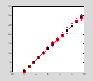
Errorbar plots
x=0:8:100;
y=3*x+4;
err=sqrt(y);
ph=errorbar(x, y, err);
set(ph, 'Marker', 's', 'MarkerSize',
13, ...
'MarkerFaceColor', 'k', 'MarkerEdgeColor', 'r', 'Color', 'm', 'LineWidth', 2)
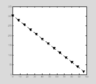
One inconvenient thing about the errorbar plots automatically generated by Matlab is that the errorbar always have same properties (e.g. color and line thickness) as the main line. Sometimes you want the error bars to have different properties. The way to do this is to draw the main line and the error bar as overlapping plots, i.e. use the error bars as an overlay. Here we start by creating a plot with black dotted lines and triangular symbols. Notice how we use a single set command to define multiple properties.
x=0:8:100;
y=300-3*x+4;
err=sqrt(2*x);
p=plot(x, y);
set(p, 'Color', 'k', 'LineStyle', ':', 'LineWidth', 2, 'Marker', 'v', 'MarkerSize', 10,'MarkerEdgeColor' , 'k', 'MarkerFaceColor','k');
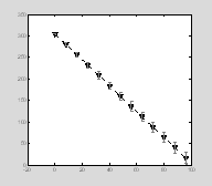
Then we add gray error bars. We define this plot as having no line and no marker so only the actual error bars are visible.
e=errorbar(x,
y, err);
set(e, 'Color', [.5 .5 .5], 'LineStyle', 'none', 'LineWidth', 1, 'Marker', 'none');
Log plots
clear all
close all
figure(1)
x=0.1:.1:4.5;
y=exp(x);
subplot(1, 3, 1);
plot(x, y, '.-', 'MarkerSize',
10, 'Color', 'k');
set(gca, 'YLim', [0 100]);
title('linear plot');
subplot(1, 3, 2)
semilogy(x, y, '.-', 'MarkerSize',
10, 'Color', 'k');
title('log y plot');
set(gca,'YLim',[0 100]);
subplot(1, 3, 3)
loglog(x, y, '.-', 'MarkerSize',
5, 'Color', 'k');
title('log log plot');
%set(gca, 'YLim', [0 100]);
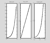
As is shown in the second and third subplots, it is possible to plot logarithmic data along either the x axis (semilogx), the y axis (semilogy), or both axes (loglog).
You may find it a little annoying that the y-axis labels are expressed in base 10. There’s no way of changing that using the matlab semilogx and semilogy commands, but there is a workaround which is explained in Section 3 (see logx2raw, logy2raw).
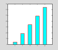
Bar plots
Here's how to create a simple bar plot, and change some basic properties using handles.
x=0:5:20;
y=[3*x+4];
ph=bar(x, y);
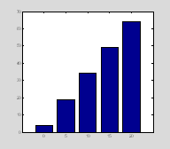
Bar properties
set(ph, 'EdgeColor', 'r')
set(ph, 'LineWidth', 1.5);
set(ph, 'FaceColor',[0 1 1 ]);
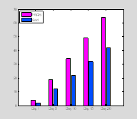
More complex bar plots
With bar plots using more than one set of y-values you will get a handle for each set of data (similarly to plotting line data using plot). Here we have two sets of y data for every x-value
x=0:5:20;
y=[3*x+4;2*x+2]';
bh=bar(x,
y);
set(bh(1), 'FaceColor',[1 0 1
])
set(bh(2), 'FaceColor',[0 .3 1
])
set(gca, 'XTickLabel',...
{'Day 1', 'Day 5', 'Day 10', 'Day 15','Day
20'})
legend([bh(1) bh(2)], 'Happy', 'Sad', 'Location', 'NorthWest')
Bar plots with error bars
Matlab doesn’t have a function to do this, so you need to use a work around. You add errorbars to bar plots in a vaery similar way as plotting them as an overlay to line plots. You may have to fiddle with the parameter width to make it look right.
width=get(bh(1), 'BarWidth')-.1;
eh1=errorbar(x-width,
y(:, 1), y(:, 1)/4, ...
'Marker', 'none','Color',
'k', 'LineStyle', 'none');
eh2=errorbar(x+width, y(:, 2), y(:, 2)/5, ...
'Marker', 'none','Color', 'k', 'LineStyle', 'none');

Note that this is the sort of thing that makes a very good function.
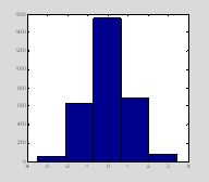
Histograms
clear all; close all
data=randn(3000, 1);
hist(data,
9);
set(gca, 'XLim', [-4.5 4.5])
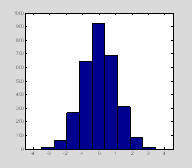
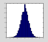
Here you have asked for your data to be divided into 9 bins. If you want to know what the center of the bins are you can ask hist to return the number of data points in each bin (n1) and the centers of the bins (x1) instead of plotting the data. If you want to then plot the histogram then you will need to call hist twice.
[n1, x1]=hist(data, 5);
figure(1); clf; hist(data, 5);
x1
53 627 1556 692 72
x1
=
-2.8111 -1.4280 -0.0450 1.3381 2.7212
You can also give hist a vector of the bin centers. Here we only collect the return argument that tells us the number of data points that fell within each bin. We already know where the bin centers are, because we defined them. We can then plot the histogram using bar.
subplot(1, 3,2);
n1=hist(data, bins);
figure(1); clf;
hist(data, bins)
clf clears all plots in the current figure window without closing the actual window. Sometimes you have your command window and your figure windows nicely arranged on the screen so you can see them all at once. clf leaves the figure window up, so you don't have to keep repositioning it every time you replot data.
histc takes in a vector that contains the upper and lower limits of each bin. It returns the number of data points that fell within each bin. Note that the bins are no longer equally spaced.
n2=histc(data, bins);
figure(1); clf;
histc(data,
bins);
Other useful 2d plot commands
Use doc (e.g. doc polar) to learn about these commands. plotyy
polar
stairs
stem
An example of plotting
Let's imagine you've collected data measuring students' reaction times to moving stimuli and their reading speed. You've done this for both males and females, and you've recorded whether the subjects play video games vs. non-gamers. You have the following subject break down:
10 males, 10 females
6 of the 10 males are gamers
4 of the 10 females are gamers.
In this program, GamersAnon.m, we'll begin by faking our data, and then we'll plot it as both a bar graph and a scatter plot.
% GamersAnon.m
%
% A fake experiment examining the effects of
gaming on reading speed
% and motion RTs
clear all
% fake data
data=zeros(4, 20);
data(1, 1:10)=1; % 0 = male, 1 = female
data(2, [[1:6], [11:14]])=1; % 0 = non-gamer, 1=gamer
data(3, :)=180; % default RT speed is 180ms
data(3, [[1:6], [11:14]])=data(3, [[1:6], [11:14]])-30;
% gamers are 30ms faster
data(3, :)=round(data(3, :)+8*randn(size(data(3,
:)))); % add random noise
data(4, :)=50; % default wpm
data(4, [[1:6], [11:14]])=40; % gamers are slower
data(4, :)=round(data(4, :)+ 4*randn(size(data(4,
:)))); % add random noise
So your data looks like this:
Columns 1
through 12
1 1 1 1 1 1 1 1 1 1 0
0
1 1 1 1 1 1 0
0 0 0 1 1
157 149
146 150 139
148 165 192
176 186 166
143
43 39
45 40 38
39 56 50
49 52 40
41
Columns 13
through 20
0 0 0 0 0 0 0 0
1 1 0
0 0 0 0 0
147 145
178 188 165
189 186 181
39 42 55 48 53 48 49 50
Now let's plot the data in a bar graph
gamer={ 'non-gamer', 'gamer'};
task = { 'motion', 'reading'};
%% bar graph
figure(1); clf;
for k=1:2 % task
for i=1:2 % male / female
for
j=1:2 % gamer / non-gamer
ind= find(data(1, :)==i-1 & data(2,
:)==j-1);
tmp=data(2+k,ind);
MeanData(k, i, j)= mean(tmp);
StdData(k, i, j)= std(tmp);
SemData(k, i, j)=std(tmp)/sqrt(length(tmp));
end
end
subplot(2,
1,k)
b1=bar(squeeze(MeanData(k, :, :))); hold on
title(task{k});
set(gca, 'XTickLabel', gender);
if
k==1
YLabel('RT (ms)');
else
YLabel('Reading speed
(wpm)');
h=legend(gamer);
set(h,
'Location', 'SouthEast');
end
end
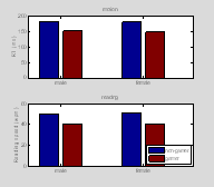
We use these nested for loops and find to extract the data for each condition. When setting up these loops you need to think carefully about how you want your figures to be organized. We have a couple of other examples of how to do this later in this chapter.
squeeze is a funny command. Let's say you have a 3D matrix, but you only want two dimensions from it (a slice from the cube). If you take the slice along anything but the last dimension then Matlab still considers this 2D slice as being 3D – it's a 3D matrix of size 1 x n x m. squeeze "squeezes" this 3D slice into an m x n 2D matrix.
Notice in the example below that b and c are identical in their contents, but Matlab thinks that b has a size of 1 x 2 x 3 whereas c is simply a 2 x 3 matrix.
a=randn(2, 2, 3);
b=a(1,
:, : )
size(b)
-0.2709 -1.4115
b(:,:,2)
=
0.5554 -1.2399
b(:,:,3)
=
0.7854 1.1957
ans
=
1 2 3
c=squeeze(b)
size(c)
-0.2709 0.5554
0.7854
-1.4115 -1.2399
1.1957
ans
=
2 3
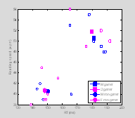
Now let's look at our data in a scatter plot.
symlist=['s', 'o'];
figure(2); clf;
for
j=1:2 % gamer / non-gamer
ind=find(data(1, :)==i-1
& data(2, :)==j-1);
tmp1=data(3,ind);
tmp2=data(4,ind);
plot(tmp1,
tmp2, '.', 'MarkerSize', 6, 'Color', colorlist(i ,:), 'Marker', symlist(j), 'MarkerFaceColor', [1
1 1]);
hold
on
% overlay larger solid color symbols for the mean response
% for male gamers, female gamers, etc. etc.
h(i,
j)=plot(MeanData(1, i, j), MeanData(2, i, j), 'MarkerSize', 12, 'Color', colorlist(i ,:),'Marker', symlist(j), 'MarkerFaceColor', colorlist(i ,:));
end
end
XLabel('RT (ms)');
YLabel('Reading speed (wpm)');
legend(h(:), 'M gamer', 'D gamer','M
non-gamer', 'F non-gamer','Location', 'SouthEast');
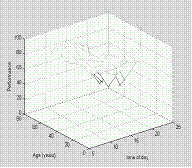
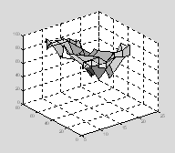
Plotting in 3d using mesh
Suppose you were looking at how age affects your ability to perform a task as a function of the time of day. So in this example, Sleepyhead.m, you have two independent variables, the time of day and the age of the subject, and one dependent variable, which is performance. Your data might look like this:
%
% An example of using mesh
to view 3D data with 2 independent and one dependent variable
clear all
age=[17 17.5 18 18.5 19 19
40 45 47 50 60 65 67 68 69 70];
tod=[9 11
1 3 5
7 9];
tod(3:end)=tod(3:end)+12; % move to the 24 hour clock!
perf=[90 90
80 80 85
80 80
;
90
80 80 80 90
90 95 ;
90
90 90 80 90
85 90 ;
80
90 75 70
80 90 85 ;
80 80 80 70
80 100 90 ;
85
80 90 75
90 85 85 ;
90
85 80 70
80 67 40 ;
100
80 80 70
80 58 30 ;
80
75 70 65
75 60 36 ;
80
80
70 80 70
60 40 ;
90
90 90 80 50
40 20 ;
90
90 90 70 80
40 30 ;
85
90 87 70
80 35 22 ;
80
85 80 75
65 45 22 ;
95
83 85 85 75
38 25 ;
90 80 90 80 80 36 18];
We are going to plot our data using mesh(x,y,Z). The rule for mesh is that first two vectors must have length(x) = n and length(y) = m where [m,n] = size(Z).
sh=mesh(tod, age, perf);
xlabel('time of day');
ylabel('Age (years)');
zlabel('Performance');
You can now play with various aspects of the figure
shading interp
colormap(gray)
One useful command is view. You can rotate your view of this three-D graph manually using the mouse if you hit the little rotation icon on the top of the menu bar. If you rotate the graph to a good view, you might then want to save the values that represent that view so you don’t have to manipulate it by hand the next time you plot the data. view allows you to save that viewpoint.
You can then set the view to the desired view which you previously saved by using a viewmatrix as an input argument.
Try saving a viewpoint, then rotate the graph manually, and use view to restore the graph to the saved viewpoint.
Alternatively you can provide view with the azimuth and elevation you desire (the azimuth and elevation are basically simpler forms of the 4x4 matrix contained in v)
There are also three default views.
view(2);
view(3);
0.5000 0.8660 0
-0.6830
-0.6634 0.3830
0.6428 -0.1812
-0.5567 0.3214
-0.7660 9.1609
0 0 0 1.0000
Also try:
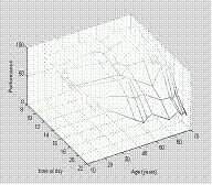
Surf and mesh can deal with missing data values as long as they are set to be NaN (not a number). Surf and mesh will simply interpolate between the missing values.
perf(5,3)=NaN;
perf(7,2)=NaN;
sh=surf(tod, age, perf);

Plot3
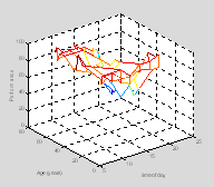
This is often useful when you have one independent and two dependent variables. One example would be if you were tracking the x and y position of a rat over time, as in this example Ratty.m.
% Ratty.m
%
% tracks the x and y
position of a rat moving in space over time.
clear all
figure(1); clf;
t = linspace(0,6*pi,101);
% fake
the data
x = sin(t)+.1*randn(size(t));
y = cos(t)+.1*randn(size(t));
% plot x & y position
over time
plot3(x, y, t, '.-');
xlabel('x position');
ylabel('y position');
zlabel('time')
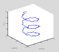
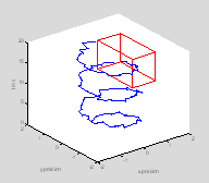
This rat is a little confused. Let’s suppose you were interested in seeing whether the rat reached a certain location (food or a swim platform) within a certain space-time window. First let’s plot the position of this target on the graph.
twin=[10 17]; % target time is 10-17 seconds
xwin=[0.7
1.7]; % target platform lies between these x co-ordinates
ywin=[-.5
1.5]; % target platform lies between these y co-ordinates
edgeoftarget=[1 2 1 1 1 1; ...
1 2
1 1 2 2; ...
1 2
2 2 1 1 ; ...
1 2
2 2 2 2;
...
1 1 1 2 1 1; ...
1 1 1 2 2 2; ...
2 2 1 2
1 1
; ...
2 2 1 2 2 2; ...
1 1 1 1 1 2; ...
1 1 2 2 1 2; ...
2 2 1 1 1 2; ...
2 2 2 2 1 2];
for i=1:size(edgeoftarget, 1)
lh=line([xwin(edgeoftarget(i, 1)) xwin(edgeoftarget(i, 2))], ...
[ywin(edgeoftarget(i, 3)) ywin(edgeoftarget(i, 4))], ...
[twin(edgeoftarget(i, 5)) twin(edgeoftarget(i, 6))]);
set(lh, 'Color', 'r');
end
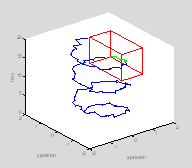
ind=find(t>=twin(1)
& t<twin(2) & x>=xwin(1) & x<xwin(2) & ...
y>=ywin(1) & y<ywin(2));
hold on
Now re-plot those points in the rat's history when she is inside the target box in green
plot3(x(ind), y(ind), t(ind), 'g.-');
Saving figures
It's possible to save figures in a variety of formats. Here we'll save the rat pathway as a tif figure.
saveas(gcf, 'RattyPathway', 'tif');
disp(['figure saved in directory ', pwd])
figure saved in directory C:\Program Files\MATLAB\R2007b