

| This web site aims to provide you with evidence where it exists, and with principals of physiology which will help you extend the evidence for those sick patients who cannot wait. |
|
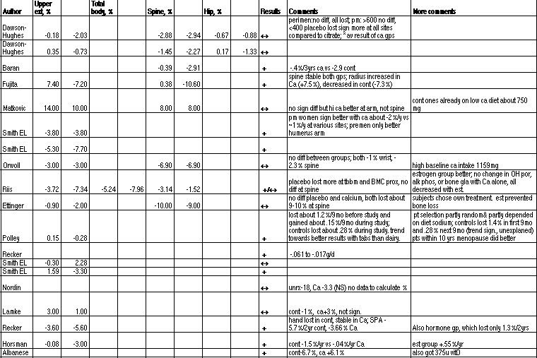
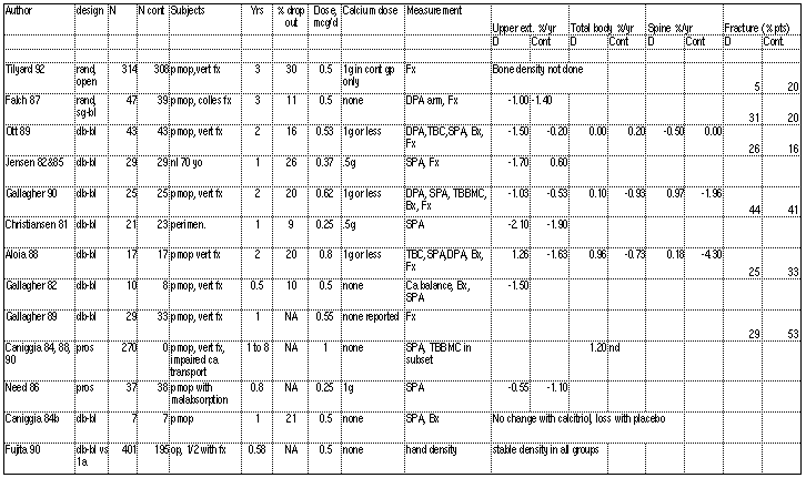
Here are a collection of evidence tables. Some are rough drafts that will, hopefully, be continually updated. They are Excel text files, and also in GIF format.
|
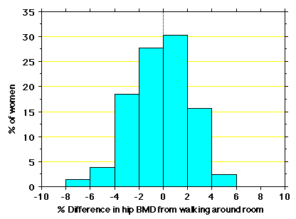
| Reproducibility of total hip bone density in 200 women, showing difference "caused" by walking around a room |
|
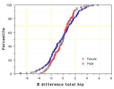
| Reproducibility in 200 women and 100 men, showing cummulative frequency of difference in total hip BMD seen after repositioning. |
|
| ALENDRONATE: Summary of results of the Fracture Intervention Trial. The difference in reduction of clinical fractures was not significant in women who did not have a vertebral fracture at the baseline visit. Notice how the incidence of new vertebral fractures depends on presence of baseline fracture. |
|
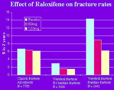
| RALOXIFENE: Preliminary results of MORE study, after 2 years, from data presented at the ASBMR in 12/98. |
|
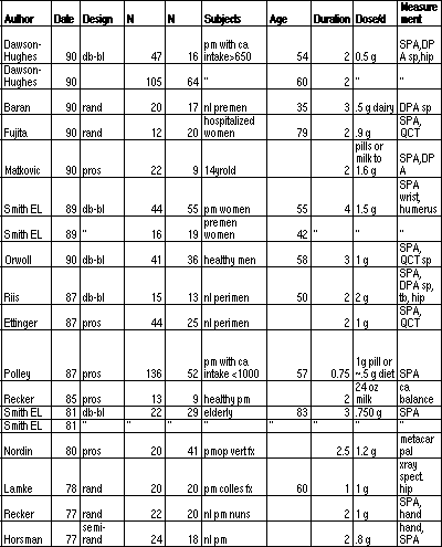
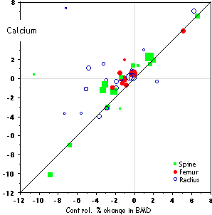
| CALCIUM: controlled trials that reported bone density in each group. The results of the controls are plotted vs the results of the treated subjects, so that the points that fall ABOVE the diagonal line represent studies in which the treatment group was BETTER than the control group. The size of the point is proportional to the nubmer of subjects in the study. |
|
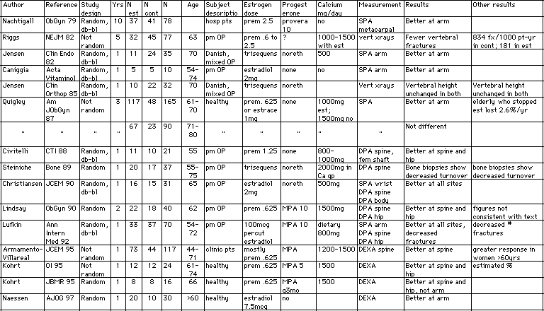
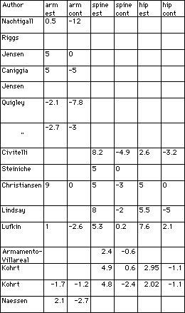
| ESTROGEN: controlled trials that reported bone density in each group. The results of the controls are plotted vs the results of the treated subjects, so that the points that fall ABOVE the diagonal line represent studies in which the treatment group was BETTER than the control group. The size of the point is proportional to the nubmer of subjects in the study. |
|
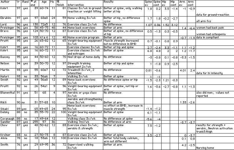
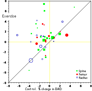
| EXERCISE: controlled trials that reported bone density in each group. The results of the controls are plotted vs the results of the treated subjects, so that the points that fall ABOVE the diagonal line represent studies in which the treatment group was BETTER than the control group. The size of the point is proportional to the nubmer of subjects in the study. |
|
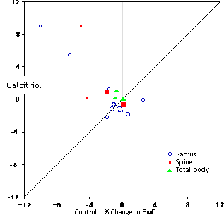
| CALCITRIOL: controlled trials that reported bone density in each group. The results of the controls are plotted vs the results of the treated subjects, so that the points that fall ABOVE the diagonal line represent studies in which the treatment group was BETTER than the control group. The size of the point is proportional to the nubmer of subjects in the study. |