Introduction
In addition to powerful calculation capabilities, spreadsheet programs provide excellent graphing and presentation features. Often a graphical presentation of data is more memorable and understandable than a table of numbers, and modern spreadsheets help you create good graphs quickly.
In Excel, there is a Chart Wizard that takes you through the steps of creating a new graph (Excels calls them charts). Using the wizard, you select the chart type, set the initial formats and data sources, and create the chart. Once the chart is made, you can adjust any of the chart features you like, until you get exactly the presentation that you want.
Creating a Chart
Before you create a chart, you need some data. There are Excel files on our web site that I'll use for this set of notes.

I'll start with poly.xls. This file
contains a few columns of numbers showing x,
x2, and x3. Download
and open the file if you would like to work through these notes with
me.
A very basic chart can be created with just a few clicks.
- Select the data to be shown in the chart. In this case, let's look at the x values by themselves, just to see what the range is that the functions are evaluated over. Click on A1 and drag down to A22. This selects a column of data.
- Select menu item Insert->Chart ... (or click on the Chart Wizard button
 ) to open the Chart Wizard.
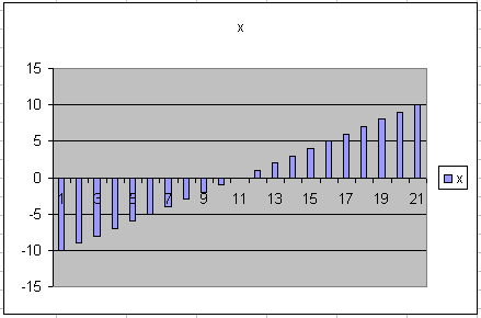
 - Select Standard Types -> Chart Type: Column -> Chart sub-type: Clustered Columns, then click Finish. You should get a simple chart showing the data values that are in the x column.
That's it, everything from now on is icing on the cake!
Modifying the Chart
Chart Type
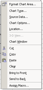
Excel provides several different types of charts. Select the chart, then right click in the white space somewhere and select Chart Type. Notice that there are lots of possibilities. Specifically, notice the first three options Column, Bar, and Line. These are the most frequently used.

Notice that the line types provide optional data markers. Change the chart type to Line with Markers. Notice that there are markers connected by lines. If you hold the mouse cursor over a marker on the chart, it displays information about the data point. (It does this for other chart types too, it's just a little more obvious what is being referred to here.)
Source Data
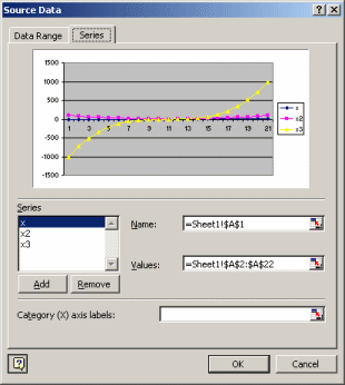
The data values that Excel is drawing these graphs of are called the source data. Each set of data is called a data series. So far, our chart just has one data series. To see information about this, Click on the white area of the chart, right-click, and select Source Data. This will display the Source Data dialog box. Select the Series tab. Notice that there is one series defined. Excel has filled in the entries for you. Click okay to close the dialog box.
Click in the gray display area of the chart. Notice that there is a box drawn in the tabular data area of the chart. This identifies the source data. You can grab the handles and adjust the data series by expanding the box. Grab the lower right handle and expand the box to the right. Notice that the additional data is plotted. Go back to the Source Data dialog box and confirm that the added series are shown there.
Chart Options
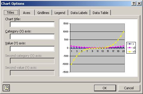
Select the chart again and right-click in the white area. Select Chart Options. There are numerous formatting details that you can specify here, including a title, various axis labels, gridlines, data labels for the points, and so on. Play with these some to get an idea of how to modify the look of the chart.
Location
From the same right-click menu (or context menu) as above, you can select Location. This lets you put the chart on an existing tabular page as I have done in this example, or you can put the charts on separate pages if you want them to be displayed by themselves without the backing data.
Explore further
Other example spreadsheets can give you a feeling for some of the more complex things you can do. The growth-demo.xls spreadsheet is one that I used a few weeks ago to demonstrate exponential growth. An interesting issue to explore using it is the idea of logarithmic axis labeling. By changing the type of axis, you can change the way exponentially growing data is presented. Double-click on the vertical axis and then use the Format Axis Scale tab to enable and disable the logarithmic scaling.

Another example is WA-exports-graphs.xls which provides plots of the data from the previous lecture. Notice that the plots are on different worksheets in the workbook. The charts are the horizontal bar chart format, and I have formatted the vertical axis so that the names all fit (Format Axis -> Font -> Font Size: 8) and they run from top to bottom (Format Axis -> Scale - > Categories in reverse order). I used the drawing toolbar (menu item View -> Toolbars -> Drawing - > Text Box) to add an explanatory text box to the chart also.

References
- Sample spreadsheets: poly.xls, growth-demo.xls, WA-exports-graphs.xls