
Introduction to Geographic Information
Systems in Forest Resources |
ArcMap Basics
Objectives:
- Add different datasets as layers to data frames
- Alter legends for layers for changing the way layers are displayed
- Perform drive
substitution to create drives L (CD) and M (removable drive).
- Adding Data to ArcMap
- Symbology: Classification and Map Display
Perform drive substitution
Perform drive
substitution to create the virtual drives L and M.
Adding Data to ArcMaps
- Create a personal folder, Start and Save an ArcMap Map Document (.mxd)
- Course CD Contents
- Add feature layers (coverage) to the data frame
- Open a layer attribute table
- Add an event layer to a data frame
- Add an image layer to the data frame
- Add a CAD layer to a data frame
- Save the map document
Create a personal folder
Create a new folder in the root directory of the M: drive, and named as arcmap_basics. When you
create new directories, give them names that mean something to you, that you
will recognize later. Avoid names like myfile, GIS, or project.
If you do not use descriptive names, you will waste far more time later attempting
to figure out what is on your file system.
Start ArcMap
- The location of the ArcMap shortcut may vary from system to system. It should
be in a path similar to this:
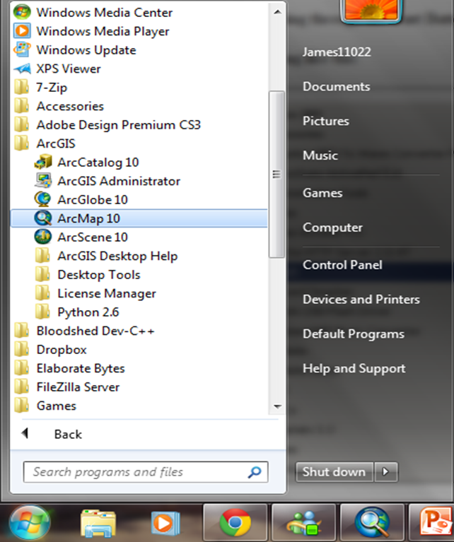
- During the first lab session, you will be shown where the shortcuts to the
ArcGIS executables are on the computers in the lab.
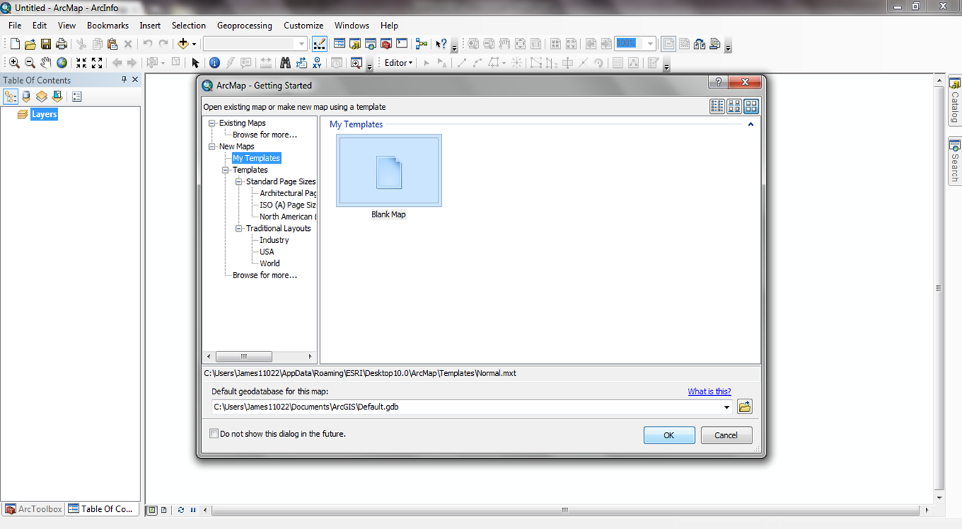
- When ArcMap opens, it will start with a single window (the Project Window) containing a few icons, a few menu choices,
and a few buttons. A dialog will also appear with several choices. Close the
dialog.
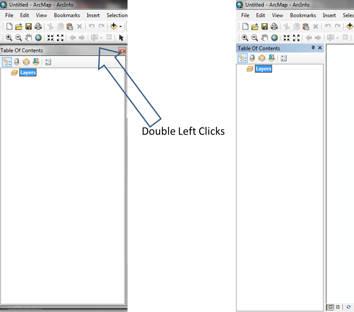
- Some of you may see a "floating content window" (left figure). Move that window to the right and double click at the top to dock the window (right figure).
Save the Map Document
Before doing anything else, save the ArcMap document. Click the Save
button  and
save the document in the directory you created. Name the file arcmap_basics_a. Note you do not need to specify the file extension
.mxd; ArcGIS will automatically add the file extension.
and
save the document in the directory you created. Name the file arcmap_basics_a. Note you do not need to specify the file extension
.mxd; ArcGIS will automatically add the file extension.
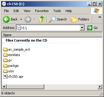
Course CD Contents
-
CD Structure
There are a number of directories and files on the CD.
Data files are in the directories packgis (Pack Forest data) and esridata (general datasets from ESRI).
The contents of the CD should look like this:
- Pack Forest Data properties
- There are TWO main file types: Coverage and Feature Classes (in the Geodatabase) in the packgis folder.
- All Feature Classes layers are stored into "packgis.mdb"
- All Coverage layers are mostly stored into "forest" folder. The Coverage file is an old data format to store information, like a zip file, it inculdes a set of classes to represent a single GIS layer. You could select one main feature class within the coverage or pick "whole package" at the same time.
Add Coverage layers to the data frame
- Click the Add Data
 button
to add a new layer to the data frame.
button
to add a new layer to the data frame.
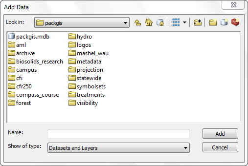
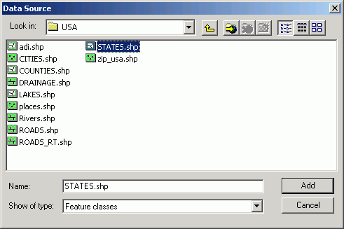
- Navigate to the directory by using "Connect to folder". Choose L:\packgis\forest on the L: drive drive (note
that the drive letter for the L: drive drive may be different from what you
see in these examples, also, always use your substituted drive letters).
The list of files in this folder are only those that can be added to an ArcMap
document. Other files in the folder may be visible in the Windows Explorer,
but if they are not sources for ArcGIS data, they will not appear in the Add
Data dialog.
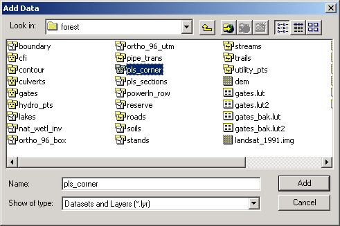
- Double-click the pls_corner data source . Because this is a coverage
data source, there is more than one feature type in the data source. This
is indicated by the icon, which shows several layers (note some of the data
sources, such as dem, do not indicate multiple layers). Double-clicking
opens the data source rather than simply adding the data source. The pls_corner
data source will open to show the individual feature classes:
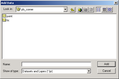
Click the point data source and click Add (or simply double-click
on the file name).
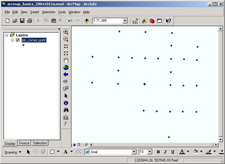
- The layer will be added to the data frame and assigned a random color (i.e.,
the color of your point markers may be different than those shown here). The
layer display is automatically turned on (the checkbox is checked). Note that
the layer name in the table of contents shows both the data source name and
the feature class (pls_corner point).
- This dataset represents Public Land Survey System section corner points.
- Next, add the boundary layer to the data frame (use the Add Layer
button ). Rather
than double-clicking to enter the data source, simply click the Add
button in the dialog. This will add the feature class with the highest priority
(in this case, the polygon data source). Note that the layer name in
the table of contents shows both the data source name and the feature class
(boundary polygon).
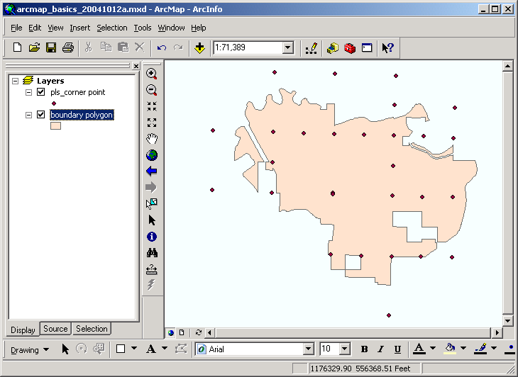
- Now add the layers roads and streams to the data frame. To
select multiple layers in the Add Layer dialog, click on one data source
name, and with the the <CTRL> key depressed, click each successive
data source. The <CTRL> key is used any time you want to make
multiple selections of objects in ArcMap.
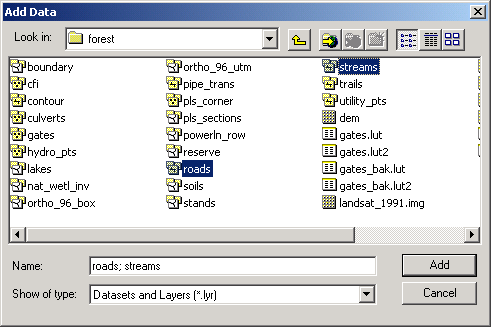
Note that each of these data sources is composed of multiple layers (as indicated
by the icon). ArcMap automatically adds the feature class with the highest
priority (in this case, the line data sources).
- If any layers are not displayed, turn them on, and arrange them in the Table
of Contents (by dragging up or down in the list) so that you can see all features.
You have just added a few different spatial data sources to a data frame. You
have altered drawing order so that polygons do not obscure points and lines.
Once data sources are added to data frames, they are known as layers.
Open a layer attribute table
Each feature data layer that is added to the data frame will also be accompanied
by a attribute table.
- To open the roads arc layer's attribute table, right the layer name
in the table of contents and select Open Attribute Table.
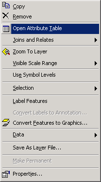
The layer attribute table, roads arc, will open.
- You
can tell at a glance which tables in the project are attribute tables (as
opposed to stand-alone tables).
- Each road segment in the layer is related to a record in this table. You can
scroll left and right or up and down to view more fields or records. We will
cover tables in depth later in the course.
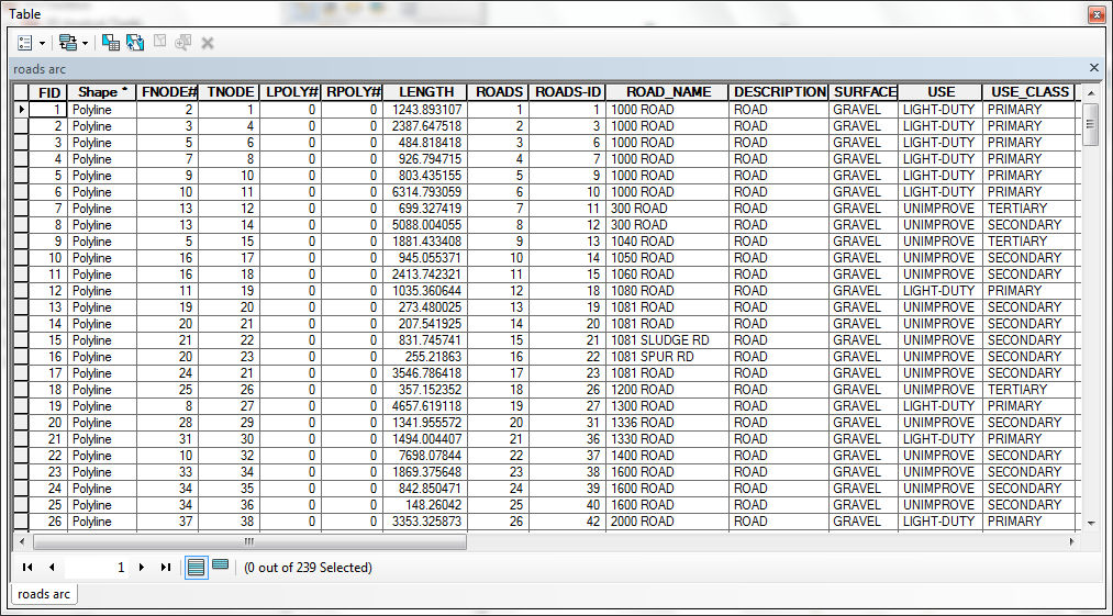
You have just opened the layer attribute table for a coverage class (a feature layer). All feature
layers (point, line, and polygon) have attribute tables. Each feature in a layer
has an associated record in the attribute table, and conversely, each record
in a attribute table has an associated spatial feature.
Add an event layer to a data frame
If you have a text or excel file that contains a set of XY coordinate points, you can import them into
ArcMap. There are few options for the files:
- Tab- or comma-delimited form,
with the .txt file extension.
- Excel 97-2003 file format, with the .xls file extension.
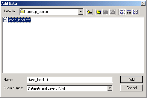
- Download the stand_label.txt file and
place it on the M: drive. You will need to right-click on the hyperlink and
select a "Save Link/Target As" option, otherwise the file will simply
load up in your web browser.
- To load the text file in your map document you may need to connect to the
folder representing the M: drive. When you attempt to add the text file, if
you do not see the drive letter for the M: drive, click the Connect to
Folder button
 and navigate to the the location where you saved the text file and Add the
file.
and navigate to the the location where you saved the text file and Add the
file.
- You will see that the table is added to the data frame, but because it is
not an explicitly spatial data source, it will not be displayed.:
- Open the table (right-click > Open). Note these are just X and
Y coordinates representing point locations.
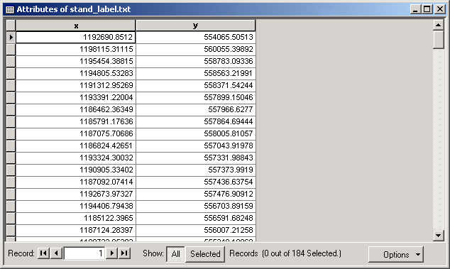
- Close the table.
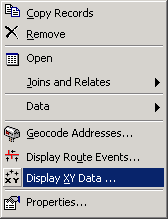
- Create an XY Event layer by right-clicking and selecting Display XY
Data.
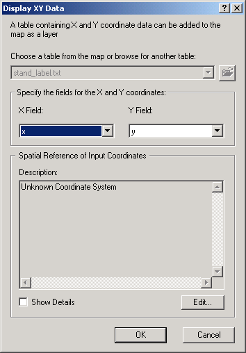
Click OK.
- The X and Y fields will automatically be set. Note that if your have nonstandard
field names representing X and Y locations, you would specify these in the
dialog. Click OK. A new layer will be added to the data frame, with
the name of the text file.
- Zoom back to full extent
 .
This layer represents the centroids ("label points") for a previous
version of the stands polygon feature class.
.
This layer represents the centroids ("label points") for a previous
version of the stands polygon feature class.
You have just added an event XY layer to a data frame. Use this technique
to convert simple point coordinate tabular data stored as a file into explicitly
spatial feature layers. Your point data can come from any source: a file that
is a list of points, a file that is a single point, or any file that can be
converted to a format that ArcGIS can open as a table.
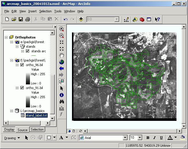
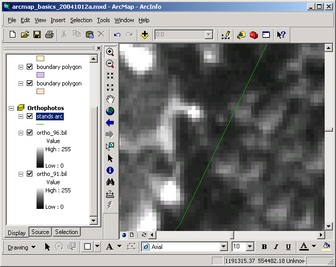
Add an image layer to the data frame
Images can be displayed in data frames. Some common images used in geographic
displays are satellite images, digital orthophotos, and scanned maps. In order
for these images to "fit" with other geographic data, they must be
accompanied by a world file, which is an ASCII file that determines pixel
size, location, and skew angles. Each of the parameters in the world file are
expressed in real-world coordinates. Without a world file, an image cannot be
placed in geographically referenced data frames. If you look at the L: drive's
directory structure, you will see world files accompanying each image file (e.g.,
ortho_91.blw).
- First, create a new data frame (Insert > Data Frame). Rename the
data frame to Orthophotos.
- Add a new layer .
- Add the \packgis\forest\ortho_91.bil and the ortho_96.bil
layers (remember to use the <CTRL> key to add more than one layer
at a time).
- Also add the feature layer \packgis\forest\stands, but only add the
the arc feature type. (Remember, double-click the stands data
source to open it to view individual feature classes.)
- Make sure that the ortho_91.bil and ortho_96.bil layers are
below the stands layer in the Table of Contents, and that the ortho_96.bil
layer is above the ortho_91.bil layer.
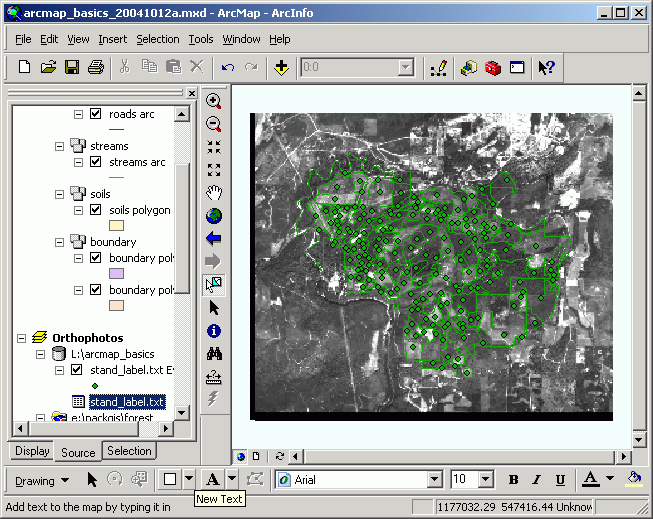
- Turn on the stands and ortho_91.bil layers.
- Zoom in to a smaller area of the data frame by selecting the Zoom In
 tool and dragging a rectangular area. Your
data frame will should similar to this, though your line color may differ:
tool and dragging a rectangular area. Your
data frame will should similar to this, though your line color may differ:
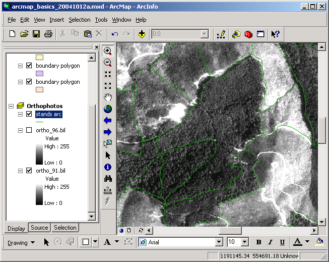
- Zoom in quite a bit more until you can see individual pixels.
- Now turn on the ortho_96.bil image layer. Do you see the difference
in pixel size? The 1991 image has a pixel size of 5.3 ft, while the 1996 image
has a pixel size of 3 ft.
Experiment with the different years of data by turning layers on and off.
Note the difference in image quality as well as the difference in vegetation
over the 5 year interval.
- Now zoom back to the full extent by clicking the Full Extent button
.
You have just added image layers to a data frame and overlaid arc (line) features
of a polygon dataset. Using different datasets stored in the same coordinate
space allows you to see the relationships among different data. Image layers
are used more and more as cheaper digital imagery becomes available.
[Note: Sometimes the warning of Pyrmid showed up...]
Pyramid layers are additional files created for rasters that have multiple
resolutions. When a raster is displayed at small scale, lower resolution is
used, but when you zoom in, finer resolution is shown. In Arc10, you may not have to see this warning if the raster layer has been built its pyramid.
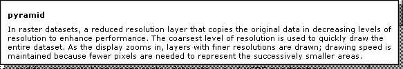
When a raster dataset is added to ArcMap for the first time, if it has not
had pyramid layers built, ArcMap will give you the option for creating pyramids.
Click Yes when asked to build pyramids. Because the data sources are
stored on the L: drive, which is not writeable, the pyramids will be stored
on the hard drive.
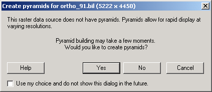
If you get a warning message, click OK.
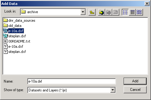
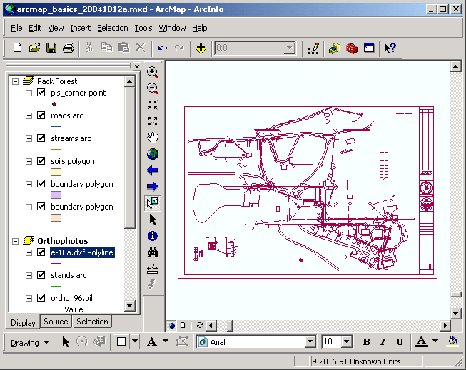
Add a CAD layer to a data frame
CAD data can be read directly by ArcMap. In this section you will load a CAD
data source and investigate the effects of incompatible coordinate systems.
- Add a data source from the \packgis\archive directory. You will
notice there are two entries for each of the DXF files in this directory.
The ones with the multilayer icons can be added on a feature class-by-feature
class basis, while the ones with the icon that looks like a compass treats
the drawing as a single entity. Open (double-click) the multilayer version
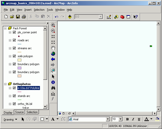
of the e-10a.dxf data source and add the polyline feature class.
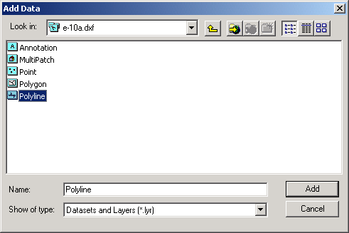
- When the layer is added to the data frame you will notice that the new
layer does not display.
- Move the cursor around in the data frame, and make a mental note the coordinates
displayed in the lower right of the Application Window. These are State Plane
coordinates, measured in feet, somewhere in the range of 1,200,000 (x), 550,000
(y). All of the Pack Forest landscape data are stored in this common coordinate
system, so that they can be displayed and analyzed together.
- Zoom to the full extent of the data frame ,
and you will see that some of the data display in a small rectangular area
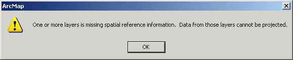
in the northeast. Why do you think this is?
This may seem confusing, but it is a critical part
of understanding how ArcMap handles display of spatial data. If,
after reading the next few paragraphs, you do not understand this, make sure
to ask a question or you may suffer from a severe lack of basic understanding
of how GIS works!!!
The features that are visible in the upper right are the layers you added
initially, which are all stored in State Plane feet.
The CAD layer features are in the data frame, and are actually located in
the lower left of the data frame, though the magnitude of coordinates of the
CAD layer features makes them too small to see.
Why? A data frame represents a simple coordinate plane, just like a sheet
of graph paper (but we don't see the lines). ArcMap displays data according
to internally-stored spatial coordinates for each data source, which are an
inherent part of the spatial data sources. The data are placed on a simple
Cartesian plane according to these internal storage coordinates.
The CAD drawing was prepared with coordinates specified in page units and
coordinates (in this case, inches), rather than in real-world units
and coordinates (feet for the other data).
Make the CAD layer active and zoom to its extent (right-click > Zoom
to layer. Now move your pointer around the data frame, you will notice
coordinates in the range of 0-30, which are page units (inches), rather than
the range you saw before with State Plane coordinates. The coordinates represent
the location on the page where features were added. This is a typical situation
when you have multiple different datasets from different sources. Some of
your data may be in one coordinate system, while others are in a different
coordinate system. In this case, some of the data are stored in a real-world
referenced coordinate system (State Plane feet), and the other dataset is
stored in an arbitrary coordinate system (page inches).
If you do have CAD datasets (or any other datasets, for that matter), you
should always find out what coordinate system and units they are stored in.
If you ever have input on the development of CAD datasets, make sure to specify
that the data should be stored in a system that matches your other GIS data.
- Delete the E-10a.dxf layer (right-click > Remove).
- Zoom back to full extent.
Important Note: Use this technique whenever
multiple datasets do not appear to display simultaneously. Even if you have
multiple datasets for the same location on the earth, the datasets may be
in different projections or coordinate space. For example, if you get data
from the Washington DNR and other data from the USGS, these datasets will
most likely be stored in different coordinate systems. If the data do not
share the same coordinate definition, you will see a large area of white space
and just a few dots of color where the data lie on the coordinate plane.
It is absolutely essential that you know the projection and
coordinate system parameters for any and all data you use in a GIS. These
topics will be covered in detail later in the course.
You have just added a CAD data source to a data frame. CAD drawings can be
important data sources, depending on the industry you are working in.
You have also learned the technique that allows you to tell if several datasets
are incompatible in coordinate or projection properties.
Save the map document
Select File > Save from the menu.
Symbology: Classification and Map Display (Snapshots are Old Version GIS, but the tools keep same operational process for Arc 10.1)
- Open an existing map document and fix broken files
- Categorical Variables: Categories
- Symbology: Graduate colors and Graduate symbols
- Symbology: Dot density map
- Symbology: Chart symbols
Open an existing map document and fix broken files
- Download the project arcmap_basics2.mxd
to the M: drive.
- From the File menu, select Open and navigate to where you
saved the mxd file.
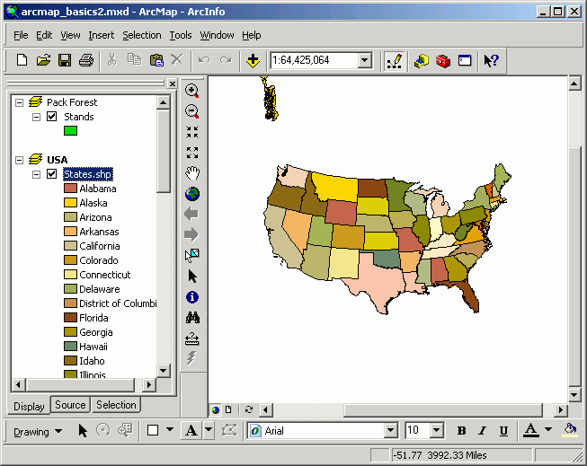
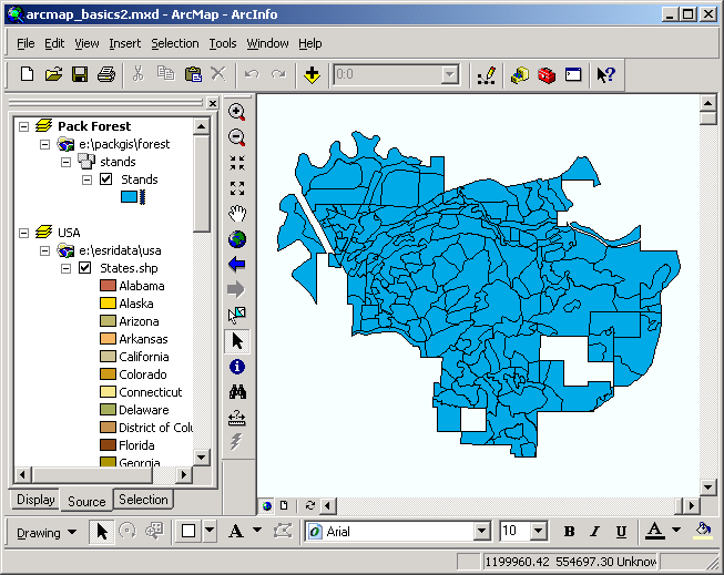
- When the map document opens, you will see the active Pack Forest data
frame, containing the Stands layer. You will also see the USA
data frame (not active). Note that there are two layers in the map document,
the Stands layer in the Pack Forest data frame, and the States.shp
layer in the USA data frame.
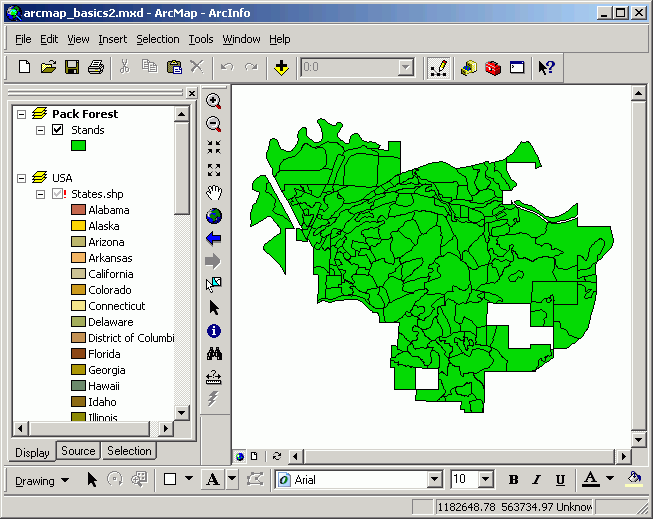
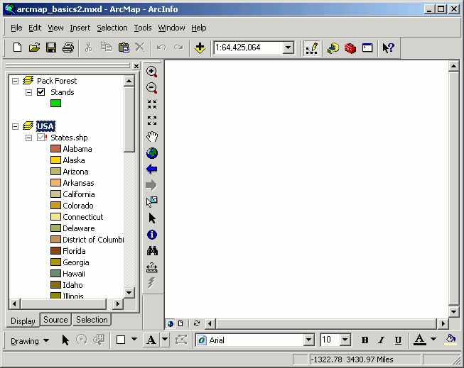
- Make the USA data frame active. Note that the States.shp layer
does not display.
- It also has a red exclamation point to the left of the layer
name. This indicates that its link with the data source is broken.
- Open the properties for the States.shp layer and click the Source
tab. Note that the map document expects to find the data set at J:\,
which is a location that does not exist. Click the Set Data Source...
button.
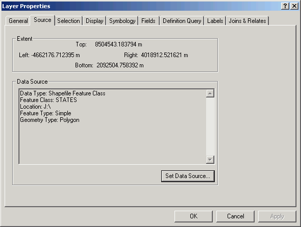
- In the "Layers Property" window > click on Set Data Source button. That will open the "Data Source" dialog.
- Navigate to L:\esridata\usa and add the STATES.shp data source.
Now you will see that the data source has been added and the layer displays.
- This is how broken data source links are fixed.
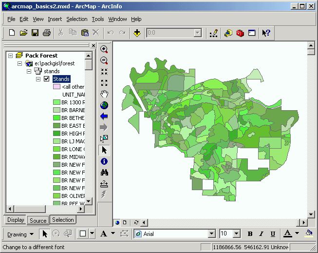
Categorical Variables: Categories
When a layer is added to a data frame, ArcMap assigns a single random color
to all features of that layer. Usually, you will want to alter the symbolization
of layers. This is done by altering the legend.
- First, change the basic color of the layer by right-clicking the patch of
green color under the Stands layer name in the table of contents. This
will open a dialog allowing you to chose a color. Select any color you like.
You will see the display change.
- Next, change the legend so that each stand is displayed in its own color.
Open the layer properties, and select the Symbology tab.
- Select Show: Categories > Unique values.
- For the Value Field select UNIT_NAME (this is the unique
name for each forest stand).
- Click Add All Values to populate the dialog.
- Select a different Color Scheme if you like.
- Click OK.
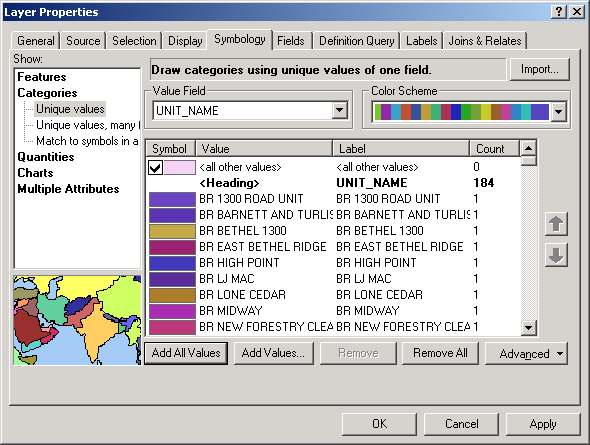
- Dismiss the properties dialog. Each stand is now symbolized with its own
color. Your display may look different from this, based on how the colors
are assigned to each polygon, but the color scheme should look similar. (Note:
some of the colors may cycle, so that the same color may be used for more
than one stand. This will most certainly cause confusion if there are a large
number of different unique values for the values field, so avoid the Unique
values classification type if you have more than 5 unique values in the
field you want to display.)
You have just made a simple alteration to the legend for a layer. Changing
legends is the main way to alter what you want to communicate to the map reader.
We will work more on altering legends throughout the course.
Continuous Values: Graduate colors and Graduated symbolos
For breaking continous values, Graduate colors and Graduate symbols were use to display the values into different classifications.
For Graduate Colors
- First, classify stands by natural breaks in the age data. Open the Layer
Properties to the Symbology tab.
- Show: Quantities > Graduated colors.
- Fields > Value: AGE_2003.
- Alter the Color Ramp to select a green monochromatic color ramp.
- Click OK.
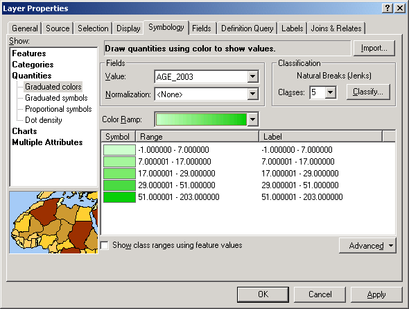
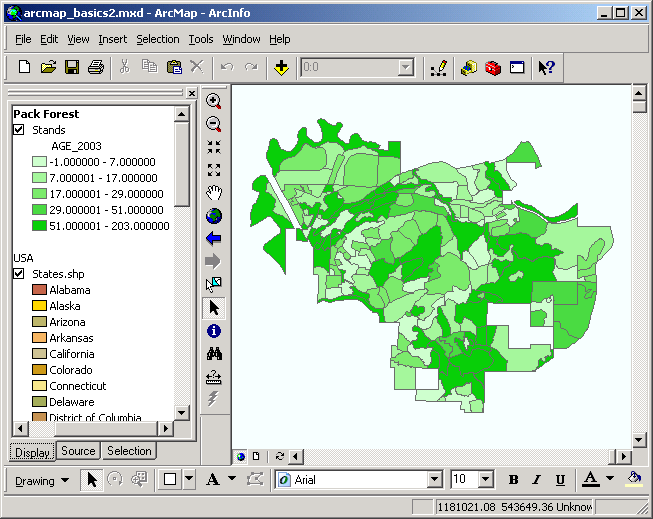
By default, ArcMap breaks the data into 5 classes, with class boundaries
at "natural breaks" using the Jenks Natural Breaks algorithm.
The darker green the stand is, the older it is.
- If you would like to customize the range and classes, go back to Classification > Classes: select 3. The ranges will
be automatically set by the Jenks algorithm. In order to change the class
breaks, enter the values for the upper bound for each class.
- For the first class, enter 60.
- For the second class, enter 100.
- The third class will automatically obtain its highest value from the
data source.
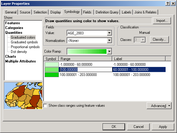
- Alter the Labels as shown below.
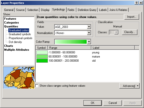
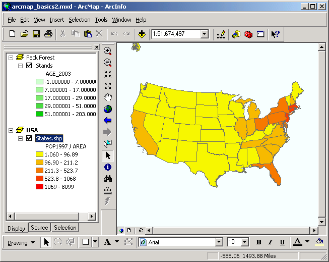
The map display will change to show the new classification. Note that the
table of contents is updated to show the labels you added
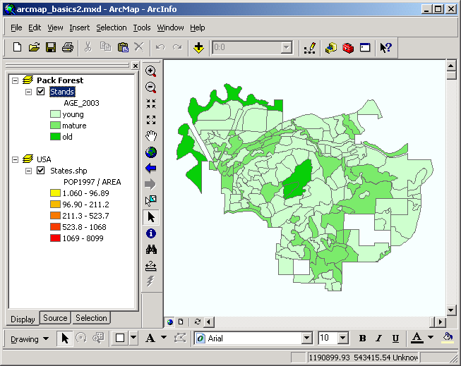
The stands are now classified into 3 distinct classes, and the data frame
shows the classes labeled as young, mature, and old.
This type of map is better at reaching a large audience with less technical
knowledge than the previous forest map.
Next, let's look at normalization in classification of data. Activate the
USA data frame (right-click > Activate), which displays each state
in a unique color.
Advanced Consideration (optional):
- First, classify the states by their population in 1997 (Show: Quantities
> Graduated colors; Fields > Value: POP1997), with the a
yellow to orange to red color ramp.
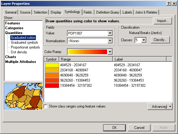
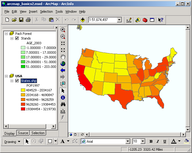
This map shows the gross population of each state. However, some of the states,
most notably, California and Texas, show very high populations. But anyone
who has ever visited California or Texas knows that there are vast areas with
very small population, and most of the people are clustered in metropolitan
areas. What may tell a better story is population density, or the number of
people per unit of ground area. If we normalize the population data (that
is, divide the state population by state area), we will get population density
rather than gross, overall population.
- Alter the layer properties by selecting Fields > Normalization: AREA.
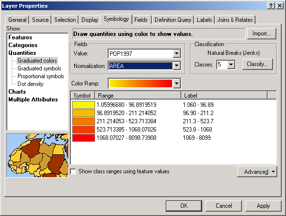
Note how now Texas and California show far lower population density, whereas
the Eastern Seaboard shows higher population density. Depending on what you
want to communicate, you will choose various methods of classifying and normalizing
data.
You have just altered the legend of a layer and normalized the classification.
This technique allows you to compare relative or proportional values of attributes
among different features.
Graduate Symbol
- Displaying points in different sizes relative to an attribute value can be
an effective and efficient communication tool.
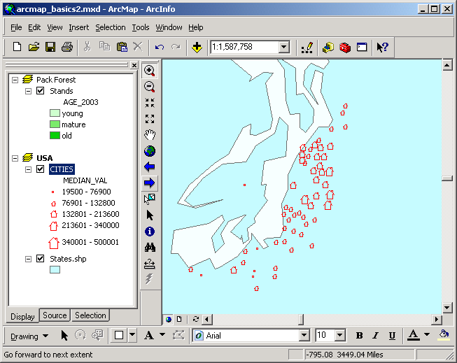
- We will display USA cities according
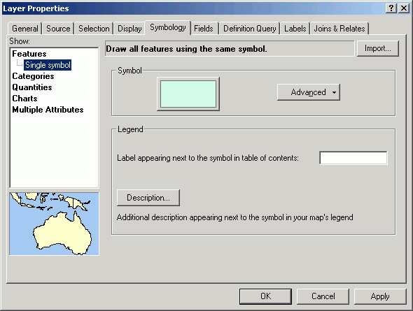
to the median home value per city. Change the legend type for States back to single symbol (in Properties
> Symbology click Features > Single symbol in the Show: control on the left).
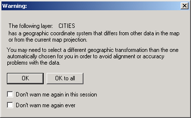
- Add the city layer from L:\esridata\usa\.
- If you
get the following warning about coordinate systems, click OK.
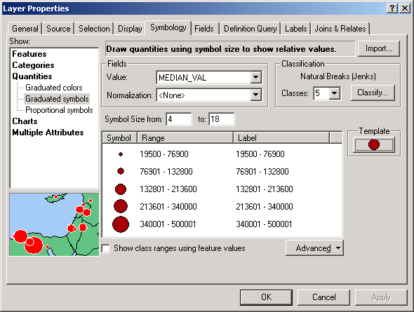
- Open the layer properties for cities.shp and choose Show: Quantities
> Graduated symbols.
- Select MEDIAN_VAL for Fields > Value. The data will be
classified into 5 groups (natural breaks, by default), and the symbols will
be scaled in size according to the value of the attribute for each feature.
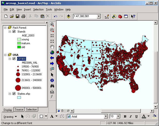
- At this scale, it may be difficult to see the difference among individual
cities, but it is possible to see that the median home value in the cities
of south Florida or southern California is much greater than that of the cities
of North Dakota or Montana.
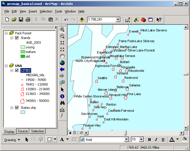
You may be more familiar with the local area, so zoom into the Puget Sound
region or a region you are more familiar with.
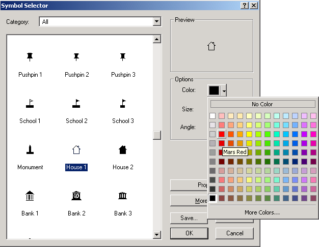
- To change the symbol, open the layer properties
again. Click the Template button.
- The Symbol Selector dialog will open. Select ANY symbol (example use house symbol).
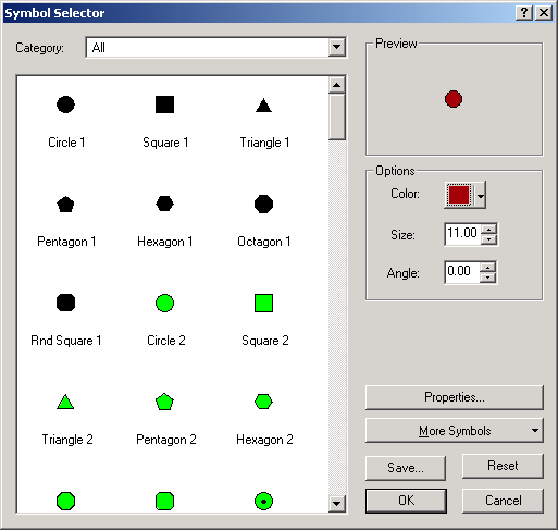
- About halfway down you will see a house symbol; select it. You can also
change the color if you like, then click OK
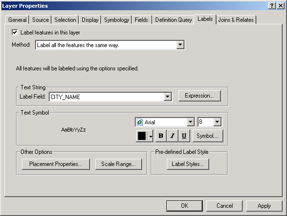
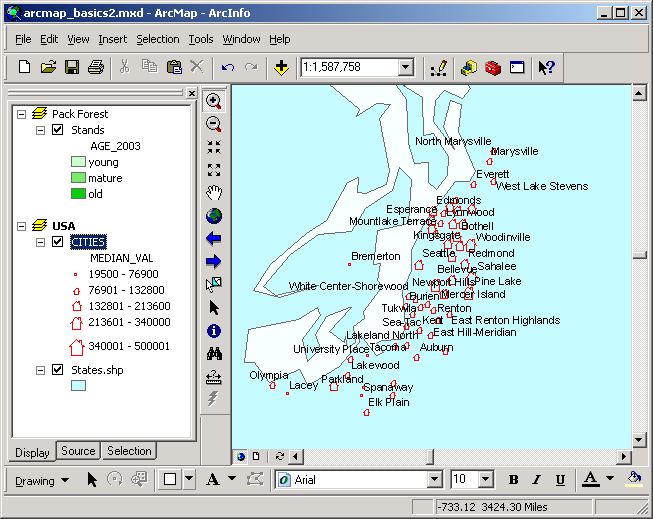
- To label the cities with their names, open the layer properties and click
the Labels tab.
- Click the checkbox for Label features in this layer.
- Make sure CITY_NAME is the selected Label Field.
Now you can see the cities in our region displayed in markers representing
the median value for houses, along with place names. You may need to zoom
in in order to see what cities correspond to each point marker.
Where do you want to live? Where can you afford to live?
Save your map document before closing in case you want to reopen it to make
changes later. Make sure to save it on the M: drive rather than on the local
hard drive.
You have just displayed a point layer in a graduated-size, custom symbol. This
technique can be used if you want to communicate something about your point
locations in a way that makes visual "sense." You have also learned
to label point features with a specific attribute value.
Symbology: Dot density map
Dot density maps are used to display polygon numerical data that represent
point phenomena. Although a polygon can only have a single value for an individual
numeric field, sometimes those numeric values represent point count phenomena.
- Open the layer properties for the states.shp layer.
- Select Quantities > Dot density.
- In Field Selection double-click NO_FARMS87.
- Drag the Dot Value slider to about 2200. This means a single
dot will represent a value of 2200 farms. A state with more farms will
have more dots.
- Click OK.
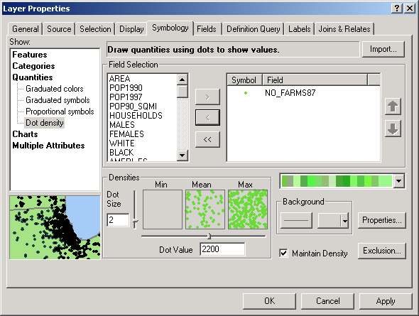
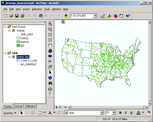
You can see the Midwestern states have the greatest number of farms.
- Hispanic farm laborers are heavily employed in agriculture
in the USA. We will use a simple visual inspection of the data to see if there
is a spatial patter to the distribution of farms and the Hispanic population.
Add another copy of the states.shp layer to the data frame. To do this,
right-click the states.shp layer and select Copy, then right-click
the USA data frame name and select Paste Layer(s).
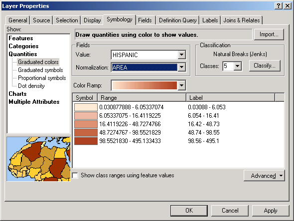
- Change the copied layer's legend to Graduated Color (5 classes) based
on the values in the Hispanic field, normalize by Area, and
choose a brown monochromatic color ramp. This shows the population density
of Hispanics.
- Make sure the layers are displayed in the correct order so that the points
appear on top of the polygons.
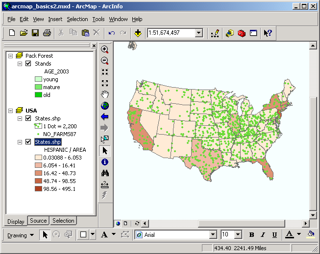
What does this tell you about the common perception that Hispanic migrant
workers dominate the farming industry? Where is the greatest concentration
of farms, and where is the greatest concentration of people of Hispanic ancestry?
How might this map be misleading or incomplete? Do you think this map shows
anything related to reality? Can you alter this map so that is communicates
something different? Do you think the source data are accurate? Note that
the states.shp layer does not include a field for the average
number of workers per farm, or the average size or output of farm.
You have just created a dot density map and compared it with a graduated
color (choropleth) map. Beware of dot density maps, because the dots do not
represent actual locations of features! Try turning the layer on and off, and
you will see that the dots change location, but always the same number of dots
are shown in each state.
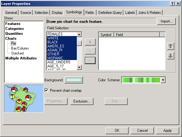
Symbology: Chart symbols
- Delete the dot density layer, and open the layer properties for the polygon
states.shp layer.
- Show: Charts > Pie. Select White, Black, Ameri_es,
Asian_pi, Other, and Hispanic fields, and click the >
button. This will create a chart symbol for each state composed of the proportion
of population represented by these different ethnic/racial groups.
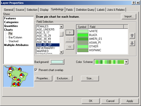
- The colors are set at random by the current color scheme. Right-click each
symbol and select a color that has more intuitive meaning.
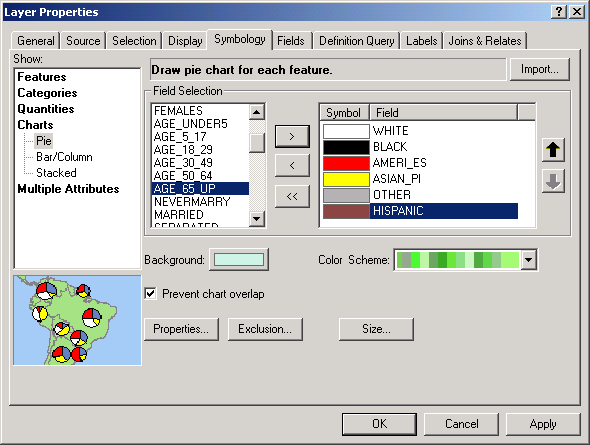
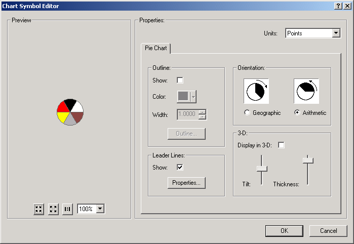
- Click Properties and uncheck the Display in 3-D checkbox.
Click OK.
- Click Size and click the radio button for Vary size using a field,
and select POP1997 (state population for 1997). This means a state
with larger population will have a larger pie chart symbol.
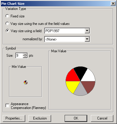
- Click OK for both dialogs.
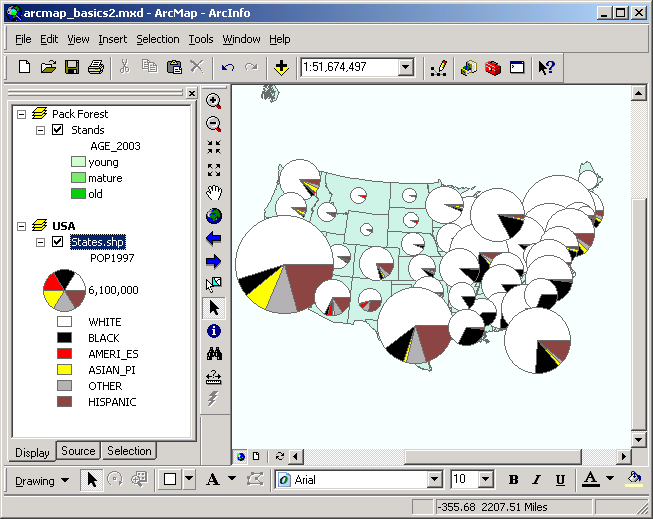
- Zoom in to get a better picture of individual states. Note how the overall
proportion of ethnic minorities changes from state to state, as well as how
the relative proportion of each minority group compares within each state.
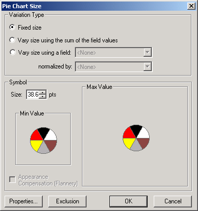
Change the Size back to Fixed Size to more easily compare proportions
of population across the states.
Take note of how Utah's demographics are different from those of the other
southwestern states. Which state has the greatest diversity? The least? These
type of maps have a tremendous amount of information to communicate in a compact
and easy to understand format.
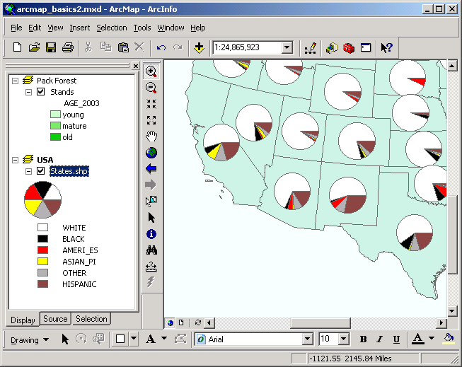
You have just created a map with chart symbols. These type of maps can convey
a large amount of information in a concise format.
REMEMBER TO TAKE YOUR CD AND REMOVABLE DRIVE
WITH YOU!!!!
Return to top
 |
|
TThe University of Washington Spatial Technology, GIS, and Remote Sensing
Page is supported by the School of Forest Resources
|
|
School of Forest Resources
|
 UW
Home
UW
Home