Projecting sea level rise in the future
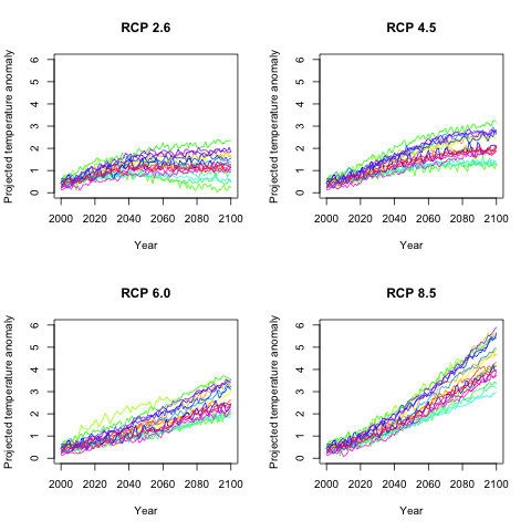
1. Getting global temperature
There are a variety of global climate models available. We will
be using the latest model runs intended for the next IPCC
assessment report (due September, 2013). In this project we have
chosen 18 models
which have runs using historical data (up to 2000) and
projections of the future (2000 through 2100) for each of the
four representative
concentration paths (scenarios about what the world may
look like in terms of greenhouse gas and other emissions, land
use, etc.). The models have all been standardized by subtracting
their average temperatures from 1970-1999. Still, they yield
different answers as to what the temperature anomaly (change
from the period 1970-1999) will be for a given year under a
given scenario. In the four figures below we show average global
annual temperature for each of the four scenarios. Each of the
18 models have the same separate color.
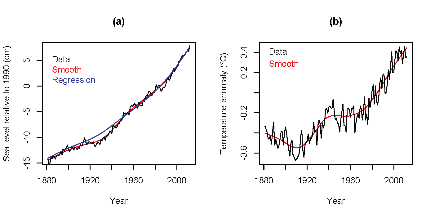
2. Getting global sea level from global temperature
Climate models are well tuned to produce good projections of
mean global temperature, but have not been as successful in
reproducing sea levels. This is partly due to difficulties in
modeling glaciers and arctic/antarctic land ice. Instead of
using model output, empirical (i.e., data-based) models have
been developed. We use a model due to Ramsdorf (2007), with a
couple of technical modifications, updated with the latest data
available in May of 2013. This approach relates smoothed (over
time) sea level (a) and smoothed temperature (b)
.
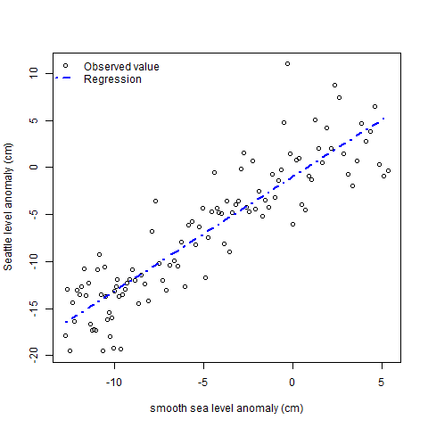
3. Getting Seattle sea level from global sea level
The actual sea level is not the same as the global sea level,
due to land rise, tectonic plate activity, ocean streams, local
atmospheric pressure etc. We need to fit the sea level at
Seattle (the site closest to Olympia having a long series of
careful measurements available) as a function of global sea
level.
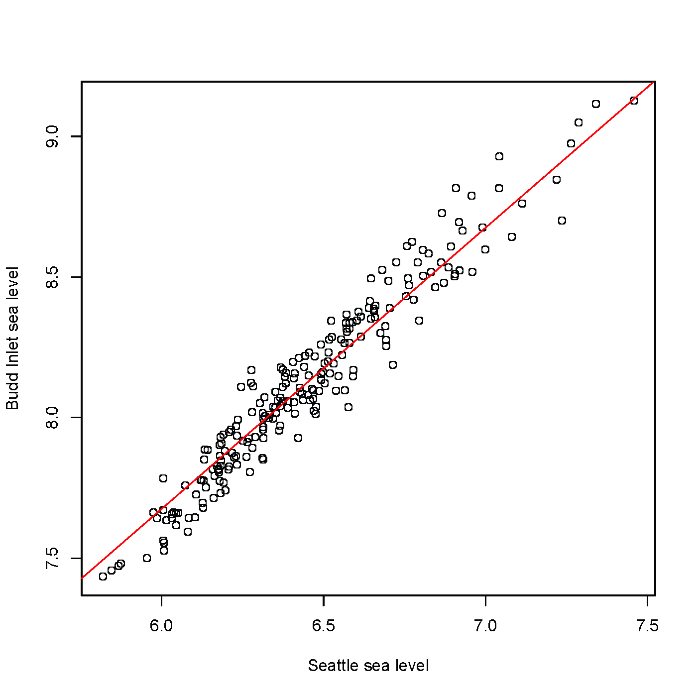
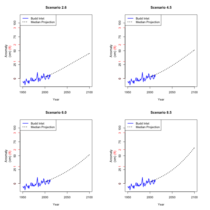
4. Getting Olympia sea level from Seattle sea level
The tidal activity at Olympia is not identical to that at
Seattle. Tides at Olympia tend to be higher. Comparing data from
the two sites (we have less than a year's worth of data from
Olympia) leads us to add a constant to the Seattle values to get
Olympia values.
5. The issue of variability
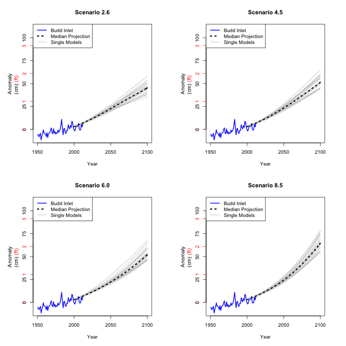
We could just estimate sea level rise at Olympia by averaging
all the climate models and applying the models in 2.-4. to the
average temperature projection. This would give us a single
number for each year and scenario.
But there is variability among the climate models. As a lower
bound on that, we can use each climate model projection to
calculate an estimated sea level using the models 2-4. It is
only a lower bound, because there may well be other climate
models that give different results, but they are not part of our
data set.
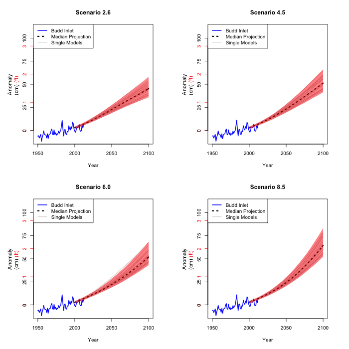
The estimated coefficients in the model in 2. are not precise.
But we can estimate the variability of these coefficients, and
apply that variability to the paths we just computed from all
the climate model projections. The picture shows the range of
where we are 90% confident that sea level rise will lay, using
the 19 paths and the variability in the relationship in 2.
The estimated coefficients in the model in 3. are not precise
either. Again, we estimate the variability and carry it through
the previous estimates.
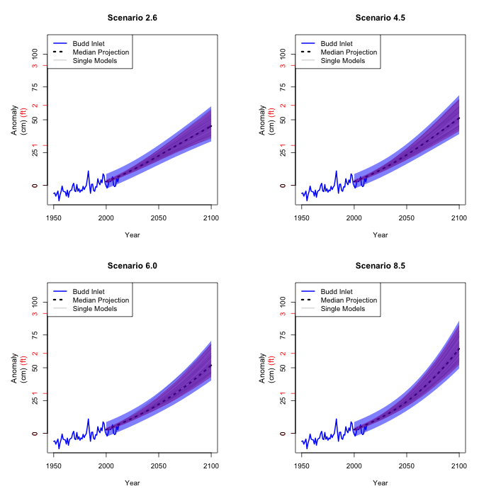
Finally, the estimate taking Seattle sea level to Olympia sea
level is of course not precise either. We carry its variability
through as well.
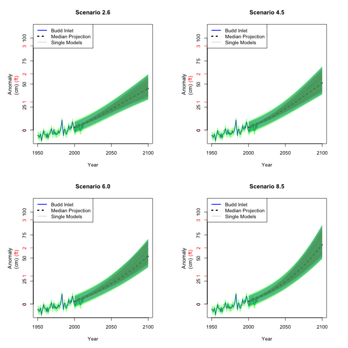
These figures are our best 90% confidence intervals of the mean
sea level in Olympia for each year and scenario. What this means
is that we are 90% confident that the regions in the final four
figures will cover the actual sea level rise at a given year for
a given scenario. We do of course not know which scenario (if
any) will take place. That is why predicting the future is so
difficult...
(Return to top)
6. Slicing this way and that
In order to get a feel for what the figures in section 5 really
mean, we can cut across a year and look at the entire
distribution (not just the middle 90% of the distribution) of
mean sea level height in Olympia for that year. The figure shows
where the different sources of variability come from for
projected sea level rise in 2050, depicted as a probability
density function. The colors correspond to the figures in the
previous sections, so the black vertical line corresponds to the
median model; the grey histogram to the various climate models; the red curve to
the relation between global temperature and global
sea level; the blue curve adds the variability due to the
relation between global sea level and Seattle
sea level; while finally the green curve depicts the full
variability, also including the relation between Seattle and Olympia sea levels.
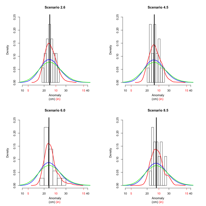
In 2050 all scenarios give very similar results. We next look
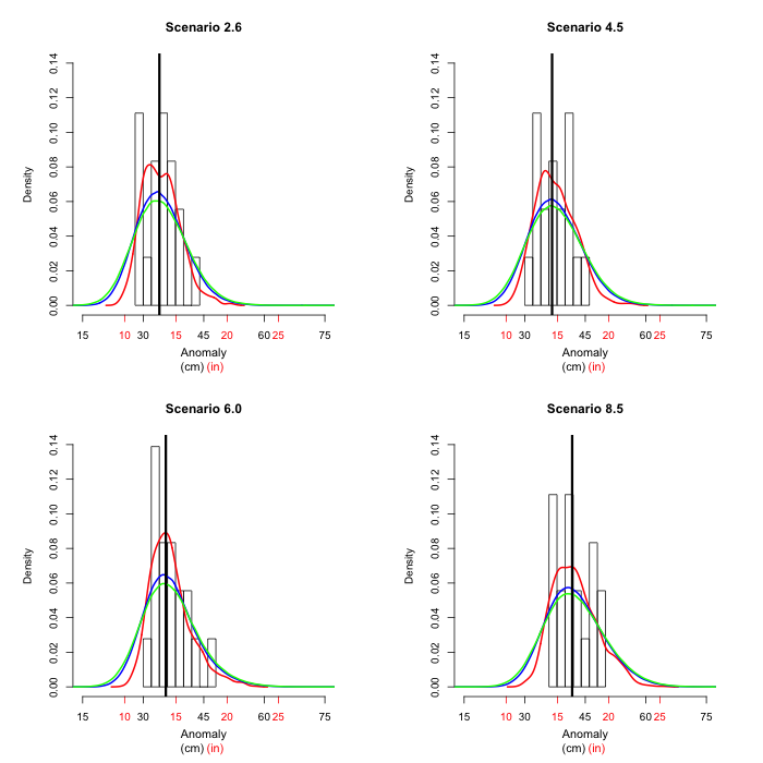
at 2075, where the scenarios are starting to look more
different.
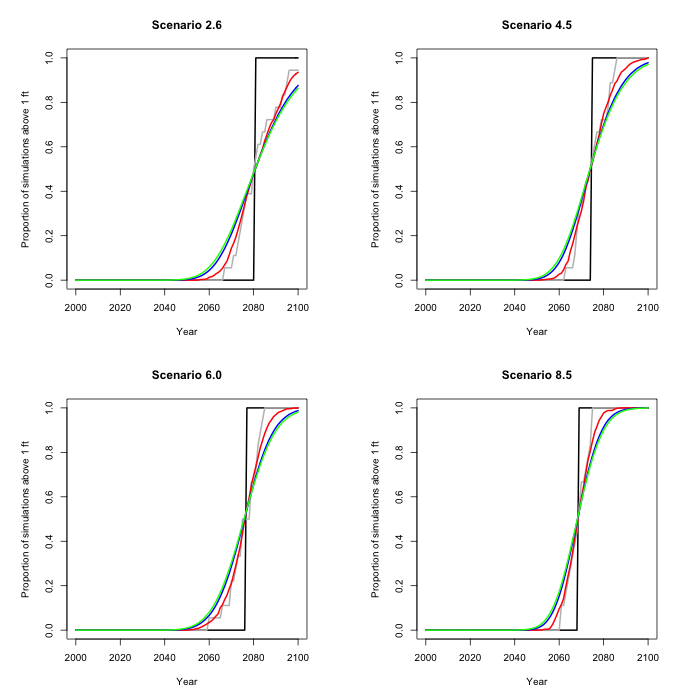
We can also slice the figures across, at a given sea level. In
this picture the probability distribution (by year) for a one
foot (30.5 cm) rise is depicted. This is a cumulative
distribution, so for example the probability is 1/2 under
scenario 2.6 that a foot sea level rise (in this case over the 2010 level) will
occur by 2080, whereas for scenario 8.5 that probability is over
80%.
(Return to top)
7. Code and data used for these calculations
All the calculations have been done in the free statistical software
R. The code and the data are
freely available to anyone interested in running the analyses.