Introduction to Geographic Information Systems in Forest Resources
| Introduction to Geographic Information Systems in Forest Resources |
|
|||||||||||||||
|
|||||||||||||||
Discussion
Cartographic choices lie at the heart of creating maps for communication. How you decide to represent your data will determine what the map communicates. You can draw the reader's attention away from one detail and toward another. You can distort data so that the reader gets a skewed picture of the underlying "reality" of the map data.
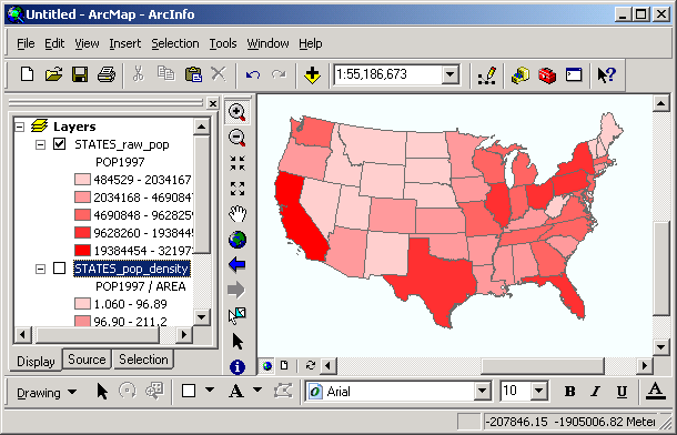
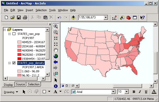
Consider these 2 maps; both show the population of each state in the contiguous USA, where the darker color represents higher population. The first map shows the total population, while the second map shows population density (population per unit area). In the first map, California shows the largest population, and some of the Northeastern states show low population. However, in the second map California shows somewhat low population density, while the Northeast shows the highest population density. Both maps represent the same general thematic data (population), but each uses a different cartographic method, and each map communicates a different idea. You would use one or the other of these maps depending on the ideas you want to communicate.
Frequently, different map symbols are chosen because of their psychological impact (for example, green and blue solid filled symbols are often used to show "cool," or non-threatening areas, while red is used to show "hot," or dangerous areas). Line weights also impart relative importance to different linear features (interstate highways are usually drawn thicker than county roads). Different point symbols can be used to signify characteristics of places (National Park maps often show amenities such as boat launches, trailheads, picnic areas, and restrooms with specialized marker symbols). Think carefully about what you want to communicate, and choose your map symbols accordingly.
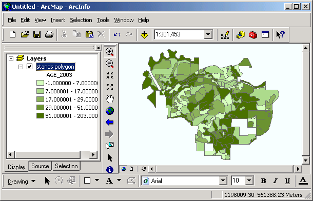
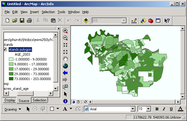
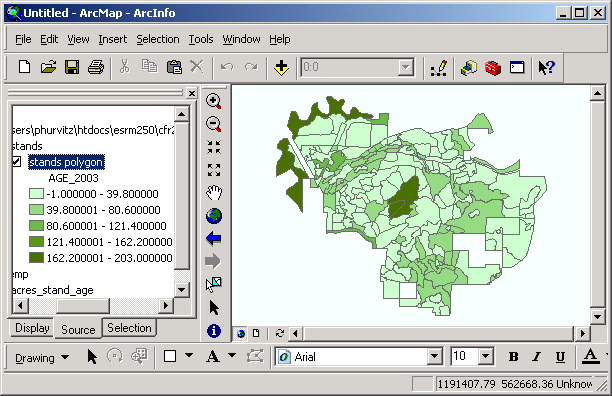
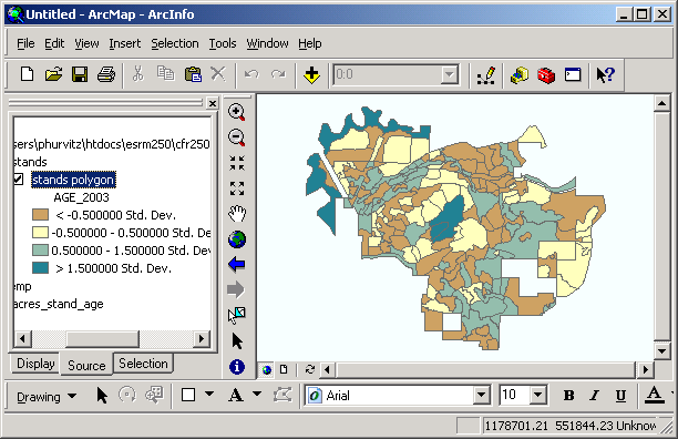
Classification is another method of changing what you want to communicate with your maps. Research has shown that it is more difficult to comprehend or compare a large number of objects, values, symbols, or colors. Classification allows you to lump similar features into classes; fewer classes are easier to compare to one another. In the maps above, if any more classes were used, the classes would become visually indistinguishable from one another. It is also easier to differentiate among large numbers of classes of ramped colors representing numerical values (e.g., population) than it is to differentiate among large numbers of classes of categorical values (e.g. dominant ethnic background).
Any good GIS software will give you the ability to quickly and easily change the way maps are displayed, by changing symbols, colors, or classification schemes
Thematic mapping
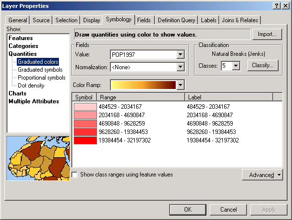
The ArcGIS Layer Properties for Symbology allow you to change the symbology of layer features within the map. There is a great deal of flexibility about how to display features. Many built-in symbol palettes are available for area, line, or point features, and it is also possible to create custom symbols.
To change the symbology for a layer, left-click the layer name and select Properties. Within the Layer Properties dialog, the Symbology tab contains the controls for altering symbology.
Most of the cartographic changes described in this section are accessed via the Layer Properties for Symbology.
Choosing a legend type
Several legend types are available:
Classifying map displays
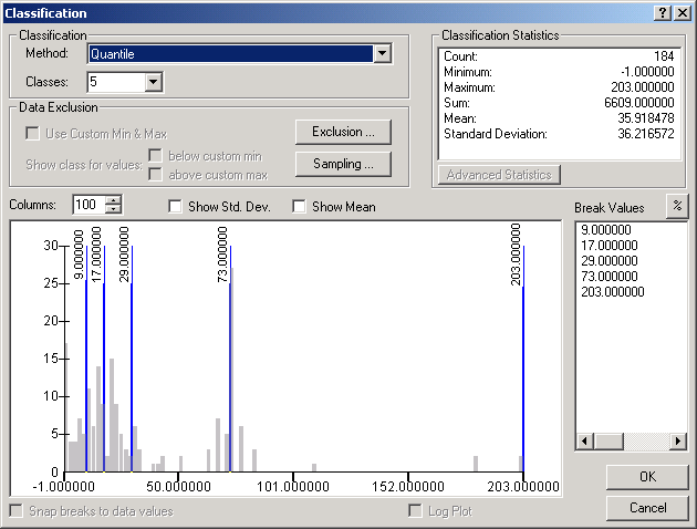
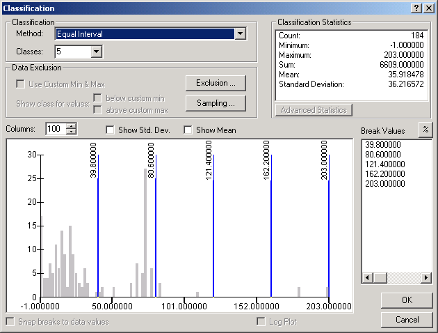
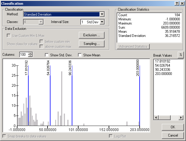
Classifications are used to group features in similar classes. Classification methods can only be used for numeric attributes. Different classification methods are used to show patterns or groupings of data values. For data sources that have a lot of unique numerical attributes, classification allows the reader to make sense out of the data.
Classification methods (type of classification, number of classes) are only used when displaying data using either graduated colors or graduated symbols.
The 5 classification methods ArcGIS uses are:

Normalizing data
Normalization of data values expresses attributes as relative values rather than absolute.
Normalization can express an attribute as a percentage of the total. For example, a map could be made to show each stand's contribution of fiber in comparison to the total amount of fiber on the forest.
Alternatively, normalization can express the ratio of one attribute to another. For example, a map could be made to display the per-area contribution of fiber to the forest total. The best example of this is the raw population vs. population density maps from the top of the page, in which the population field is divided by the area field.
Do not normalize attributes that are already expressed in percentages or densities (these data are already normalized), otherwise you will make your data unintelligible.
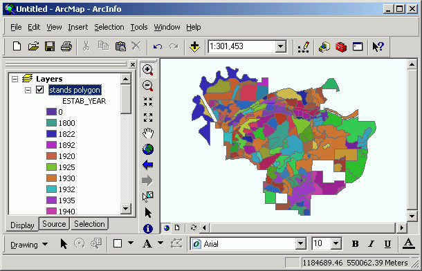
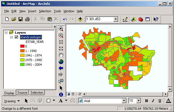
Manipulating classes
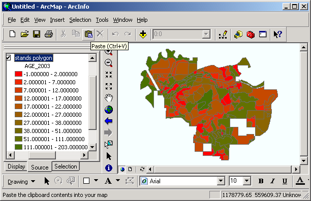
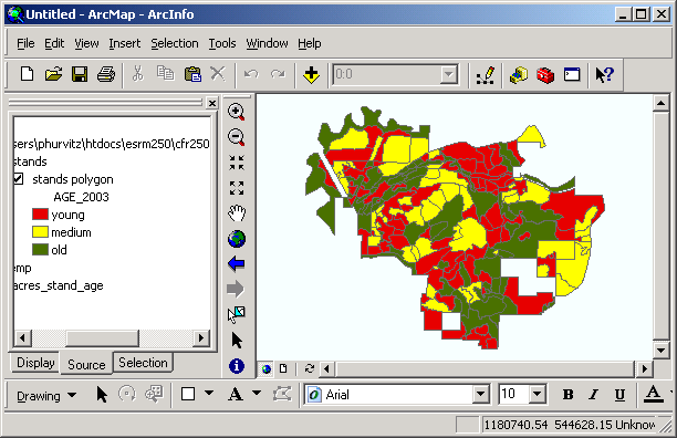
It is possible to alter the classification by adding and deleting classes, by altering the position of class breaks, or by editing class labels. Here are examples of both manipulations. Both of these maps display the same data, but with different numbers of classes, different colors, and different class labels. When would use one instead of the other?
Adding and deleting classes
Classes can be added to and deleted from the legend classification scheme. To add classes, simply specify a different number of classes in the classification scheme. To delete a class, right-click the class in the Layer Properties > Symbology dialog and select Remove Class(es).
Sorting values & labels
Legends can be sorted in ascending or descending order. The Range field are sorted numerically, and the Label field is sorted alphabetically. Note that the symbols are the same but the values are reversed.
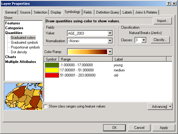
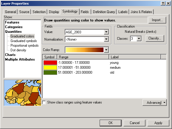
Flipping symbols
The order of symbols can be reversed as well as the data ranges and labels. The order of the symbols will change, but the order of the values will remain the same. For example, if your colors ramp from green to yellow to red, flipping the symbols will reverse the order of the colors.
In this example, the 3-class legend is flipped. Note that the values are the same and in the same order, but the colors have changed.
Ramping colors
Color ramping is automatic when you choose the graduated color legend type. However, it is possible to change the first and last color, and have them gradually change between. You can also merge several individual monochromatic color ramps and ramp the colors that fall between (e.g., blue > green | green > yellow | yellow > red | red > white).
In this image, the color ramp goes from green through yellow to red.
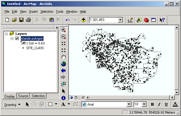
Working with null values
Sometimes attribute data contain null values. A null value is different from an actual value of 0 (for example, a value of 0 is valid for temperature, but not valid for a speed limit). Null values are often coded numerically as 0 or -9, or as blanks in character fields. It is possible to perform a query to exclude null values; any features with this value will not be displayed.
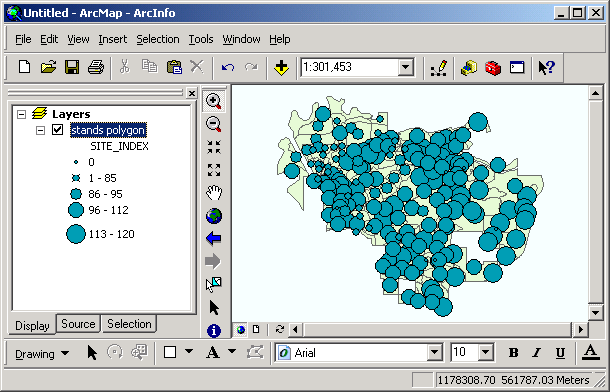
Scaling symbols
Marker symbols can be scaled so that as you zoom in and out, the size of the marker changes with the scale. Without scaling, as you zoom in, the absolute size of the markers will stay the same; with scaling on, the markers will increase in size.
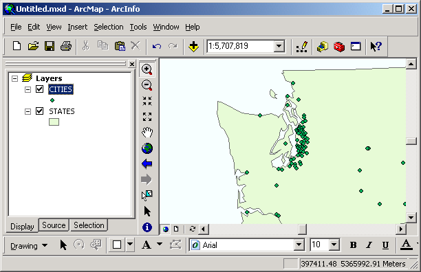
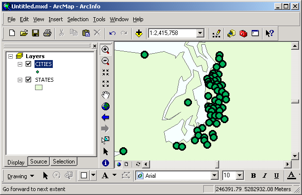
Here is a view with simple point symbols:
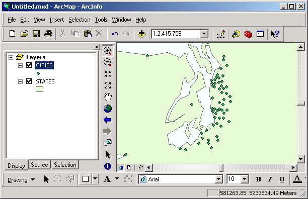
This is a larger scale view with scaling off:
And with scaling on:
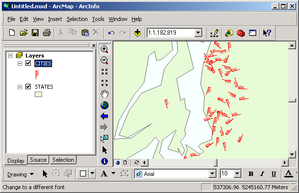
Rotating symbols
If a field exists within a point layer's attribute table describing the angle of the feature, this can be used to rotate each marker by that value. Marker symbol rotation can be used to show the direction of travel of a point phenomenon (e.g., an animal's direction of migration based on a telemetry point or wind direction from a weather station).
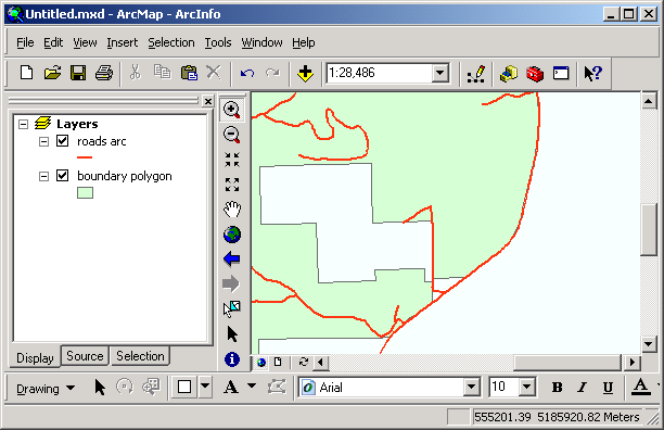
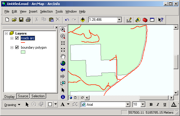
Offsetting lines
Lines can be offset any distance you like. This is handy when you are displaying several lines that lie on top of each other (for example, the Pack Forest boundary is delineated in places by roads and streams). Offsetting allows your map to display all lines. The offset direction is controlled by the arc's direction.
Here are similar views, one with line offset at a value of 0 (no offset), and the other at a value of 2 points.
Return to top | ahead to Changing Layer Display Properties
|
|||||||||||||||
|
The University of Washington Spatial Technology, GIS, and Remote Sensing Page is supported by the School of Forest Resources |
School of Forest Resources |