Chapter 2 Descriptive Statistics
Before we build statistical models, we need to understand how to summarize data. Descriptive statistics provide numerical summaries of a sample: measures of central tendency (like the mean), variability (like variance and standard deviation), and distributional shape.
These quantities do not tell us whether effects are “significant,” nor do they explain why patterns occur. Instead, they describe what is observed.
Importantly, many inferential methods introduced later in this book — including t-tests, regression and ANOVA — are built directly on these descriptive quantities. In particular, sums of squares and measures of variability will reappear repeatedly.
Many of the examples in this book and class are analyses from a survey that I give to my undergraduate statistics class, Psych 315. The survey asked students about benign things like their heights, parent’s heights, favorite color and so on. There are around 100 students in the class, so this is a large enough sample size to see some interesting things. Note, however, this survey is not scientific - any inferences we make from it are just for demonstration.
This first chapter will show you how to load in data from the survey and explore some of the data using basic descriptive statistics like measures of central tendency and variability, bar graphs and histograms.
‘Descriptive statistics’ are what they sound like they are, which are summaries of a sample. They form the foundation for ‘inferential statistics’
First we’ll clear the workspace (the variables in memory) and load in the survey data.
R’s function read.csv loads in csv files and if there are
headers in the first row uses the names in the headers to name
the ‘fields’ that contain the data.
rm(list = ls())
survey <-read.csv("http://www.courses.washington.edu/psy315/datasets/Psych315W21survey.csv")
The line rm(list = ls()) is R’s way of clearing all variables from memory. I know it looks overly complicated for such a simple action. If you care, the function rm can clear a list of named variables, and ls() lists all variables in memory.
The code above then uses read.csv to load in the csv file from the URL site and put all the data into a variable called ‘survey’.
‘survey’ has a bunch of fields associated with it that correspond to your answers to each of the questions.
For example, I asked students about their heights (in inches). This can be found in the field ‘height’ and can be accessed = with the dollar sign ($):
##   [1] 68 64 63 60 66 70 62 66 61 65 62 72 61 64 67 69 72 71 62 66 62 65 67 60 62
##  [26] 65 62 72 61 65 70 68 67 68 64 66 61 66 67 63 62 64 61 63 68 62 69 72 68 61
##  [51] 67 65 69 62 63 72 68 63 63 68 74 72 61 68 70 70 62 68 61 62 59 63 62 64 71
##  [76] 62 65 62 70 63 67 66 72 66 66 60 65 62 68 75 65 70 65 68 62 62 72 66 74 71
## [101] 68 68 67 64 67 63 65 66 66 65 66 60 67 64 64 62 61 68 66 64 64 67 67 62 65
## [126] 68 63 64 65 74 71 61 68 68 68 63 72 65 64 61 63 66 65 66 69 69 66 63 73 61
## [151] 65 74
To just look at the first few values, use head:
## [1] 68 64 63 60 66 70How many students filled out the survey? This can be determined with the function length for any of the fields:
## [1] 152Mother’s heights are in the field ‘mheight’:
## [1] 64 62 61 60 61 60These lists are in the same order across students, so the first student in the list (whoever it is) has a height of:
## [1] 68and has a mother of height
## [1] 64Here are some basic statistics about your mother’s heights:
mean:
## [1] NAThe answer might be ‘NA’ which means ‘not available’ That’s because there is missing data in the list. Look back and you’ll see that some of the entries are ‘NA’.
To calculate the mean, while ignoring missing entries, use:
## [1] 64Another way to deal with missing data is to create a new variable without the ’NA’s.
To find the missing data, use ‘is.na’
##   [1] FALSE FALSE FALSE FALSE FALSE FALSE FALSE FALSE FALSE FALSE FALSE  TRUE
##  [13] FALSE FALSE FALSE FALSE FALSE FALSE FALSE FALSE FALSE FALSE FALSE FALSE
##  [25] FALSE FALSE FALSE  TRUE FALSE FALSE FALSE FALSE FALSE FALSE FALSE FALSE
##  [37] FALSE FALSE FALSE FALSE FALSE FALSE FALSE FALSE FALSE FALSE FALSE FALSE
##  [49] FALSE FALSE FALSE FALSE FALSE FALSE FALSE FALSE FALSE FALSE FALSE FALSE
##  [61] FALSE FALSE FALSE  TRUE FALSE FALSE FALSE FALSE FALSE FALSE FALSE FALSE
##  [73] FALSE FALSE FALSE FALSE FALSE FALSE FALSE FALSE FALSE FALSE FALSE FALSE
##  [85] FALSE FALSE FALSE  TRUE FALSE FALSE FALSE FALSE FALSE FALSE FALSE FALSE
##  [97] FALSE FALSE  TRUE FALSE FALSE  TRUE FALSE FALSE FALSE FALSE FALSE FALSE
## [109] FALSE FALSE FALSE FALSE FALSE FALSE FALSE FALSE FALSE FALSE FALSE FALSE
## [121] FALSE FALSE FALSE FALSE FALSE FALSE FALSE FALSE FALSE FALSE FALSE FALSE
## [133] FALSE FALSE FALSE FALSE FALSE FALSE FALSE  TRUE FALSE FALSE FALSE FALSE
## [145] FALSE FALSE FALSE FALSE FALSE FALSE FALSE FALSE
gives you ‘TRUE’ for the locations of the missing data.
To find the data that’s NOT missing, use ‘!’ which switches TRUE to FALSE and vice versa:
##   [1]  TRUE  TRUE  TRUE  TRUE  TRUE  TRUE  TRUE  TRUE  TRUE  TRUE  TRUE FALSE
##  [13]  TRUE  TRUE  TRUE  TRUE  TRUE  TRUE  TRUE  TRUE  TRUE  TRUE  TRUE  TRUE
##  [25]  TRUE  TRUE  TRUE FALSE  TRUE  TRUE  TRUE  TRUE  TRUE  TRUE  TRUE  TRUE
##  [37]  TRUE  TRUE  TRUE  TRUE  TRUE  TRUE  TRUE  TRUE  TRUE  TRUE  TRUE  TRUE
##  [49]  TRUE  TRUE  TRUE  TRUE  TRUE  TRUE  TRUE  TRUE  TRUE  TRUE  TRUE  TRUE
##  [61]  TRUE  TRUE  TRUE FALSE  TRUE  TRUE  TRUE  TRUE  TRUE  TRUE  TRUE  TRUE
##  [73]  TRUE  TRUE  TRUE  TRUE  TRUE  TRUE  TRUE  TRUE  TRUE  TRUE  TRUE  TRUE
##  [85]  TRUE  TRUE  TRUE FALSE  TRUE  TRUE  TRUE  TRUE  TRUE  TRUE  TRUE  TRUE
##  [97]  TRUE  TRUE FALSE  TRUE  TRUE FALSE  TRUE  TRUE  TRUE  TRUE  TRUE  TRUE
## [109]  TRUE  TRUE  TRUE  TRUE  TRUE  TRUE  TRUE  TRUE  TRUE  TRUE  TRUE  TRUE
## [121]  TRUE  TRUE  TRUE  TRUE  TRUE  TRUE  TRUE  TRUE  TRUE  TRUE  TRUE  TRUE
## [133]  TRUE  TRUE  TRUE  TRUE  TRUE  TRUE  TRUE FALSE  TRUE  TRUE  TRUE  TRUE
## [145]  TRUE  TRUE  TRUE  TRUE  TRUE  TRUE  TRUE  TRUE
Finally, we can use this list to pull out the non-missing data, and put it into a new variable ‘mheight’:
mean should now work:
## [1] 64The minimum mother’s height with min:
## [1] 51and the maximum with max:
## [1] 722.0.1 Fun fact about the mean:
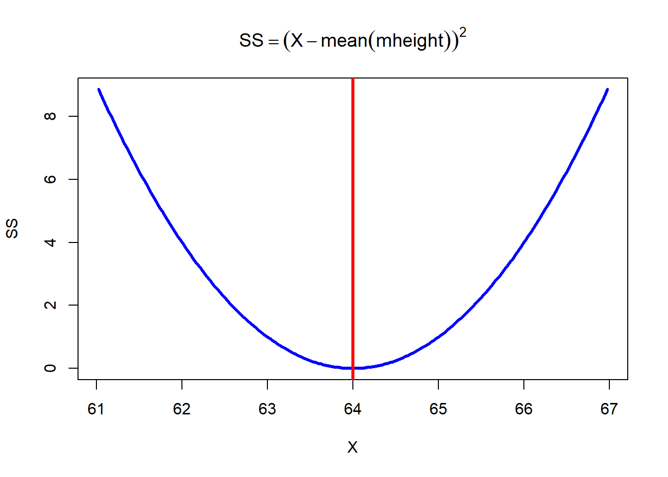
The mean has a special mathematical property: it is the value that minimizes the sum of squared deviations from the data. In other words, if we tried to predict every observation with a single number, the best possible prediction (in the least-squares sense) would be the mean.
This is a plot of the sums of squared deviation of heights (X) from the mean of father’s heights heights. Notice that it’s a nice parabola with an obvious minimum at X = 64 inches.
(sample) standard deviation with sd:
## [1] 2.976762(sample) variance with var:
## [1] 8.861111Variance quantifies the average squared deviation from the mean. Many statistical procedures are based on comparing different sources of variance.
median:
## [1] 64or equivalently using quantile:
## 50%
##  64
Note the ‘50%’ above the result. That’s because quantile returns the result as a ‘named number’. If you want just a regular number without the name, pass the named number through
as.numeric:
## [1] 64The Semi-interquartile range can be calculated using quantile
## [1] 2We can plot a histogram of mother’s heights like this
# define class intervals based in the min and max:
class.interval <- seq(min(mheight),
                      max(mheight),
                      1)
hist(survey$mheight,
     main="Histogram of Mother's Heights",
     xlab="Height (in)",
     col="blue",
     xaxt='n',
     yaxt = 'n',
     breaks =class.interval
)

# and then adding your own axes with the 'axis' function
# Axis 1 is 'x' and 2 is 'y':
axis(1, at=class.interval)
axis(2, at=seq(0,100,5),las = 1) 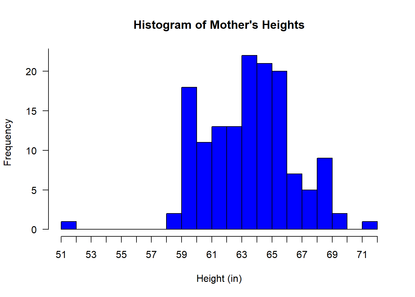
What is ratio of men to women in this class? Remember, we can ask which students identified as “Woman” with:
##   [1] FALSE  TRUE  TRUE  TRUE  TRUE FALSE  TRUE  TRUE  TRUE  TRUE  TRUE FALSE
##  [13]  TRUE  TRUE  TRUE  TRUE FALSE  TRUE  TRUE  TRUE  TRUE  TRUE  TRUE  TRUE
##  [25]  TRUE  TRUE  TRUE FALSE  TRUE  TRUE FALSE  TRUE  TRUE  TRUE  TRUE  TRUE
##  [37]  TRUE  TRUE  TRUE  TRUE  TRUE  TRUE  TRUE  TRUE FALSE  TRUE  TRUE FALSE
##  [49]  TRUE  TRUE FALSE  TRUE  TRUE  TRUE  TRUE FALSE FALSE  TRUE  TRUE  TRUE
##  [61] FALSE  TRUE FALSE  TRUE FALSE  TRUE  TRUE  TRUE  TRUE  TRUE  TRUE  TRUE
##  [73] FALSE  TRUE FALSE  TRUE  TRUE  TRUE  TRUE  TRUE  TRUE FALSE FALSE  TRUE
##  [85] FALSE  TRUE  TRUE  TRUE  TRUE FALSE  TRUE FALSE  TRUE  TRUE  TRUE  TRUE
##  [97] FALSE  TRUE FALSE FALSE  TRUE  TRUE  TRUE  TRUE  TRUE  TRUE  TRUE  TRUE
## [109]  TRUE  TRUE  TRUE  TRUE  TRUE  TRUE  TRUE  TRUE  TRUE  TRUE FALSE  TRUE
## [121]  TRUE  TRUE  TRUE  TRUE  TRUE  TRUE  TRUE  TRUE  TRUE FALSE  TRUE  TRUE
## [133]  TRUE  TRUE  TRUE  TRUE FALSE  TRUE  TRUE  TRUE  TRUE  TRUE  TRUE  TRUE
## [145]  TRUE  TRUE FALSE  TRUE FALSE  TRUE  TRUE FALSE
The sum function will give you the number of TRUE’s:
## [1] 122Similarly for the men:
## [1] 29The total number of students is:
## [1] 152And for women:
## [1] 80.26316The percent of men is:
## [1] 19.07895Note: these may not add up to 100%. This will happen if some students choose not to answer that question in the survey.
Try this on your own: Calculate the percent of left vs. right handers in the class.
How much do you all play video games? That’s in the field ‘games_hours’
hist(survey$games_hours,
main="Histogram of Video Game Playing",
xlab="Hours/day",
col="blue",
breaks =seq(0,max(survey$games_hours),.5)
)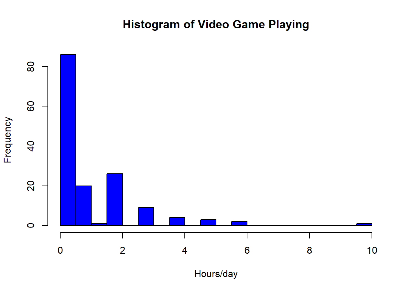 Does this distribution look normal? If not
is it positively or negatively skewed?
Does this distribution look normal? If not
is it positively or negatively skewed?
A histogram provides an empirical approximation of the underlying probability distribution. The shape we observe reflects sampling variability as well as any true structure in the population.
Does video game playing differ by gender?
## [1] 1.568966## [1] 0.8827869Later on we’ll see if this difference is ‘statistically significant’ using an ‘independent measures t-test’.
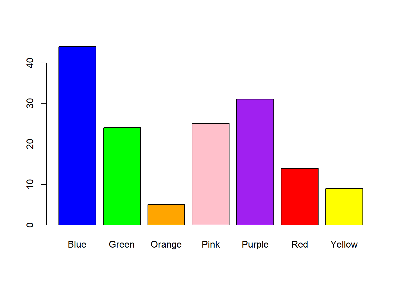
What is the distribution of your favorite colors? You’d think we could type hist(survey$color)’ but that doesn’t work because hist needs a list of numbers, not a list of nominal category names.
Fortunately, R has a convenient function table that tabulates nominal scale data into frequencies:
##
##   Blue  Green Orange   Pink Purple    Red Yellow
## 44 24 5 25 31 14 9##
## Blue Green Orange Pink Purple Red Yellow
## 44 24 5 25 31 14 9This variable color.freqs is something called a ‘table’. It’s like a list of numbers, except that the columns have names associated with them. In our case, the names of the columns are the color names.
Tables are convenient because they let you keep track of what the numbers mean.
You can then send this table into the function `barplot` to make a histogram:
``` r
barplot(color.freqs)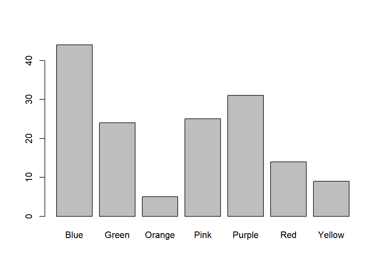 Got to love your love of ‘purple’.
Want to get fancy? Let’s use the option col to color the bars by their color names:
 Let’s compare the frequency distribution of favorite colors by gender. First we need to create a table frequency distributions for each gender separately, using the ‘table’ function like before. But this time we’ll index into the values for the associated gender:
color.freqs.men <- table(survey$color[survey$gender == "Man"])
color.freqs.women <- table(survey$color[survey$gender == "Woman"])
table will also create 2 (or more) dimensional tables by adding in each factor. Here’s a table of preferred color for all genders:
Next we’ll combine these two tables using the ‘rbind’ function which concatenates rows into a new table:
##
##         Blue Green Orange Pink Purple Red Yellow
##            1     0      0    0      0   0      0
##   Man     11     5      0    0      6   6      1
##   Woman   32    19      5   25     25   8      8
You can see that it contains a matrix of numbers along with names for the rows and columns.
This year, there were students that chose not to enter a gender. If we want to exclude this data from the table, we can pull out only the “Man” and “Woman” rows in the table (ignoring the thorny issue of only including students that provided a gender identity):
This table is ready to be plotted using barplot. We’ll use the option beside = TRUE so the “Men” and “Women” bars are plotted next to each other instead of on top of each other.
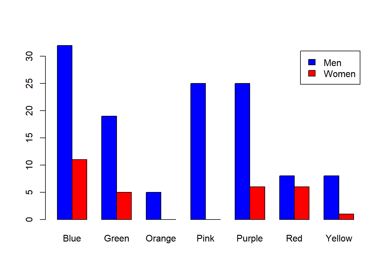 Do you think there is a difference in the distribution of color preference across gender? Later on we’ll determine if these two distributions are significantly different from each other using a ’Chi-squared test for independence`.
As an exercise, see if you can create a histogram of the number of birthdays for each month The months you all were born in is in survey$month:
As before, we can make a table and plot it as a bar plot:
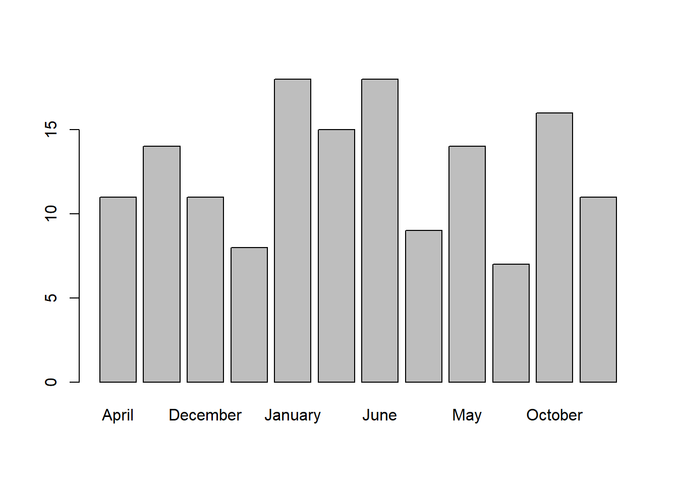 By default, table organizes the categories in alphabetical order. That’s not what we want. Look at the table:
##
##     April    August  December  February   January      July      June     March
##        11        14        11         8        18        15        18         9
##       May  November   October September
##        14         7        16        11
You can see it’s in alphabetical order. To rearrange the order we can turn survey$month into a ‘factor’, which is a list with a particular order of ‘levels’. R has a built in list month.name in the proper order. If we run this:
From now on, when we refer to survey$month, the ‘levels’ will be in the order that we specified. So if we recompute the table, the months will be plotted in the correct order:
Now look:
##
##   January  February     March     April       May      June      July    August
##        18         8         9        11        14        18        15        14
## September   October  November  December
##        11        16         7        11
It’s in the proper order. Now the bar plot will look right:
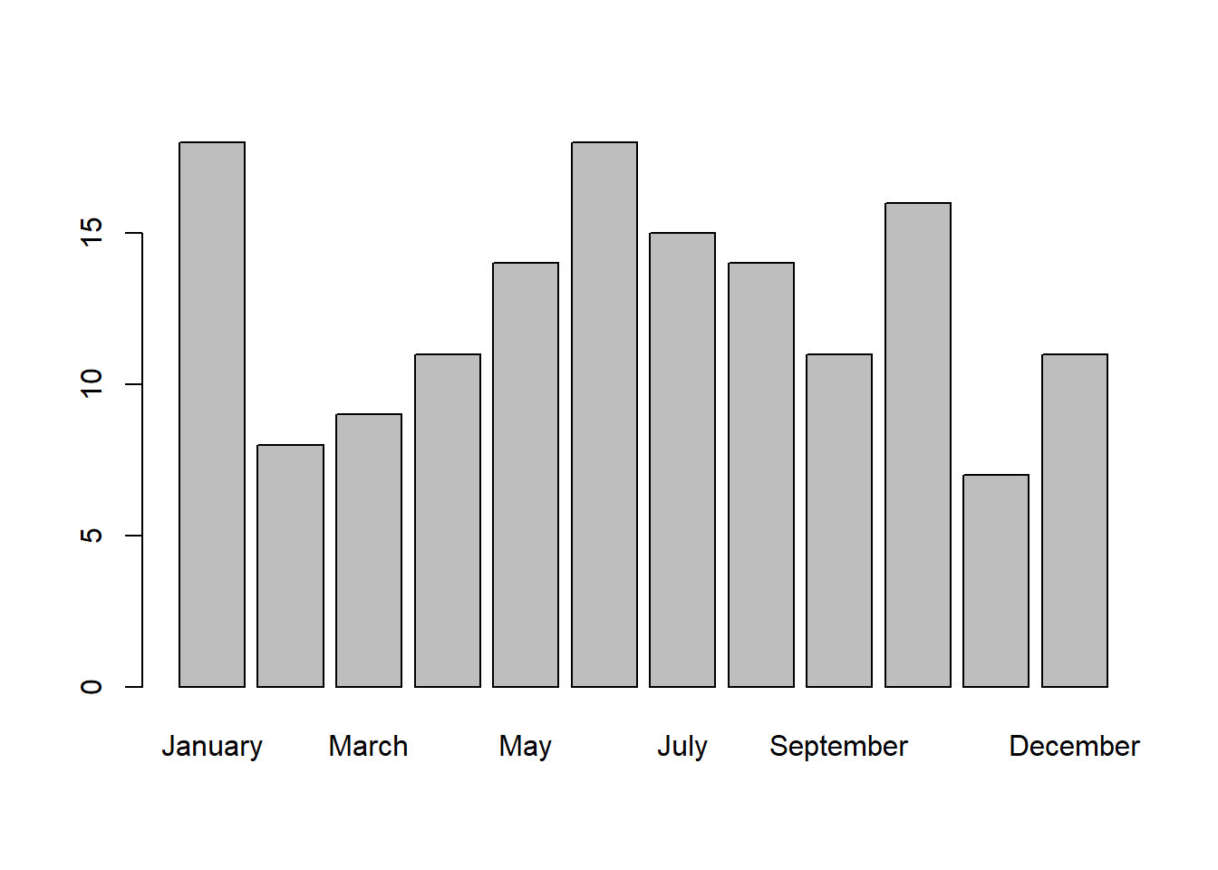 There are more students born in some months than others. Do you think this happened just by chance? Or is this distribution particularly unsual? Later on we’ll run a ‘Chi-Squared’ test to determine how likely we’d get a data set like this by chance.
Finally, let’s find the average amount of sleep for the women that like to sit near the front of the class:
To find these students we need to find those for which BOTH their gender is Woman AND their favorite color is ‘Purple’. This requires us to use & (and) to compare lists of TRUE
and FALSE
& compares two TRUE/FALSE variables and returns ‘TRUE’ if both are TRUE
## [1] TRUE## [1] FALSE## [1] FALSE## [1] FALSEHere’s how to use & to find the women that like to sit near the front of the class:
And here’s the average amount of sleep they get each night:
## [1] 7.204545We use | for ‘or’. This returns TRUE if either are TRUE:
## [1] TRUE## [1] TRUE## [1] TRUE## [1] FALSELet’s use | to find the favorite color for students that were either born in January or are left-handed:
students.january.left = survey$month == "January" | survey$hand == "Left"
survey$color[students.january.left]
## [1] "Blue" "Blue" "Purple" "Blue" "Green" "Purple" "Green" "Red"
## [9] "Red" "Purple" "Pink" "Blue" "Red" "Red" "Green" "Purple"
## [17] "Pink" "Green" "Orange" "Purple" "Green" "Blue" "Pink" "Blue"