Chapter 3 Frequency Distributions
The frequency distribution of a sample is a count of scores that fall into specific categories. Frequency distributions are very often shown as a bar graph, or histogram. You can make a histogram from nominal scale data or continuous data, but for continuous data you have to decided which ranges of scores fall into which ‘class interval’. We’ll first start with nominal scale data.
3.1 Nominal scale data
The easiest frequency distributions to understand and plot are for nominal scale data, where your measure falls into discrete categories. For example, in the survey, I asked students what their favorite color is. We can use R’s ‘table’ function to tabulate the number of students that prefer each color, and ‘barplot’ to plot the resulting frequencies:
survey <- read.csv("http://www.courses.washington.edu/psy315/datasets/Psych315W21survey.csv")
color.distribution <- table(survey$color)
barplot(color.distribution,xlab = "Favorite Color",ylab = "Frequency")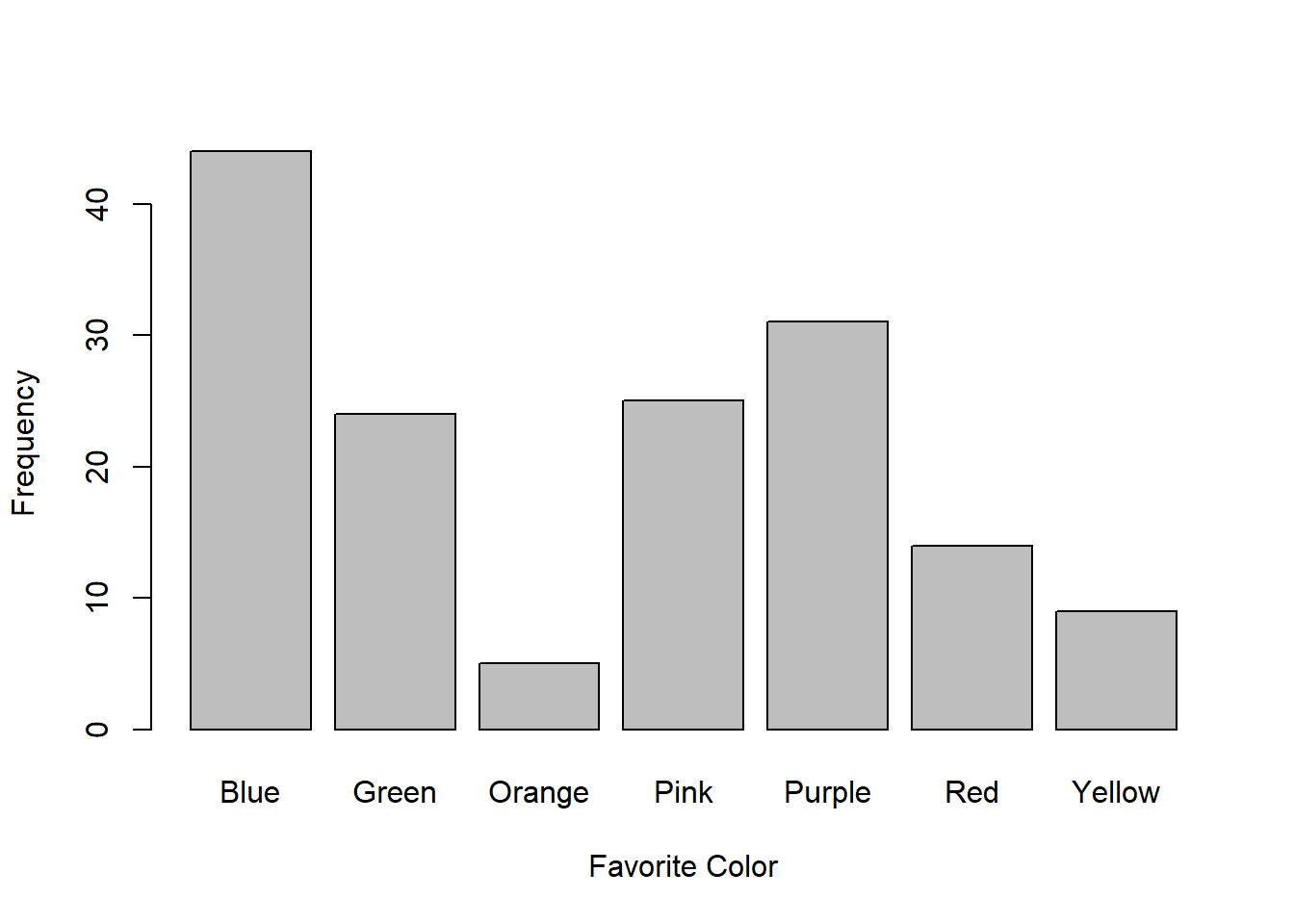
The y-axis is the number, or frequency, of students that prefer each color. For example, you can see that 31 students chose “Purple” as their favorite color (Go Huskies).
3.2 Relative frequency distributions
Sometimes you don’t care about the actual frequency of things, but rather the proportion or percent of things that fall into each category. This is called a ‘relative frequency distribution’, or sometimes a ‘probability distribution’. This is done by dividing the frequencies by the size of your sample (and multiplying by 100 if you want percent instead of proportion). For example, there are a total of 152 students in the class, so the proportion of students chose “Purple” as their favorite color is \(\frac{31}{152} = 0.2039\). Here is the relative frequency distribution for favorite color:
color.relative.distribution = color.distribution/length(survey$color)
barplot(color.relative.distribution,xlab = "Favorite Color",ylab = "Relative Frequency")
The relative frequency distribution throws out the sample size, so it is often used as a way to generalize your sample to a larger population, or to compare the distributions of samples that have different sizes.
3.3 Probability distribution
Since the relative frequency is the actual frequency divided by the sample size, the sum of all of the relative frequencies should add up to 1. This means that you can think of the relative frequencies as probabilities. For example, if your were to choose a student at random, the probability that that student chose “Purple” as their favorite color is 0.2039
This is why the relative frequency for discrete data is sometimes called the ‘probability distribution’.
3.4 Continuous scale data
To plot the frequency distribution for continuous scale data we need to divide the continuous scale into discrete bins, called ‘class intervals’. Plots of frequency distributions for continuous data are called ‘histograms’. It’s easy to make histograms in R using the ‘hist’ function. Here’s a plot of the frequency distribution for the amount of sleep the students reported they get each night:
-1.png)
Notice that the bars touch. This is a convention - for discrete data we often leave a gap between the bars, and with a continuous distribution (histogram) we have the bars touch.
3.5 Choosing class intervals
R ‘hist’ function chooses it’s own set of class intervals based on some algorithm. It seems to chose around 8-1 intervals with widths and borders as integers (whole numbers).
I tend to want control over these things. Next we’ll discuss three factors that can help with your choice of class intervals: centering, the resolution of your data, and the size of your sample.
3.5.1 Centering the bars
Look at the histogram for sleep. Since the class interval borders are integers, it’s hard to tell how many students got, say exactly 6 hours of sleep. The answer is 24 students. Since 6 lands exactly on the border, you can see that R decided to put those 24 students into the lower class interval (5-6 hours). Placing borderline scores on the lower class interval is the most common convention across software packages, by the way.
To avoid this ambiguity, we can set the class intervals to be centered on the integers using the ‘breaks’ option in ‘hist’. Below there’s a call to the function ‘axis’ which lets us modify the x-axis ticks to be steps of 1 hour (instead of 2)
breaks <- seq(round(min(survey$sleep))-.5,round(max(survey$sleep))+.5)
hist(survey$sleep,main = "",breaks = breaks,xlab = "Sleep (hours/night)",ylab = "Frequency")
axis(side=1, at=seq(0,max(survey$sleep), 1))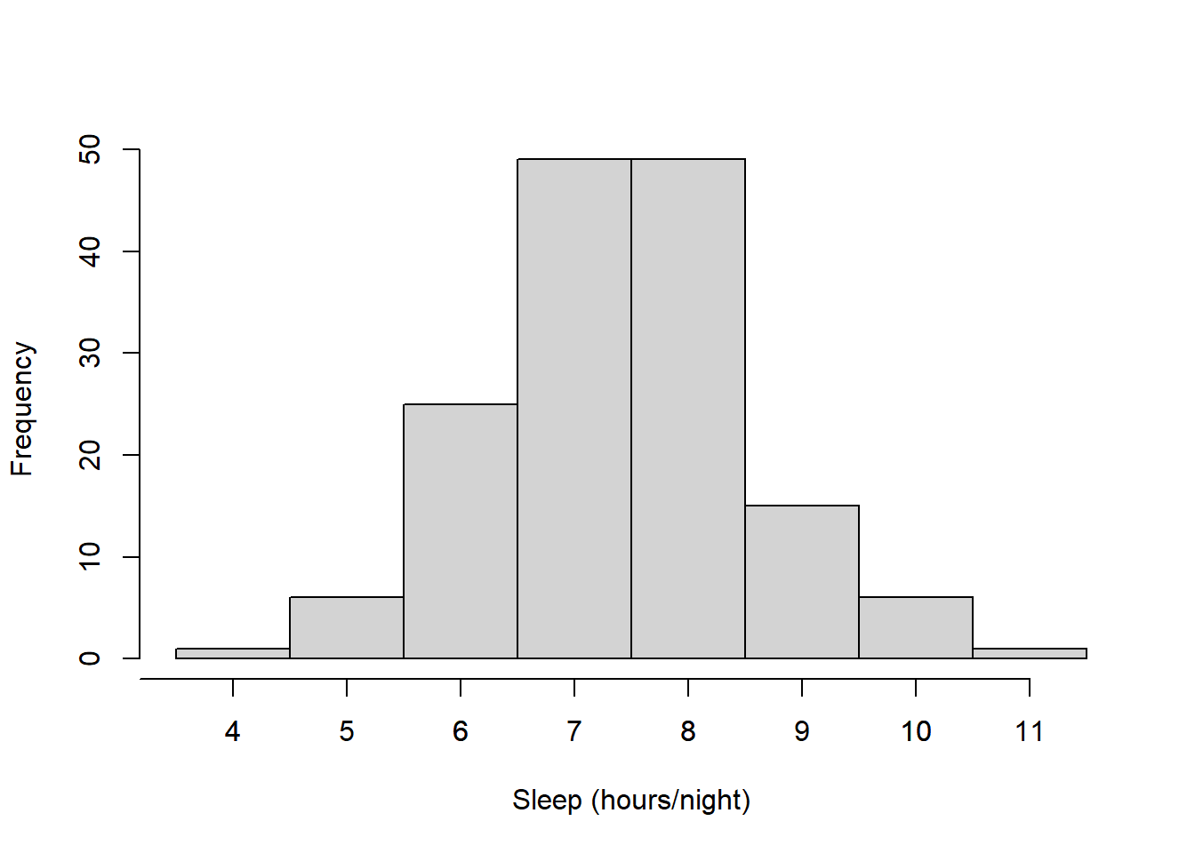
3.5.2 Matching the resolution of your data
Consider R’s choice for class intervals for plotting the heights of those who identified as women in the class:
women.heights <- na.omit(survey$height[survey$gender=="Woman"])
hist(women.heights,main = "",xlab = "Women's Height (in)",ylab="Frequency")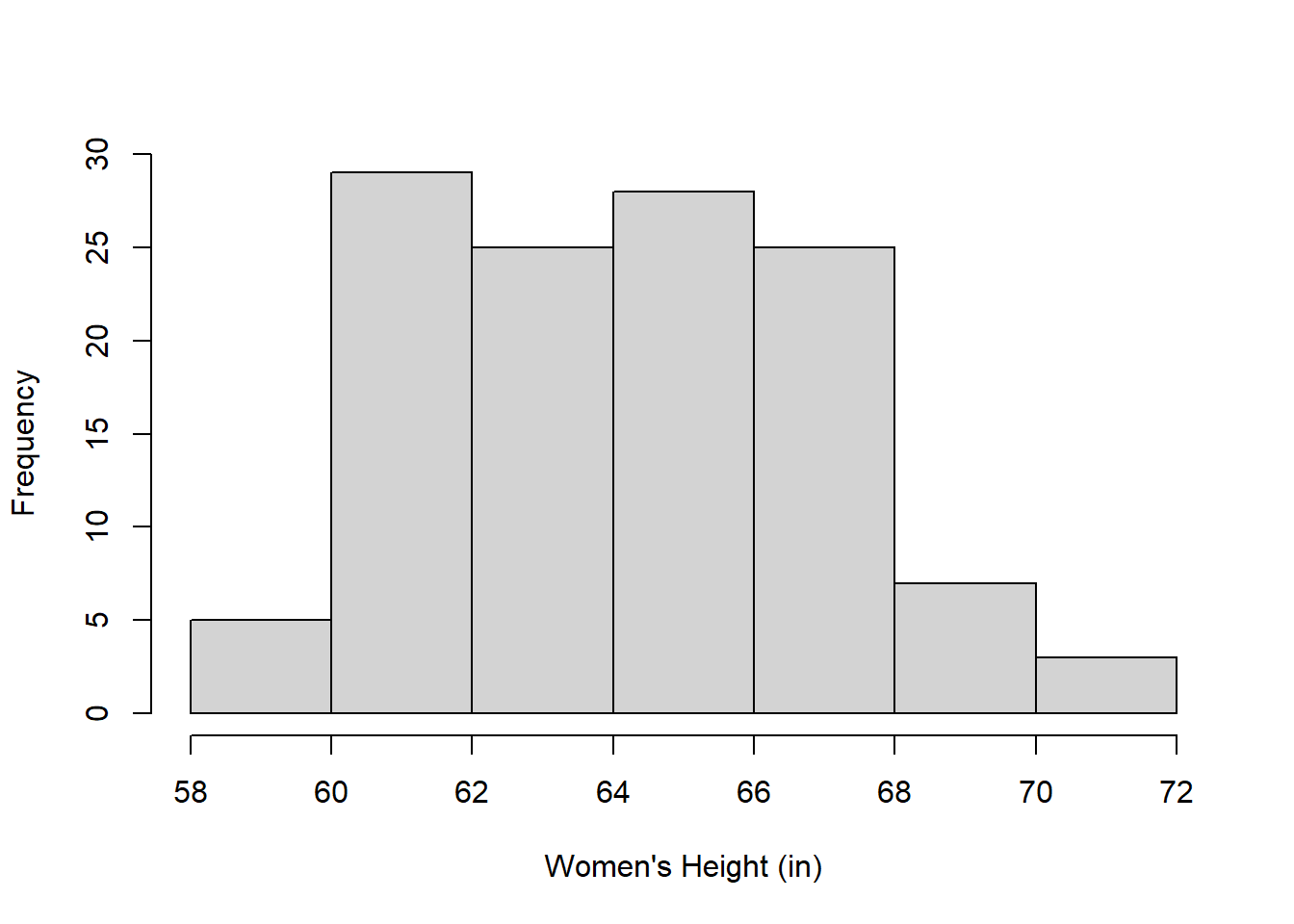
In my opinion, R (and other programs) tend to choose class intervals that are too wide (2 inches here) so there aren’t very many bars. Since the survey asked the students to report their heights to the nearest inch, it makes more sense to choose a class interval that matches the resolution of the data.
Here’s the frequency distribution with one-inch intervals centered on the inch:
breaks <- seq(round(min(women.heights))-.5,round(max(women.heights))+.5)
hist(women.heights,breaks = breaks,main = "",xlab = "Women's Height (in)",ylab="Frequency")
axis(side=1, at=seq(min(women.heights),max(women.heights), 1))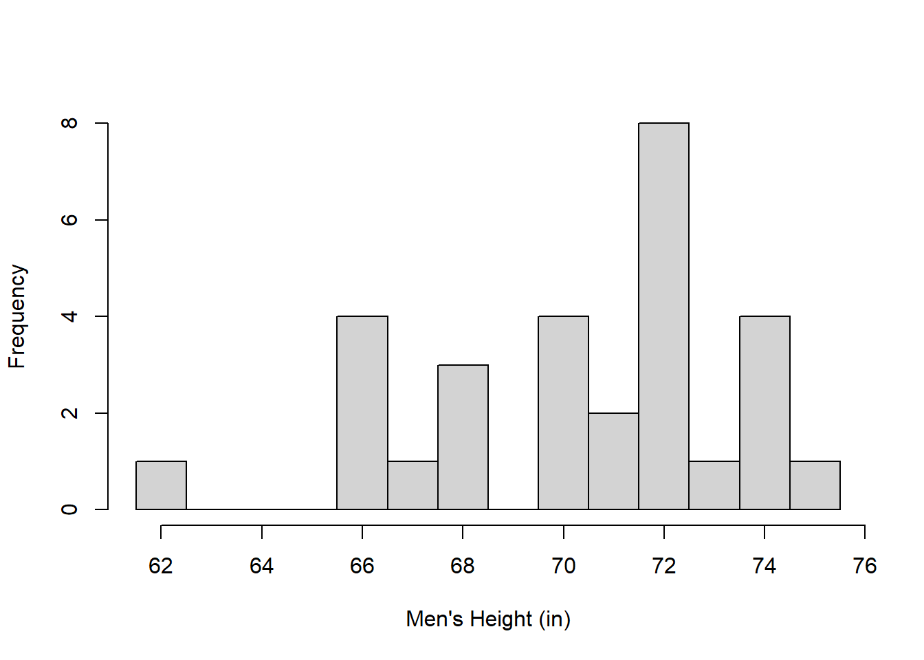
3.5.3 Sample size
If you have a small sample size then you might have empty class intervals if your intervals are too narrow. For example, here’s the frequency distribution for the 29 men in the class using one-inch wide intervals:
men.heights <- na.omit(survey$height[survey$gender=="Man"])
breaks <- seq(round(min(men.heights))-.5,round(max(men.heights))+.5)

hist(men.heights,main = "",breaks = breaks,xlab = "Men's Height (in)",ylab="Frequency")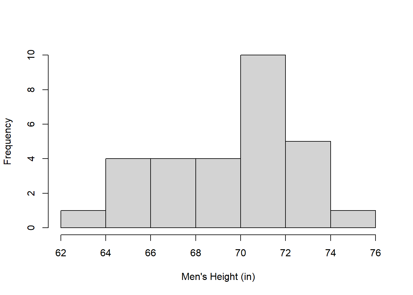
Since there are fewer men than women we see gaps, or empty class intervals. In cases like this it makes sense to lower the number of intervals. With R’s ‘hist’ function, if ‘breaks’ is set to a single number, then hist does it’s best to use that number of class intervals:
breaks <- seq(round(min(men.heights)),round(max(men.heights)),2)
hist(men.heights,breaks = 8,main = "",xlab = "Men's Height (in)",ylab="Frequency")
The choice of class intervals is a matter of taste, but it’s good to realize that distributions look different to the eye with different class intervals. This emphasizes that frequency distributions are only a way of visualizing your data - they’re a summary statistic. Please don’t call these graphs ‘data’!
3.6 Relative Cumulative Frequency
Frequency distribution plots are useful for visualizing where data lies along the distribution, but not as useful for estimating, say the median of the distribution or more generally the proportion of scores above and below some value.
Do to this we need the ‘relative cumulative frequency’ plot which is the proportion of samples that fall below a value as that value sweeps from the lowest to highest value in the sample. For example, from the survey, we can calculate and plot the cumulative frequency of women’s heights like this:
breaks <- unique(sort(women.heights))
x.cut = cut(women.heights, breaks, right=FALSE)
x.freq = table(x.cut)

cumfreq0 = c(0, cumsum(x.freq))/length(women.heights)
plot(breaks,cumfreq0,type = "b",pch = 19, lwd = 2,col = "blue",xlab = "Women's Heights (in)",ylab = "Relative Cumulative Frequency")
grid()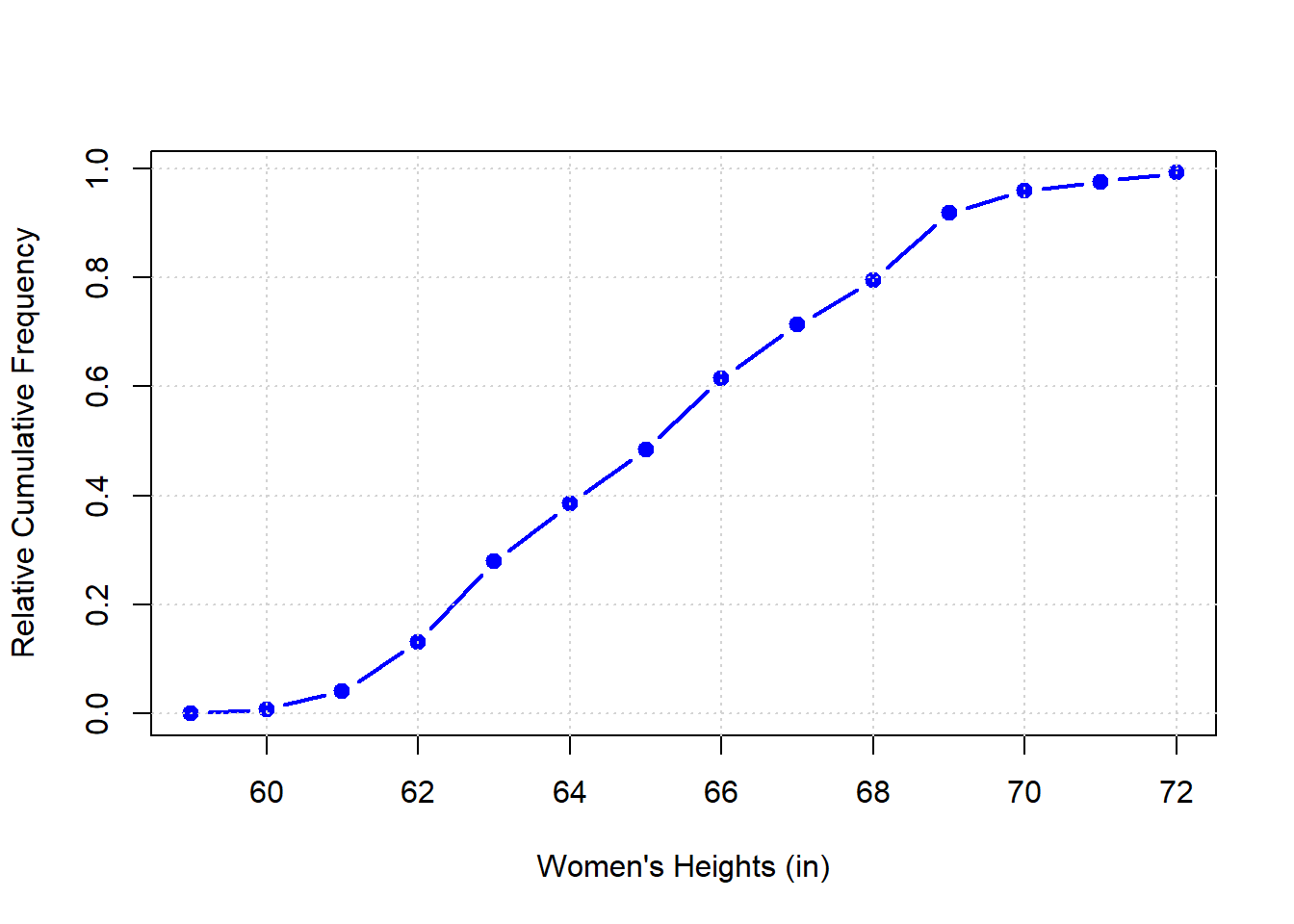
Relative cumulative frequency plots are useful for eyeballing the proportion of heights above and below some value. From this plot we can see that, for example, you can see that 50 percent of the women are 65 inches or taller (or shorter). You can also see that the proportion of women that are shorter than 62 inches is about 0.15.
The shape - and specifically the slope - of the relative cumulative frequency plot tells you something about the shape of the distribution. The slope is flat in intervals where aren’t many scores, and the slope is steep where the density of scores is high. The S-shaped cumulative frequency seen here for heights is the signature of a normal, or bell-shaped distribution. The curve is flat at the low and high ends, corresponding to the sparse number of samples in the tails, and the curve is steepest in the middle in the thick part of the bell-curve. You can see this by comparing this curve to the frequency distribution of woman’s heights plotted earlier.
3.7 Percentile Points and Percentile Ranks
Rather then eyeballing these proportions, R has a couple of functions that calculate the proportion of scores below certain values. Back to our first example - what proportion of women’s heights fall below 62 inches? We have specific names for these things. The height in this example (or more generally the ‘score’) is called the ‘percentile point’. The corresponding proportion of scores below this percentile point is called the ‘percentile rank’.
3.7.1 ‘Quantile’: Percentile Ranks to Percentile Points
R’s function ‘quantile’ give you percentile points from percentile ranks. For example, to find the height (percentile point) for which 50% (percentile rank) falls below is:
## 50%
##  65
Note the option ‘type=5’. R allows for 9 different ways for computing percentile points! They’re all very similar. Type 5 is the simplest and most commonly used.
If you want to calculate more than one percentile rank at a time, you can add a list of ranks using the ‘c’ command. Remember, ‘c’ allows you to concatenate a list of numbers together.
Let’s generate the percentile points for the lowest 5%, first quartile, median, third quartile and highest 95%:
##  5% 25% 50% 75% 95%
##  61  62  65  67  69
3.7.2 Percentile Points to Percentile Ranks
For some reason, R doesn’t have a good function for going from percentile points to percentile ranks in R. If you look around you’ll be pointed to the ‘ecdf’ function (‘Empirical Cumulative Distribution Function’). For our example converting a height (point) of 62 to rank is done like this:
## [1] 0.2786885Notice that this doesn’t agree with the cumulative frequency graph, where we estimated the rank to be about 0.15.
I don’t know why this kind of wrong, and why there isn’t a good inverse of the quantile function. Instead, I’m going to take a brief digression to show you how to find the inverse of a function like this using a procedure called ‘binary search’.
3.7.3 Inverting the quantile function using ‘Binary Search’
This section might be a little advanced for someone new with R, so don’t worry - it’s a bit of a digression.
The binary search algorithm is an efficient way to find the inverse of a ‘monotonically increasing’ function - which is a function for which the output only increases with the input. ‘quantile’ is an example: as the percentile rank increases, the percentile point must also increase (or stay the same).
Let’s use our example of finding the rank for a point of 62, that is the percentile rank for a height of 62 inches.
The trick behind the binary search is to start out with two values that we know will bracket the answer. For our example, we know that the percentile rank must be between zero and one. We start with finding the percentile point for the midpoint of our bracket which is a rank of 0.5. We already found that the corresponding percentile point is 65 inches. This is above the desired percentile point of 62 which means that our first guess of 0.5 is too high. The actual rank must be between 0 and .5, so we try the midpoint for the new bracket which is 0.25.
This procedure continues, dividing the bracket in half with either the upper and lower bounds being replaced by the midpoint of the bracket, depending on the percentile point at the midpoint. The bracket narrows quickly: after 20 iterations, the width of the bracket is only \((\frac{1}{2})^{20} = \frac{1}{1048576} = 0.000000953674\)
Here’s how to do it with a for loop in R:
desired_point <- 62  # desired percentile point
lo <- 0  # lower end of bracket
hi <- 1  # high end of bracket
for (i in 1:20) {
  mid <- (lo+hi)/2  # find the midpoint of the bracket
  # find the percentile point at the midpoint
  current_point <- quantile(women.heights,mid, type =5)
  if (current_point<desired_point) # if we're too low:
    {lo <- mid } # replace the lower end of the bracket with the midpoint
  else  # other wise
    {hi <- mid} # replace the higher end of the bracket with the midpoint
}
rank <- (lo+hi)/2  # split the bracket one more time.
rank
## [1] 0.1352458This should be the rank for the percentile point of 62. Let’s check:
## 13.52458%
##        62