Chapter 4 The Normal PDF
4.1 Sampling from the standard normal distribution
The normal distribution - the familiar bell-shaped distribution - shows up all over the place. Specifically, in the next chapter on the The Central Limit Theorem we will see that the distribution of sample means tends toward normality even when the original data are not normal. R has a set of functions that let you sample from and work with the normal distribution. We’ll start with rnorm (r for random, norm for normal) which draws random numbers from the normal distribution.
The following code generates a huge sample from a normal distribution with mean 0 and standard deviation of 1, which is called the standard normal:
The command set.seed sets the random number generator seed so that the following sequence will always be the same. This way my numbers will look like your numbers if you run this code.
With this huge sample size, hopefully the mean and standard deviation will be close to 0 and 1 respectively:
## [1] -0.006537039## [1] 1.012356Good.
To visualize the distribution of this sample we can plot a histogram after choosing the class intervals. Here’s how we did it in the last chapter on frequency distributions:
x.range <- round(max(abs(x)),.5)+.5
breaks = seq(min(x)-.5,max(x)+.5,.5)
hist(x,main = "",breaks = breaks,xlab = "x",ylab = "Frequency")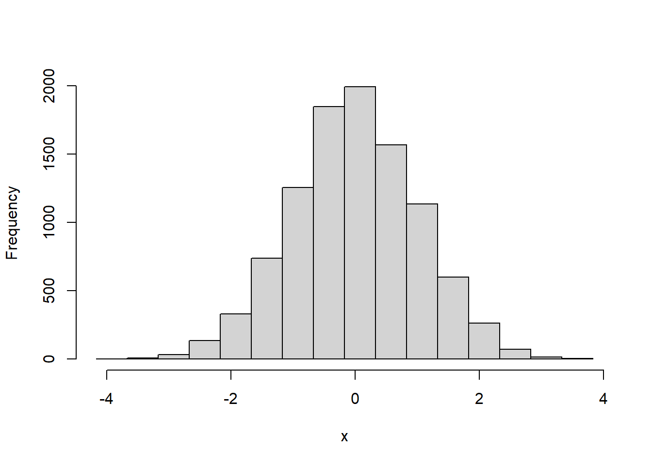
4.2 Density - the equivalent of relative frequency for continuous data
For discrete data, we calculated the relative frequency distribution by dividing by the sample size. If we do that here with continuous data we have the problem that we picked the class intervals ourselves. So, for example, doubling the width would roughly double the frequencies. To convert frequencies into densities, we divide by both the sample size and the interval width.
The analogue of the relative frequency for continuous data is called the ‘density’, and the graph is called the ‘probability density function’, or ‘pdf’. You can plot the density instead of the frequency using ‘hist’ by setting ‘freq = FALSE’:
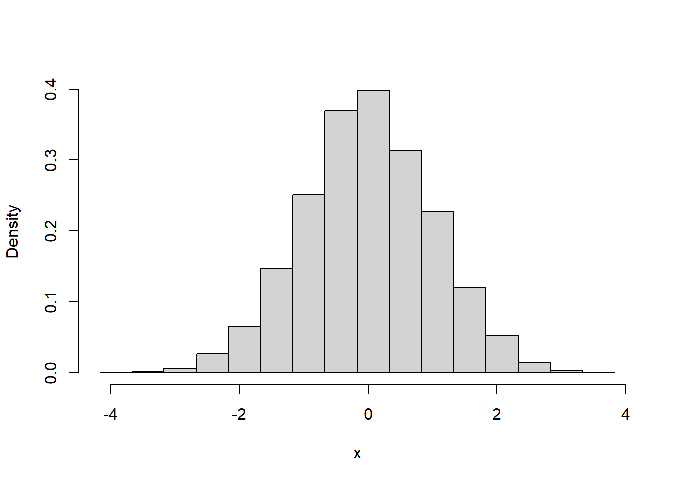
With such a large sample size, we can use a very small class interval with to get a better look at the distribution:
breaks = seq(-x.range,x.range,.1)
hist(x,main = "",breaks = breaks,xlab = "x",ylab = "Density",freq = FALSE)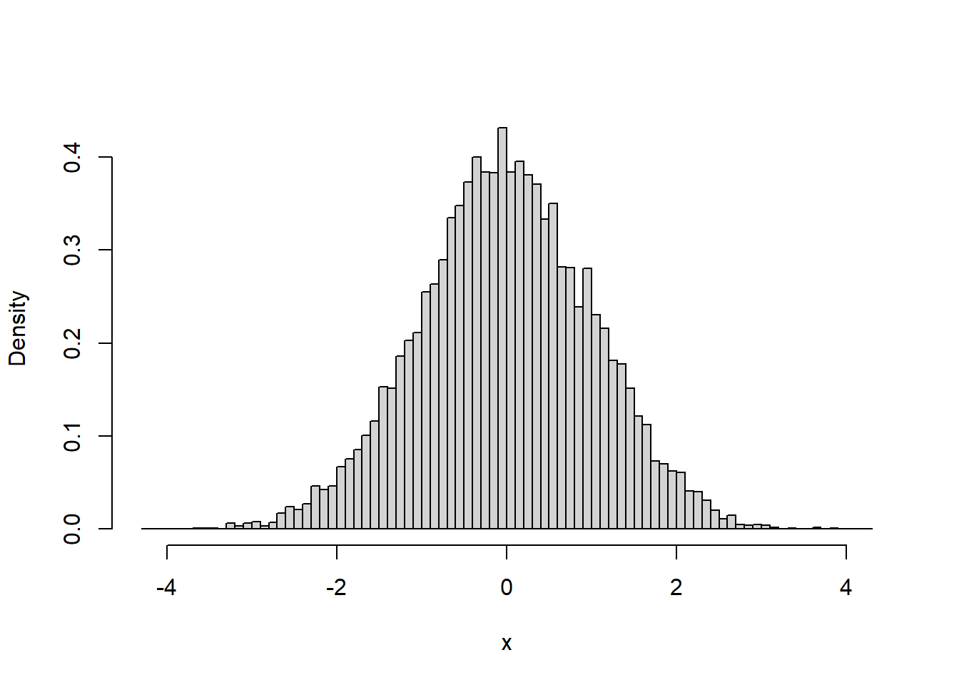
Notice that even though the intervals are narrow, the height of the graph still peaks at around the same height of about 0.4. This is because the calculation of density takes into account the width of the intervals.
Remember, the relative frequency distribution for discrete data tells you the probability that a given sample will fall into a given category. There is a related relation between density and probability for the pdf: Since the heights of the bars are scaled by their width, the area, and not the height, of each bar represents the probability of drawing a sample from that class interval.
The useful thing about this is that you can use the pdf to find the probability of sampling a value within a certain range of class intervals we just sum the areas of the bars that cover that range.
Let’s use this to calculate the probability of obtaining a sample between the values of 0 and 0.5.
In the latest plot, the class interval width in the plot above was set to 0.1. There are 4 intervals that cover the range, and their heights add up to \(0.395+0.381+0.371+0.333 = 1.48\).
Multiplying this sum by the class interval width gives us \((1.48)(0.1) = 0.148\)
This means that about 15% of the scores fall between 0 and 0.5.
4.3 The normal pdf
Since we drew samples from the normal distribution, the pdf looks like the familiar bell-curve. With a finite sample we have to use a finite number of class intervals. We could use narrow class intervals because our sample size is large. In theory, with a big enough sample size we could get a smooth-looking pdf. This is a calculus thing: the sample sizes go to infinity but the widths go to zero. In the end, you get a smooth, continuous pdf that is the probability density function of the population that you’re drawing from.
Since it’s a smooth curve, we can describe it as a function of x. The standard normal distribution has a pdf of:
\[ y = \frac{e^{-\frac{x^{2}}{2}}}{\sqrt{2\pi}} \]
Where \(e\) is the basis of the natural logarithm (one of my favorite numbers). Like \(\pi\), it has a non-repeating decimal that goes on forever. You can use R’s ‘exp’ function to see \(e\) to the first 80 decimal places:
## [1] "2.71828182845904509079559829842764884233474731445312"Sorry for the digression.
Let’s see how well the pdf for the standard normal fits the distribution of our sample by overlaying it on the histogram:
We’ll start plotting pdfs using the ‘ggplot’ function from the ‘ggplot2’ library. ggplot takes a little getting used to, but it’s a very flexible function that allows us to do things like overlay plots.
The following code first runs the 'hist' function with plot=FALSE which returns the frequencies without plotting. ‘plot’ also returns the $density. We then use ggplot to plot the density. We’ll use the geom_step() option which plots the bars without the vertical lines at the class intervals. This is cleaner for plots with lots of narrow class intervals. With a large sample size like this we can use narrow class intervals.
Since it contains all possible values, the area under the normal distribution - and any probability density function - is equal to one.
x.distribution <- hist(x,plot = FALSE,breaks = 200 )
big.data <- data.frame(x=x.distribution$mids,y=x.distribution$density)
p <- ggplot(big.data,aes(x=x,y=y)) + geom_step() + theme_bw() +
  scale_x_continuous(breaks = seq(-4,4)) +
  geom_hline(yintercept = 0) +
  ylab("")
p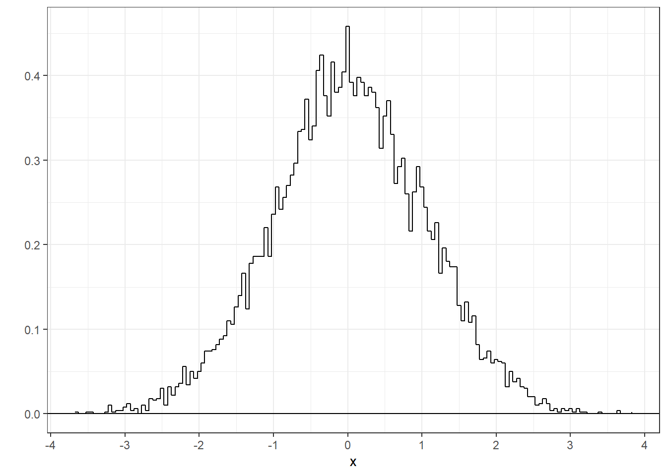
R has it’s own function, dnorm, that calculates the pdf as a function of x. Here’s the smooth pdf for the standard normal on top of the sample pdf:
y <- dnorm(breaks,0,1)
norm.pdf <- data.frame(x=breaks,y=y)
p + geom_line(data =norm.pdf,aes(x=x,y=y),color = 'blue')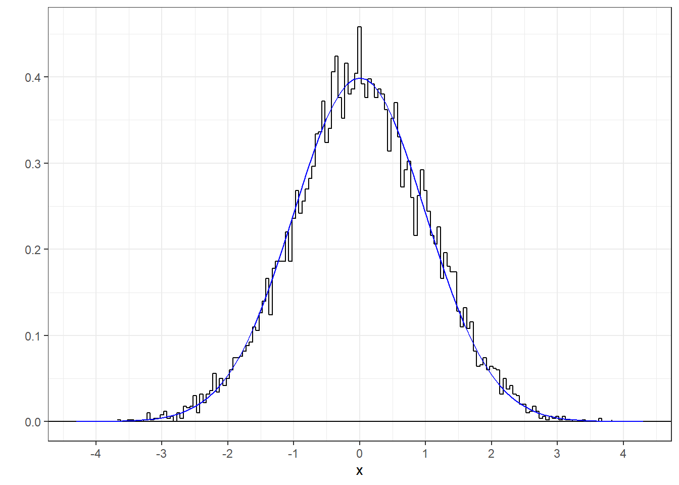
It’s a nice fit, which demonstrates that R’s random number generator is working well.
What do the y-axis values mean? When we evaluate dnorm at 1, or example:
## [1] 0.2419707This is the height of the standard normal pdf at x = 1. But it’s not a probability. The probability of drawing exactly 1 is equal to zero. It only makes sense to think of areas under the curve between values of x.
4.4 Probabilities under the standard normal
Given this smooth pdf, we can use the same trick to find probabilities that scores will fall within certain intervals by calculating the area under the pdf - which is integration in calculus. Frustratingly, although there is that function for the pdf, there is no closed-form integral for that function. But it doesn’t really matter because there are algorithms for approximating the integrals to any degree of precision. R has the pnorm function for this. pnorm finds the area from minus infinity to a desired area. This result should make sense:
## [1] 0.5Since the standard normal is symmetric around zero, half of the area falls below zero.
pnorm is all we need to find the area - and therefore the probability - between two values.
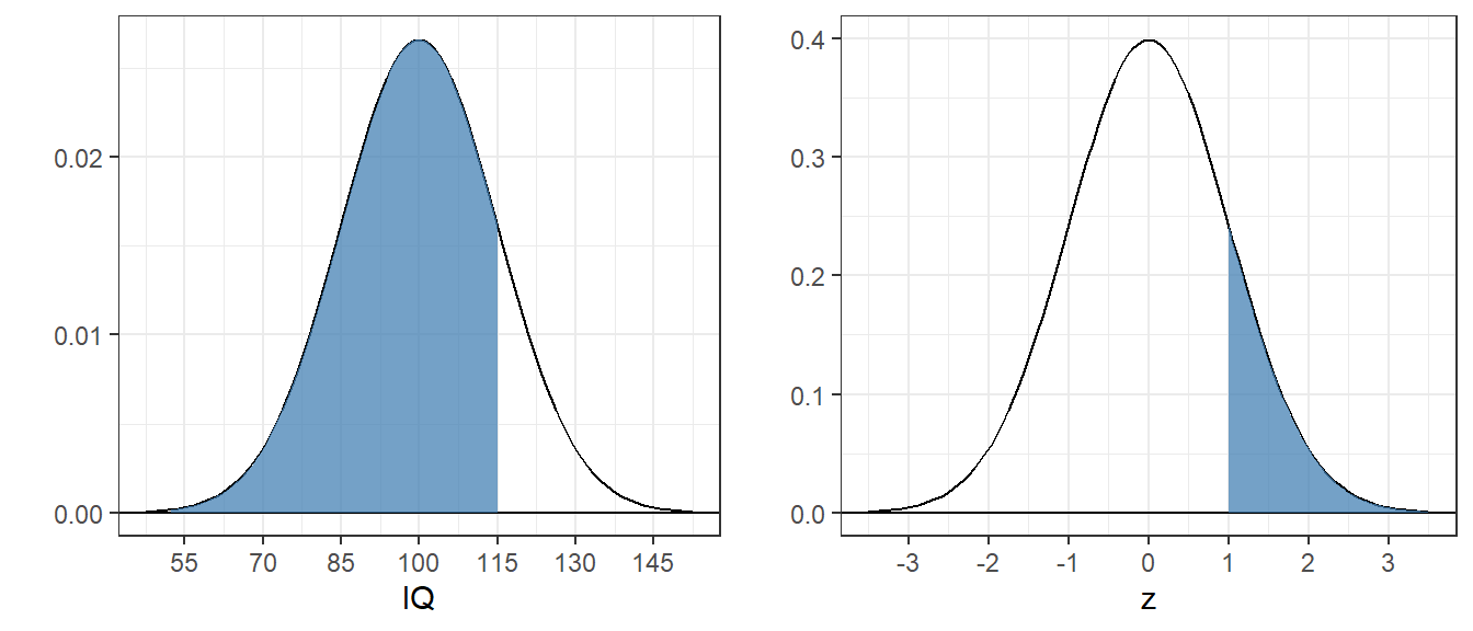
4.4.1 Example 1: Find the area above z=1 for the standard normal
Mathematically, it is the integral of the standard normal from 1 to infinity:
\[ \int_{1}^{\infty} \frac{e^{-\frac{z^{2}}{2}}}{\sqrt{2\pi}}dz \]
Which is the area of the shaded region:
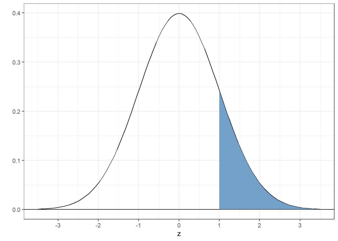
Note that we’re using z instead of x. z is the variable used to describe the x-axis for the standard normal distribution.
Since pnorm finds the area below z, the trick is to find the area below 1 and subtract this from 1 since the total area is equal to 1:
## [1] 0.1586553You can get the same answer using the ‘lower.tail’ option which is ‘TRUE’ by default. If set lower.tail=‘FALSE’ it finds the area above:
## [1] 0.15865534.4.2 Example 2: Find the area between -1 and 1
The trick here is to subtract the area below -1 from the area below 1:
## [1] 0.6826895About 2/3 of the total area for the normal distribution falls within \(\pm\) 1 standard deviation from the mean.
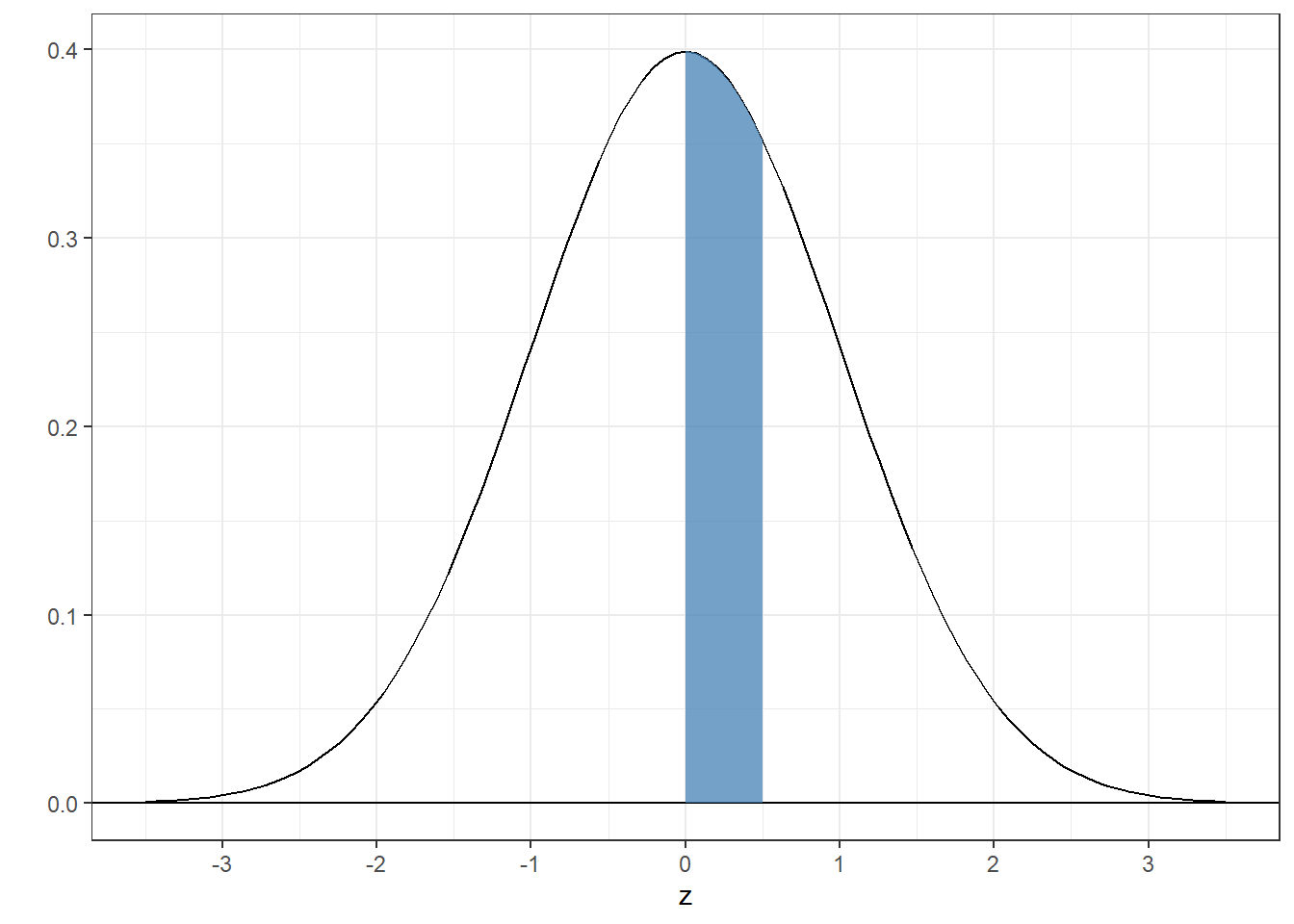
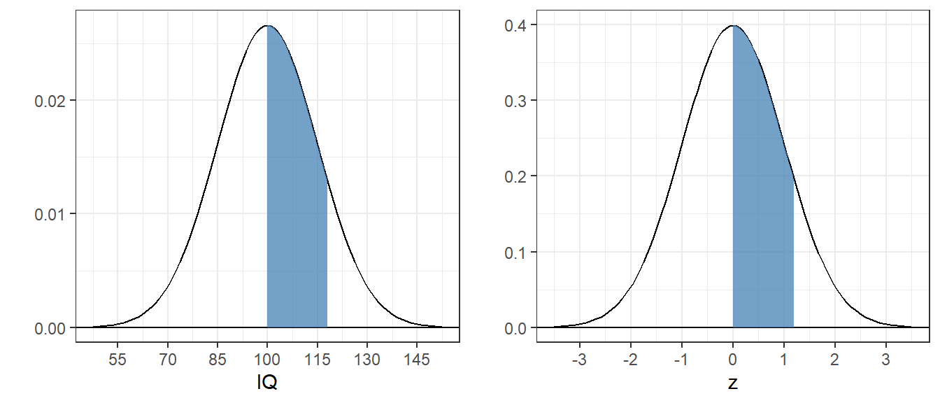
4.4.3 Example 3: Find the area between 0 and 1/2
 Just like the last one:
## [1] 0.1914625Compare this number to 0.148, which is what we got when we added up the areas under the pdf from the sample. It’s pretty close. It’s not exact because our sample, although huge, is finite in size, so we didn’t get the exact number of samples between 0 and 0.5 that’s expected from the actual normal pdf.
4.4.4 Example 4: Find the z-score for which the area below is 0.75
This is the reverse of the previous examples: I gave you an area and you have to find the score. R does this with the qnorm function, which is the inverse of the pnorm function:
## [1] 0.6744898So about 67% of the area under the standard normal falls below .75. We can verify this with pnorm:
## [1] 0.75Or to get fancy:
## [1] 0.75The shaded region has an area of 0.75:
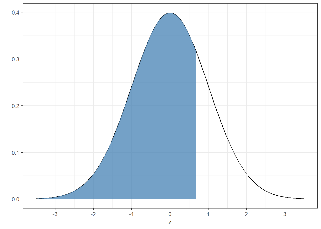
4.4.5 Example 5: What z-scores bracket the middle 95% of the area under the standard normal?
This is a fun one. If the middle contains 95% of the area, then the two tails each contain a total of 5% of the area. Splitting each tail in half means that each tails contains a proportion of \(\frac{1-.95}{2} = 0.025\) of the area. The score for which the proportion of the area below is .025 is:
## [1] -1.959964The boundary for the upper range is the score for which the proportion below is \(1-.025 = .975\):
## [1] 1.959964You could have guessed that because the standard normal distribution is symmetric around zero.
Here’s the graph:

Remember this number - it’s very close to 2. About 95% of the area of the standard normal falls between -2 and 2. This means that if you were to draw a random sample from the standard normal, it’ll fall outside the range of -2 and 2 about 5% of the time. You’ll see this number, 5%, a lot in the future. This is the common significance threshold of \(\alpha\) = .05 in two-tailed hypothesis tests. We will return to this repeatedly.
4.5 Non-standard normal distributions
All normal distributions have the same shape - they only differ by their means and standard deviations. A normal distribution with mean \(\mu\) and standard deviation \(\sigma\) has the probability density function:
\[ y = \frac{e^{-\frac{(x-\mu)^{2}}{2\sigma^2}}}{\sigma\sqrt{2\pi}} \]
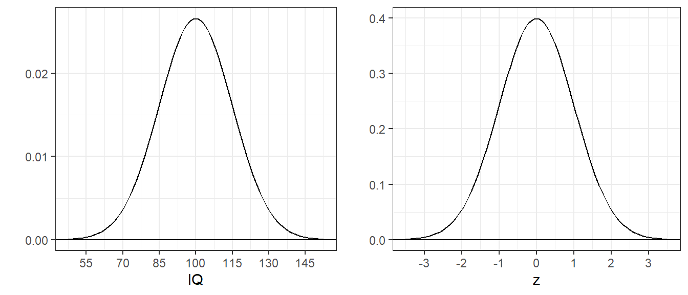
Consider IQ scores, which are normalized to have a mean of 100 and a standard deviation of 15. The pdf for IQ’s is just a shifted and scaled version of the standard normal pdf:
4.5.1 Example 6 What proportion of IQ’s area above 115?
I picked this score because it’s exactly one standard deviation above the mean. All normal distributions have the same shape, so the area is the same as the area above 1 for the standard normal, since the standard deviation of the standard normal is 1, which we calculated in Example 1 as 0.1586553.
It follows that probabilities for any IQ score can be found using the standard normal by converting the score into standard deviation units. If \(x\) is your score (IQ in this example), then the score in standard deviation units is:
\[ z = \frac{x-\mu}{\sigma} \]
This transformation converts any normal distribution into the standard normal distribution. You can see that the areas are the same in this figure:
You might have noticed that the y-axis scales for these two plots are different. That’s because the scales on the x-axis are different. Although the curves are smooth, you can think of the class interval width for IQs to be 15 times wider than for the z-scores. So in order for the bars to have the same heights, we need to divide the heights of the bars for the IQ scores by 15. That’s why the height in the z-score of 0.3 corresponds to a height in the IQ scores of \(\frac{.3}{15} = 0.02\).
The converted score is called z-score.
4.5.2 Example 7: What proportion of IQs fall between 100 and 118?
We need to convert the IQ scores to z-scores:
\[ z_1 = \frac{100-100}{15} = 0, z_2 = \frac{118-100}{15} = 1.2 \] So the answer is:
## [1] 0.3849303There is a shortcut that bypasses the need to calculate the two z-scores. pnorm let you pass in the means and standard deviations of your population as arguments. Without them they’re set to the default values of \(\mu = 0\) and \(\sigma = 1\). See how this gives you the same answer:
## [1] 0.3849303Here’s what the areas look like for both the IQ and the standard normal distributions:
4.5.3 Example 8: What IQ marks the top 1% of all IQ’s?
Since you have a proportion (.01) we need to use qnorm to find the z-score:
## [1] 2.326348Then we need to find the IQ that is 2.3263479 standard deviations above the mean. This is \(IQ = 100 + (2.3263479)(15):\)
## [1] 134.8952In general, if you have a z-score, we can rearrange the original formula for the z-score:
\[ z = \frac{x-\mu}{\sigma} \]
and solve for x:
\[ x = \mu + z\sigma \]
You might have guessed that qnorm also allows for the shortcut. So the quick way to answer this problem is:
## [1] 134.8952Here’s what that top 1% (above an IQ of about 135) looks like:
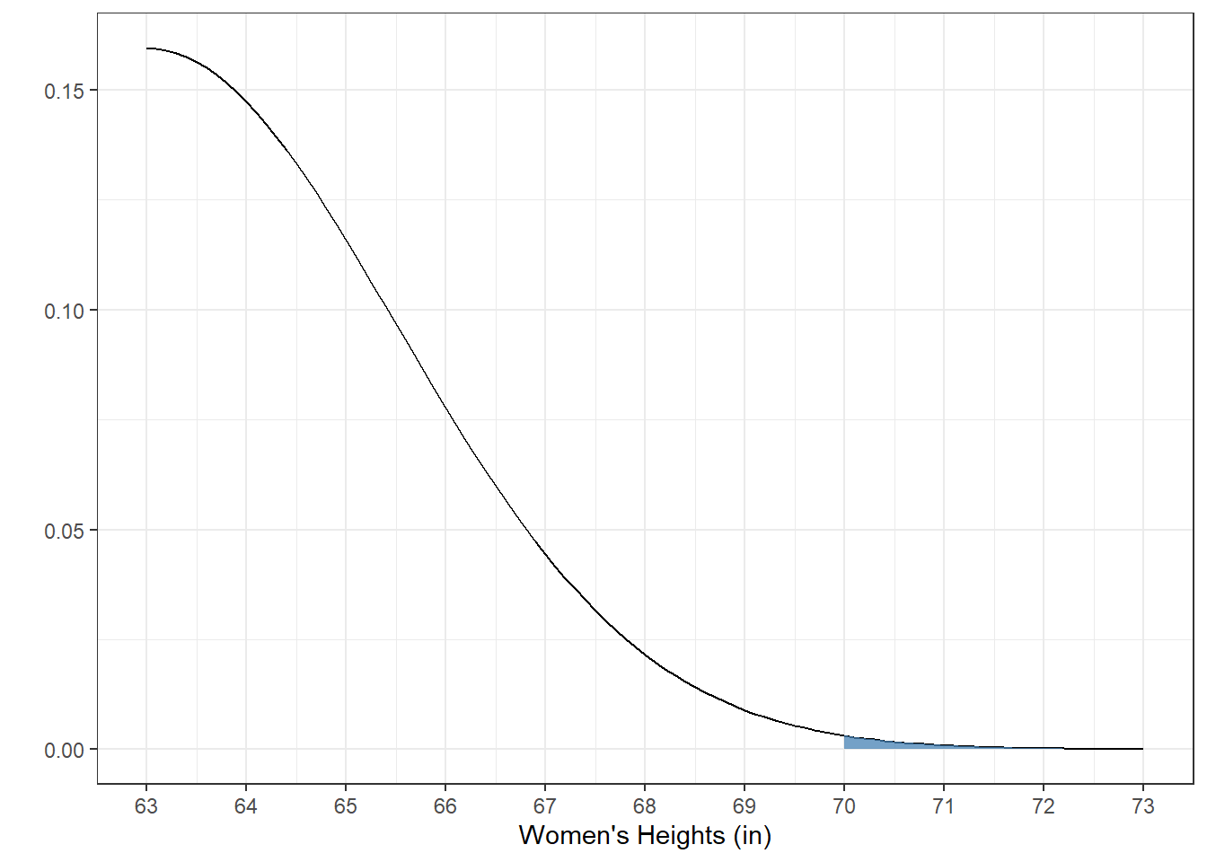
4.5.4 Example 9: What proportion of women in the world are taller than 70 inches?
For this we need to know something about the distribution of heights of women in the world. Digging around the world wide web, I’ve come up with the estimate that the average height of women in the world globally is 63 inches, with a standard deviation of 2.5 inches.
To solve this problem we’ll use the pnorm function:
## [1] 0.00255513This is a tiny proportion. To visualize this we need to zoom in on the upper tail of the distribution:

4.5.5 Example 9: What heights cover the middle 50% of the population of the women’s heights?
This can be done with the qnorm function, since we’re given proportions. We know that the proportions in the two tails are 0.25:
## [1] 61.31378## [1] 64.68622The range between the upper 75% and upper 25%, divided by 2, is called the semi-interquartile-range, and has it’s own symbol, Q. Q for women’s heights is:
## [1] 1.686224From example 2 we calculated that about 2/3 of the area under the normal distribution falls between \(\pm\) 1 standard deviation of the mean. Since \(\pm\) Q covers only the middle 50% it makes sense that Q is smaller than the standard deviation of 2.5 inches.
Here’s what the middle 50% looks like in blue overlaid on \(\pm\) one standard deviation in pink:
4.6 Visualizing the Normal Distribution
Finally, here’s a widget that I used for teaching the undergraduate version of this class. It allows you to adjust either the area of the rejection region or the critical values with one or two tails, and calculates the remaining values. You can start by dragging the critical value line left and right in the graph and watch what happens. Do these numbers match up with what you get with pnorm and qnorm?